Strap in, because this exercise is a big one!
So, for this exercise, our job is to visualise a number of characters based on well-known character types or professions. Easy, right? Now combine that with the constraint that every character cannot be a stereotype. Instead, it must be an archetype - it visually communicates information in a way that isn't some kind of trope.
Now, combine that constraint with the typical 'art school' challenge of 'draw 50 things'. That's right, for this exercise we need to draw 40 (!) archetypes. To start with I needed to make a list of the 40 things I was going to depict, which is actually a lot harder than you think. By about number 25 I had to rely on some kind of word or image association to trigger my brain! My list ended up as:
Police officer
Firefighter
Judge
Detective
Nurse
Bank Manager
Bank Robber
Programmer
Engineer
Lecturer
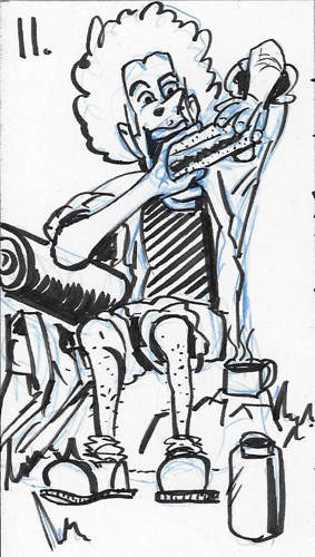
Backpacker
Airport Security
Dog trainer
Blacksmith
Glassblower
Mountain Rescue
Chef
Tube-Driver
Priest
Farmer
Pirate
Micro-Brewer
Hairdresser
Photojournalist
Dancer
Personal trainer
Acrobatic performer
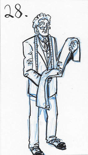
Tailor
Construction worker
Judo instructor
Mechanic
Bartender
Director
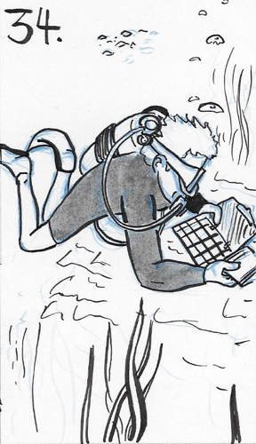
Marine biologist
Librarian
Cafe owner
E-sports gamer
Gamekeeper
Bodyguard
Cartoonist
Phew! Next, I followed the instructions to split two A3 pages into 5x4 grids and started work drawing my characters. I decided to do rough pencils with a blue mechanical pencil, to I could scaffold characters more easily if I needed to. Then I inked on top with a Tombow Fudenosuke hard-tip pen. In some of the later drawings, I also used a grey ink pentel brush pen for adding in some definition and contrast.
I did my best to think about the character ahead of doing the drawing, but I also tried not to think too much, and to rely on the implicit choices my brain would make to draw the images. This allowed me to make more explicit choices which I did to try and experiment with things like archetypes that challenge stereotypes and assumptions, trying to use shape language, mixing between cartoony and more realistic. I also found it challenging to efficiently draw faces when they were that small, so I was pushed to work out how best to use expression, features and posture to convey emotion or temperament.
Here are my 40 characters:
Let's look a bit deeper into the process:
I found the exercise tough - I ended up spending 15-20 minutes on each character on average, and as I had to fit it into my normal routines, I had to tackle it in batches. I think this shows, and by the time I hit the late twenties, I am starting to run out of steam. The poses I chose for the latter half of the images are more static and less inventive.
All of the images are, to me, obviously identifiable as mine, and my style, even when I have varied the realism. However by-and-large I hate it! I can see where I have incorporated learning from doing life drawing and urban sketching. My studies have made my understanding of how clothes crease and fold much better, and I think I can do pretty well in getting the bunching and taughtening right, making my characters less wooden. I still haven't nailed shoes, and they all end up being a bit cartoony with large bulbous toe caps.
I tried my best to play with expressions where I could, and I am getting a lot better at thinking about the structure of the face and how the muscles move. I still need to do a lot of work here, but it's good progress. For some of the characters, I didn't try and just rely on my imagination, but made judicious use of reference photos. I didn't want to copy directly, so where I could I took the ideas and general positions of the models and adapted them to my own version and narratives. There are a few of the images which I think work really well:
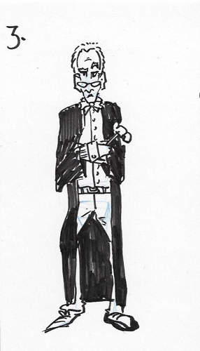
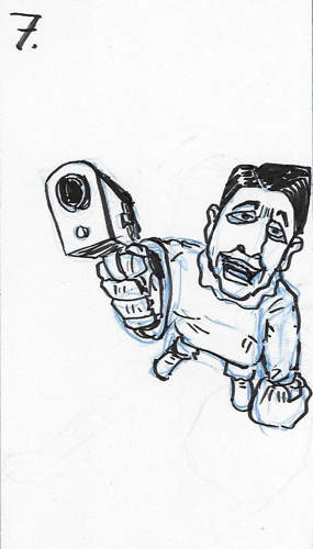
I enjoy these two images - the first was an experiment with shape language. I tried to use long, thin shapes to depict the character. The second was an experiment with a top-down perspective as a way to build on the feedback my tutor gave me in my feedback for Assignment 1. I went with a Ronald Regan mask as a little homage to the film Point Break!
I thought that these two images were great fun to do, and were me trying to experiment with a more cartoony approach. I really enjoy the expressiveness of the backpacker and the energy.
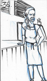
These three images I like for different reasons. The diver pleased me because I was able to take inspiration from reference, and really turn it into my own thing, adjusting the pose, activity and backdrop and still keeping the perspective and proportions. The second was probably my best blend between cartoony and realism. The suit, in particular, had just enough information to be realistic but was more simplified than some of the other clothes that I had drawn on characters. I really like the face and it reminds me a bit of Posy Simmond's work. Lastly, I liked the cafe owner image because I got a chance to piece together a number of separate pieces of inspiration into a single image that worked in its own right.
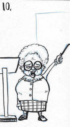
There were a number of images that were just poor. For each of the examples above, there were a few things at play, but essentially it came down to a combination of tiredness and boredom. Doing this exercise has taught me a lot about pacing, and that just persevering can be harmful in its own right - switching things up, taking breaks and allowing your brain to rest seem to be an important part of the process and something I need to heed as I complete more sequential work.
Putting things into place

For the last part of the exercise, I had to take the base template comic shown above and insert one of my characters into the strip. I could add in other elements that I thought could be useful based on my previous exercises.
I started by snipping the image out of the coursework pdf as a more efficient way than printing and scanning as it suggested in the text. This also allowed me to have a ready-made digital template by which to add in elements like I had done in exercise 2.1. In addition this time, I was able to also add layers of additional drawing. The dotted line already gives a bit of a shape and the eye-line of the character suggests a character with a bit of height. I used this to exclude any of my shorter characters.
I started with text so that could build a narrative and work out how much space I had in the final pane.


Next, using my initial sketch as a reference, I decided to choose the tailor as my character - being a bit closer up I could put more detail into the picture, so I digitally added a new pencil sketch into the empty space in the strip, trying to play around with the expression to fit the narrative.
I wasn't sure that the tailor's profession was important to the little narrative I had created for the comic strip. So I decided to leave off the measuring tape from around his neck.
I also got the sense from the words I had written and the expression of the man opening the door that the visit was not an expected or welcome one, so I tried to give the tailor a stern, almost angry expression. I wanted to give the sense that he had some sort of grudge.
After I had them in place I used the sketch to work out where I needed to erase the background, and then added in my own inks:

I had adjusted a few aspects like the angle of the waistcoat and worked hard to try and capture the right gesture of the mouth, which I ended up being really pleased with. I think the end result works pretty well.










Comments