This exercise was actually already very familiar for me, as I had elected to create a comic for Assignment 4 of Illustration Sketchbooks. So for this exercise, I didn't want to go too over-the-top. I decided instead to use this exercise as an opportunity to take some space and have some fun with my work in the run-up to the big Assignment 5.
Having read a good deal of work by Emily Carroll in Exercise 5.1 I was intrigued to try my hand at a short story, and maybe one that also translates well to a webcomic. I used my sketchbook to mind map ideas but was struggling. After a conversation with my wife, we ended up talking about how some of the best Doctor Who stories tap into those irrational childhood beliefs and fears and takes them to a new conclusion.
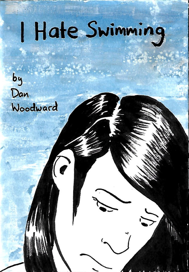
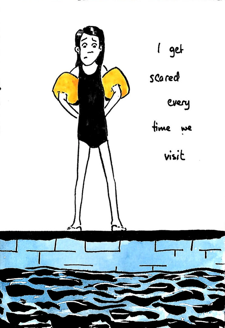
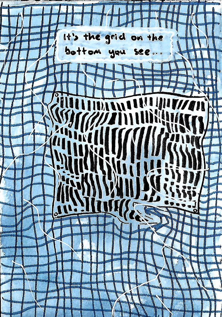
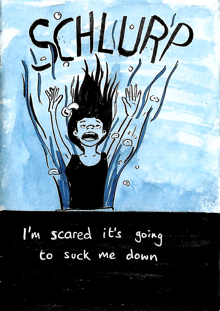
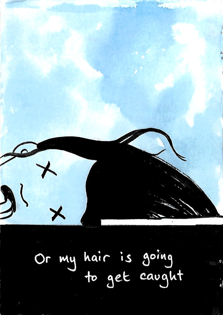
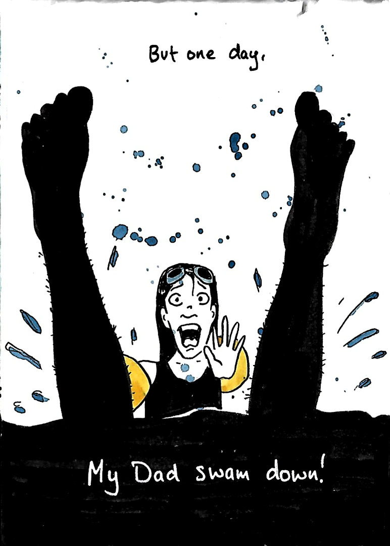
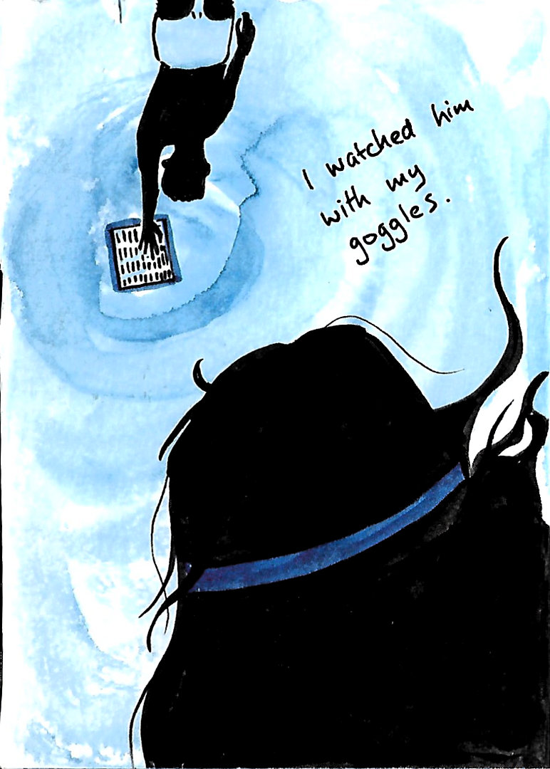
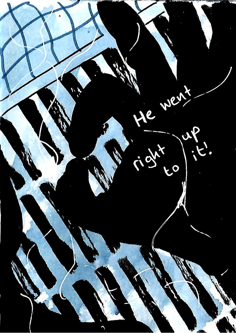
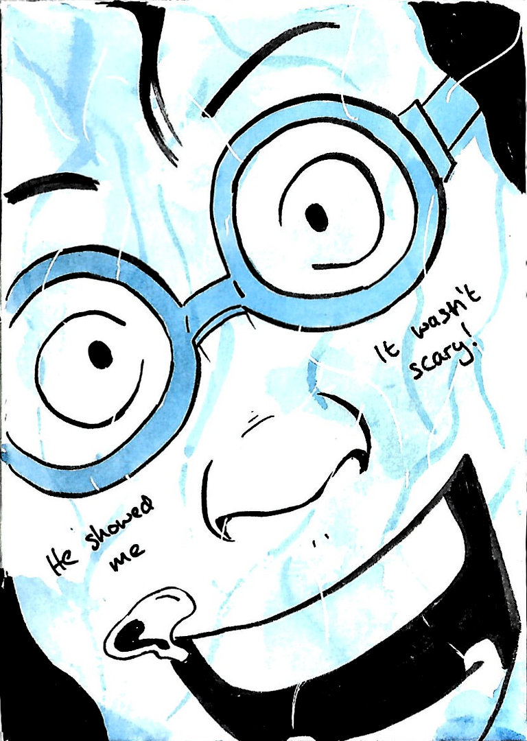
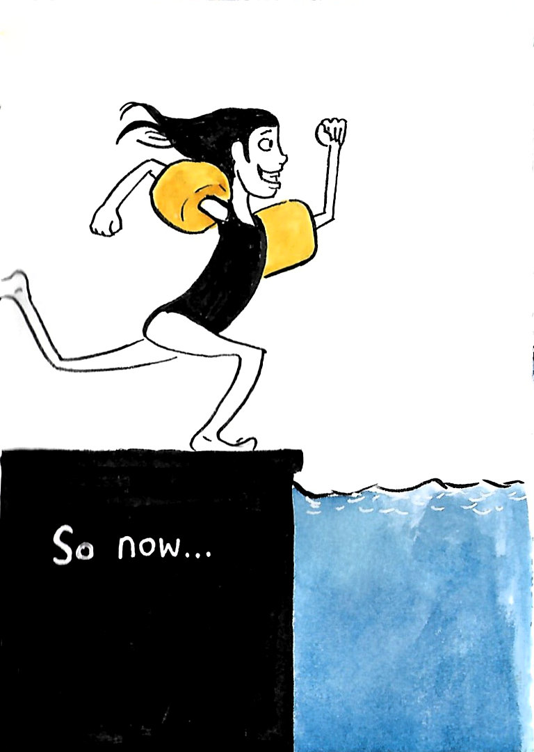
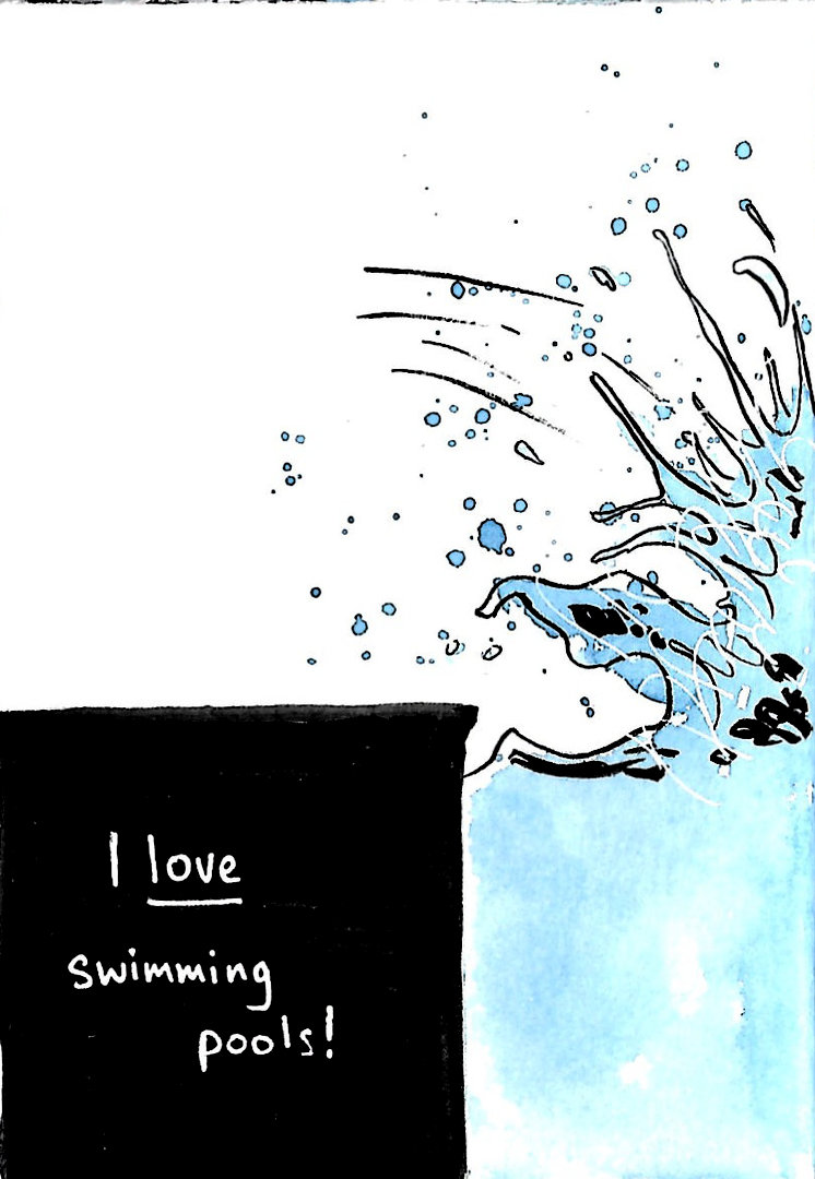
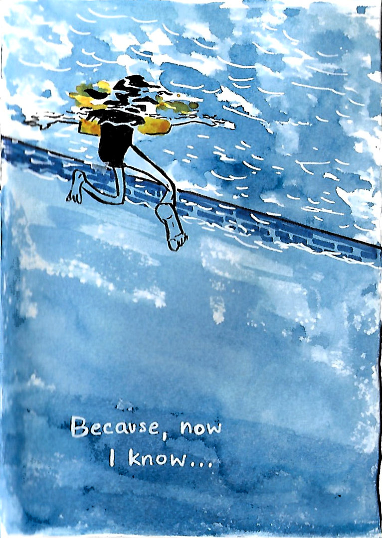
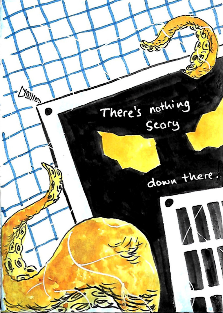
Based on this I jotted down some text to create a little story based on my wife's fear of swimming pool grates! When reading the story I was close to the 16 pages present in a small zine, so I tweaked the text a little and decided to add a cover so that the story fit nicely in the remaining 15 pages.
I roughly creased an A3 page of hot-pressed watercolour paper to get my panel shapes, then used a mechanical pencil to rough in my story. I added in ink lines using pens and brush pens to neaten up the images and then erased the pencil lines. I then used watercolour to add colour to the story. I used Prussian blue, with a spot colour of quin. gold.
Once I had everything finished, I folded the comic up and stapled it. Instead of cutting the edges, I used a scalpel to open up the pages. I know I was meant to start with an A4, but given I had A3 paper available, this allowed me to make the most out of the comic.
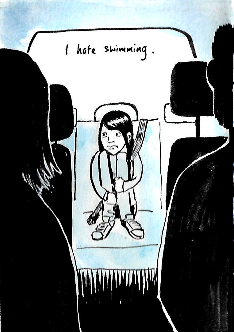
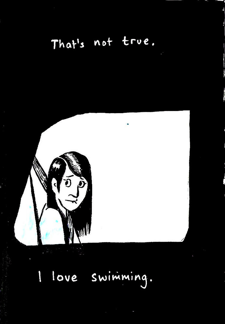
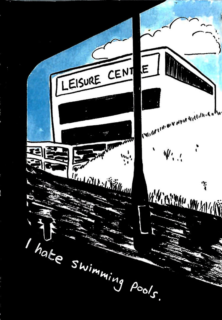
Afterwards, I scanned in the comic (I wish I had done this before I assembled it!) and tidied up a few things and made the blacks more pronounced using levels adjustments. I have added the images here so that they scroll as a carousel, but I think the comic would also work vertically as a webcomic.
This was a fun exercise to do, and I was pleased how I was able to not get bogged down in worrying about the story this time. It felt a bit weird only doing rough sketched on the paper itself without any thumbnailing, but I think the overall effect works well. I can see improvement in my composition choices and my characterisations, so I think this is a nice little step forward.

















Comments