This exercise takes a text of my choice and adapts it to a graphic format. Choosing my text was harder than I had expected. Since my son was born I don't get the chance to read books as much as I used to. I have a collection of books, but most of the ones I've kept are related to worlds that have a lot of existing visual reference in other media.
So I looked at my collection of novels from my favourite Science Fiction author Peter F Hamilton. I've always wanted to see his worlds in a visual format, as his 'space opera' worldbuilding is phenomenal. Most of the novels are substantial, so trying to pull three to four pages to use in the exercise was difficult - they often have a lot of contextual detail that wouldn't really translate well for the exercise. So I concentrated my search on a set of short stories set in the same fictional universe.
One of these was self-contained and seemed to have a good blend of imagery, action and dialogue. This was, however the one story where some other media had adapted the content (it was used as part of an animation story collection on Netflix). But most people wouldn't have any preconceived visual references to the story and the Netflix animation itself had not left any marked visual impressions for me, given that I already had my own imagined world from reading the story years ago.
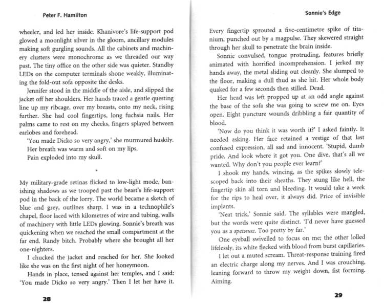
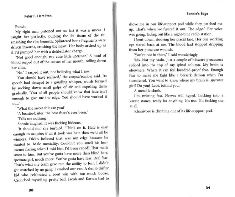
I used my scanner to scan in the last four pages of the short story, and then printed it out.
I then used highlighters to identify passages of action, description and dialogue. It was interesting to notice that by concentrating on this action my mind started to think about visual options and imagery. I then tried to separate the text into sequences, which I felt might best create the right rhythm visually.

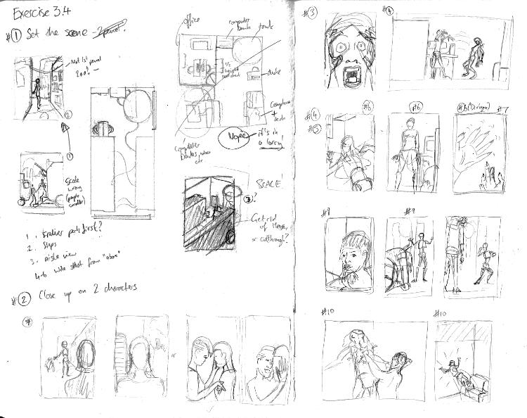
After I had the sequences mapped out, I took to my sketchbook to try and think about how these sequences might play out. In constructing my first few thumbnails, I realised that I was having problems thinking about what the 'camera' would see from shot to shot. So I decided to try an approach I had learned from cartoonist Dan Berry, who creates almost isometric sketches of his environments so that he can visually understand the space.
Rather than do an isometric sketch, I opted for a top-down view of the main environment of the text passage. I found this really useful and I was also able to adapt the space from the description in the text to hopefully best make the use of the space for storytelling.
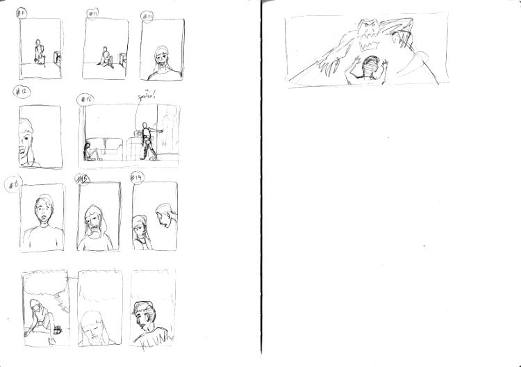
This gave me a lot of confidence to move forward, and my preliminary sketches soon turned into my actual thumbnails. I completed them completely in sequence, trying to make sure the passages made sense, I didn't think too much as to the end page layouts.
I then needed to actually see how these thumbnails would work on a page. So I scanned them, and then extracted each thumbnail, placing them into a 9-panel grid in Affinity Designer. Some of the panels I extended to be two or three panels wide. I realised at the start that I made notes that my original sequencing might not work and that I would have to adapt that part. But I hadn't drawn them! So I back-filled these panels with some digital thumbnails drawn straight into the software.
I then took the text and added it to the panels. I had tried to think about the space needed for text as I was drawing the thumbnail sequences but as I started doing it for real, I had to tweak my approach a number of times. I also realised that I needed to adapt the text to make it work in this context. Some bits were left out but I also had to add some dialogue at the start to keep the pacing and set the context.
One of my biggest departures was to set the whole thing from only one character's internal monologue, as this format didn't easily support the dual-perspective easily.
One of the aspects that I struggled with the most was how to convey one of the character's voice changing to be gurgling and broken after being attacked. I decided to 'break' the words by making individual syllables and letters emphasised.
I feel like the last panel could do with some additional dialogue to ground the computerised voice introduced in the last few panels to a specific source, like a speaker linked to the life-support pod or similar.
Whilst this is a pretty short write-up it was quite a challenging exercise. I felt a little out of my depth in getting the thumbnails to work, but I can also see where my efforts in life drawing are starting to pay off in my ability to pose characters in a believable way.
Reference
Hamilton, P., 1998. A second chance at Eden. 5th ed. London: Pan Books, pp.28-31.


Comments