Graphic Fiction - Exercise 4.6: Documenting an Event
- Dan Woodward
- Aug 1, 2021
- 5 min read
For this exercise, the task was to create a two-page comic narrative of an event (either news or domestic). The upside of being overdue for my assignment was that I could respond to current affairs in real-time; this meant that I could focus on a topic which I felt impacted me directly. The UK government has decided to move forward with defunding university arts programmes in order to redistribute the funds towards STEM subjects.
I am the lead representative of the student association, and I felt that the association should, at the very least, make a statement. I was disappointed that the OCA didn't seem to have any plan for a press statement on this subject, so I decided that I could use this exercise as a way to practice reportage comics and actually use my work 'in the wild'.
So I started by writing down my thoughts in prose first, so see on paper what I wanted to say.
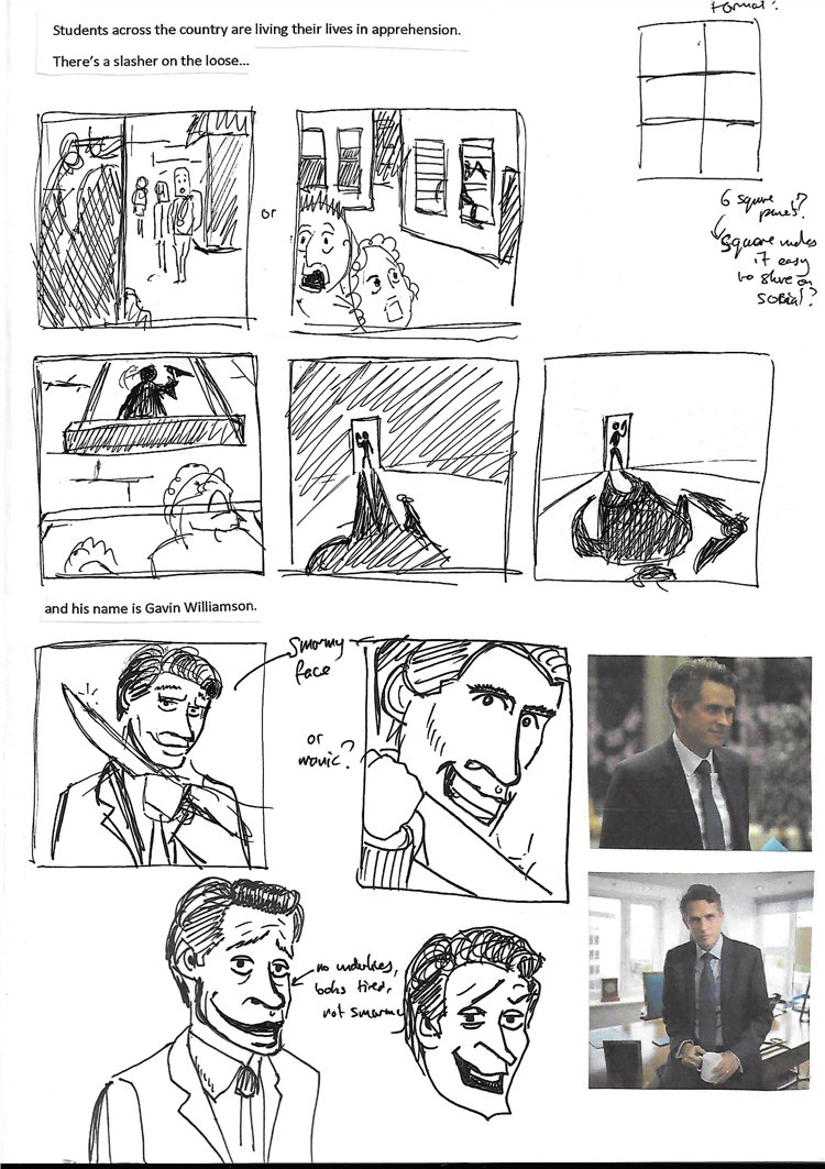
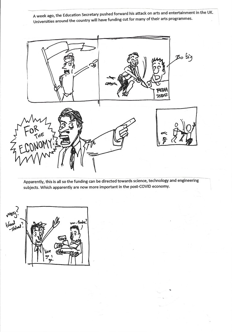
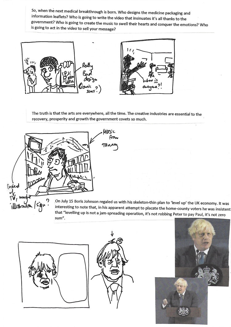
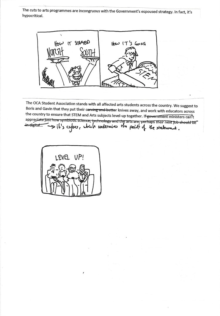
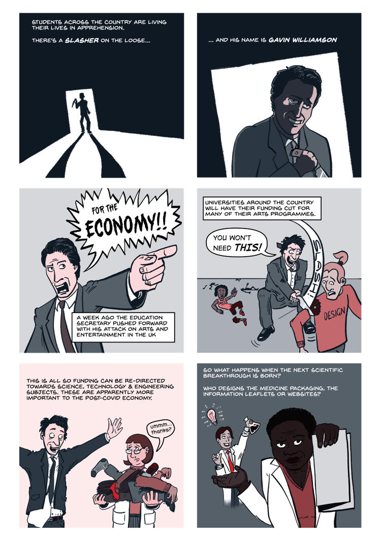
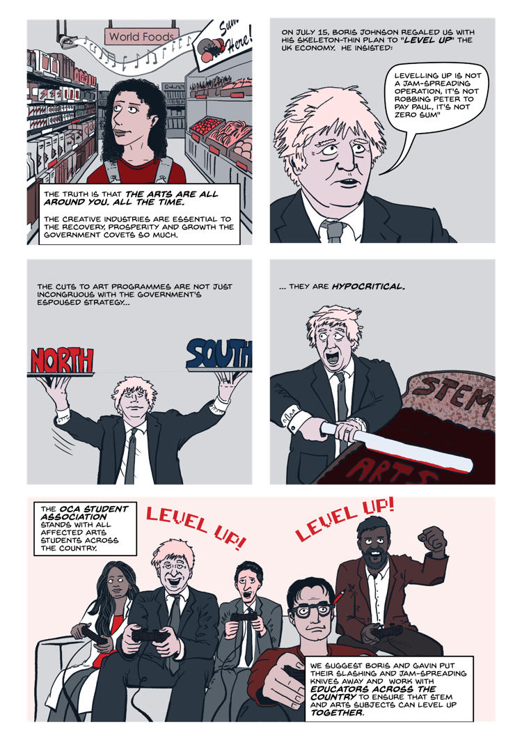
Students across the country are living their lives in apprehension. There’s a slasher on the loose… and his name is Gavin Williamson. A week ago, the Education Secretary pushed forward his attack on arts and entertainment in the UK. Universities around the country will have funding cut for many of their arts programmes. Apparently, this is all so the funding can be directed towards science, technology and engineering subjects. Which apparently are now more important in the post-COVID economy. So, when the next medical breakthrough is born. Who designs the medicine packaging and information leaflets? Who is going to write the video that insinuates it’s all thanks to the government? Who is going to create the music to swell their hearts and conquer the emotions? Who is going to act in the video to sell your message? The truth is that the arts are everywhere, all the time. The creative industries are essential to the recovery, prosperity and growth the government covets so much. On July 15 Boris Johnson regaled us with his skeleton-thin plan to ‘level up’ the UK economy. It was interesting to note that, in his apparent attempt to placate the home-county voters he was insistent that “levelling up is not a jam-spreading operation, it’s not robbing Peter to pay Paul, it’s not zero sum”. The cuts to arts programmes are incongruous with the Government’s espoused strategy. In fact, it’s hypocritical. The OCA Student Association stands with all affected arts students across the country. We suggest to Boris and Gavin that they put their carving and butter knives away, and work with educators across the country to ensure that STEM and Arts subjects level-up together. If government ministers can’t appreciate just how symbiotic science, technology and the arts are, perhaps their next job should be in digital…
I knew that all of this text wouldn't properly fit into a comic. So I took to my sketchbook to think through the problem. I quickly decided to go for a 6-panel layout, and to make each panel square - this would allow me to post the comic as a webcomic on Instagram, using the swipe feature to tell the story. I could also show it as a more traditional comic on other platforms.
So by the time I had done this little exploration, I had a reasonable idea of how I wanted to approach the comic. I started by creating some very rough structural compositions based on my very crude thumbnails to get a sense of proportions, storytelling and readability. This required some tweaking and I very quickly realised that I was better off omitting a panel in the middle, which expanded on the importance of art in order to leave myself more space for a double-width panel at the end.
Rather than draw this as a single comic and then chop it up, I instead designed it as 11 individual panels which I could construct in a myriad of different layouts if needed. Here you can see the work at the pencils stage, building on top of the rough structural sketches:

I was really pleased with some of my drawings. For some of the poses I composited other reference images to get the kind of layout I wanted - this was particularly useful for panel 9 whose pose I could not image well enough in my head alone. For most of the panels, I tried to take the advice I had been given by Brett Parson, and used reference briefly, then attempted to draw my own thing using the mental reference to guide me. I am most pleased with panel five, which actually had no reference at all. I think I am getting better at expressions and poses, but sometimes they can really be off, like the man in the foreground of panel four. But it was good enough to tell the story. Originally I only had one "level up" in the last panel, but I changed it to two so that when I split the panel into two halves, each would have the context. Once I was happy I moved on to inking the work digitally.

The inks ended up being pretty straightforward, but I also had the opportunity to tweak and fix a few things here and there. I decided to leave the pamphlet blank, as I think that made the point of the panel more than doing an intentionally poor design. Next, I decided to add some colour. I started by using vintage mid-century halftones to colour the panels, but I found that I didn't like the effect very much.
The palette I had chosen was based on the OCASA brand colours as a way of tying it together as an official statement. This inherently meant I was working with colours that had a lot of contrast between their dark and light versions. The blue is also inherently desaturated, meaning that when you use lighter versions they tend to appear grey. I experimented with a few different ways of rendering the colours, and in the end, I settled on an approach that tried to mimic printing with a risograph printer using two colours. Somewhere between traditional printing and screen printing. I laid down my different blue tones first, using the standard gradations of the brand colours, as well as an additional darker blue which I then used instead of blacks. I then used different versions of the red wither by themselves or layered on top to get the different colours and effects I wanted. For the reds, the hue never changed, but I tinkered with the saturation here and there to get the combined colour that I needed. You can see the finished coloured comic below:
I was pleased with the final result, it was tough sometimes to get the right blend but I think I did a pretty good job. I wonder how I might have coloured it if I had not wanted to keep it 'on brand'. I then went about posting the comic onto the different Student Association social channels. This was quite scary to publicly make a stance like this, but so far, as of writing, the response has been very positive. I think there is a good deal of scope for communicating important information and ideas this way.








Commentaires