Graphic Fiction - Exercise 5.3: Create an Artwork
- Dan Woodward

- Sep 1, 2021
- 5 min read
For this exercise, I was a little surprised, as I already had a good idea about what subject I wanted to use. My little nod to The Hitchhiker's Guide to the Galaxy in Exercise 4.4 was actually something that filled me with a lot of joy. The whale in particular is probably one of my most favourite things I have ever drawn! The pair are not a new thing for me to focus on - I used them when designing a novel mockup in Key Steps in Illustration.

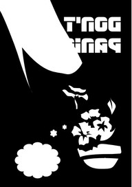
For it to work as a piece in its own right, however, I would need to rearrange the composition significantly. Using the ink layer, I placed the flowers and whale into a new digital document. Obviously, given their origin, they were incomplete, so I also had to think about what I might need to add or subtract to make a new composition work. When I was generally happy, I added extra detail to the image. To balance the image I added in the large "Don't Panic" words to evoke the Guide. I had in my head that you could use the overall piece as a poster or framed illustration.
I didn't think that the colour scheme in the original work would be suitable out of context, so I next tried to work out what would be a good colour scheme for this new piece of art. My original plan was to have the image printed, likely using a screen print. I had not done any screen prints since my GCSEs, so I had a rudimentary idea of how the colours could be layered. I used the digital format to my advantage by separating out colours like printing - making them multiply layers so that the colours themselves were additive. After much trial and error, I settled on a colour scheme that I was happy with.

My real issue was then that I did not have the equipment or expertise to do this as a screen print. In particular, the detail in the image meant that I was best off using a UV resist on the screen for the layers, which would be expensive, and I only had experience with using paper masks.
So instead I opted to try the piece as a linocut print. To do this I needed to work out what layers I would need, and then transfer these to lino so I could remove the material not needed. First, I created templates. Using the colour layers I had created, I was able to separate things into black and white, and then used a rubbing trace-down paper to transfer the images to the lino. I had also taken the liberty to reverse the images so that they would render the right way around once applied to the paper.
When cutting the lino, I ended up cutting out smaller blocks for smaller separate pieces like the mouth, tongue and petals. This made the lino scraping easier, however, it also meant that registration was going to be very difficult come printing time. After all my lino blocks were ready I proceeded to ink them. I was printing onto some fairly good quality, thick mounting paper. It was an off-white colour called meringue which I thought would work well with the colour scheme I had chosen. I started with the background sky first, mixing the inks in a tray to not only get the right colour, but also a gradient blend between them.

Even though I was using a baren to apply pressure, for each of the four attempts I couldn't seem to get smooth coverage. So instead I decided to embrace the imperfections, and work towards a rougher, more urban feel to the work. Layer by layer I added on the ink. The registration issues were very apparent at this point, and the frustrating thing was each version had a payer I like the most, but they were never on the same print! The ink itself took some time to dry between layers, so this process was quite time-consuming. Eventually, I had the layers together with only the line art remaining.


Given all of the mistakes so far, inconsistent printing and generally poor results, I was concerned that adding on the black lines would further marr the images. So as a precaution I decided to select the version which had the most potential as a finished piece and scanned in the coloured version. Once I had this saved, I then proceeded to add on the line art later.

Not one of the images really stood out for me as something I would be proud to put on my own wall. So I decided to see if I could do anything with my backup scan. As you can see above, when scanned the gradient looks overly green, rather than the duck-egg blue I was intending. So I used my photo editor to adjust the hue of that area as best as I could. I also had the digital inks electronically from when I was creating the layers. This meant I could attempt to layer these on top of the scan I had made. I used this opportunity to clean up some of the lines; I also was able to cover some aspects of the line art around which helped me to minimise the visual aesthetic of registration/alignment problems.

To make it read well, I also added some digital letters in yellow to the title. Overall, I am pretty pleased with this hybrid version. I actually really like some of the textural parts to the print, and it gives it a nice industrial look that I like a lot.

When you look at the final picture there are a number of areas that just don't work - as before the colours are not right, and for many layers, there seems to be a lot of over-inking or smudging. I am not sure why this happened, as I tried to be careful to just get an even layer of ink for each section. The black line art layer on this particular print has pretty good alignment but was the worst for print marks. It's very frustrating when you put so much effort into something like this for it to come out so poorly.
However, one thing I can take from this is that some of the print textures are lovely, and it means I have all the equipment at my disposal to create a library of textures that I can scan and then use digitally. The final print-only version has an authenticity about it, however, I cannot help but feel that it would have been better for me to try this image as a screen print, where I feel I would have achieved better results.


Comments