I had a little bit of experience going into this exercise, as I had to use photos as a backup for Exercise 3.3. For this exercise, however, I had to turn the photos themselves into a proper comic, which could include words as well as pictures.
My main memory of photo comics was in the 80s, where they would sometimes feature in tabloid newspapers agony aunt sections. Not usually found in our house, I remember the salacious images on the coffee table when I would visit my friend's house. I was dismayed to see that they were still being produced, and read like a bad 'Carry On' film...
I also remembered seeing them in teen magazines in the 80s and 90s, like this comic from Jackie magazine:

The comic format has also been used for satire and comedy. The covers of Private Eye magazine often feature single photo cartoons, and National Lampoon magazine in the US regularly ran a Foto Funnies section.

Whilst often look down upon, photo comics have also been used for more mainstream comics, like Hanko Kolk's work. Marvel even got in on the game in the 1980s!
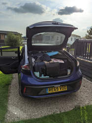
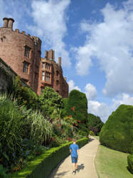
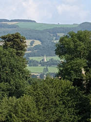
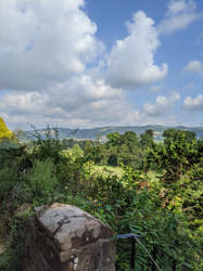
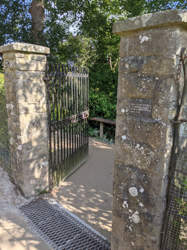
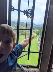
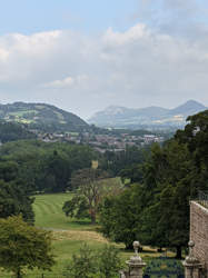
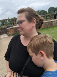
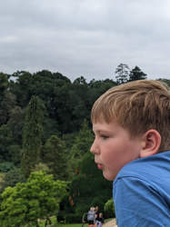
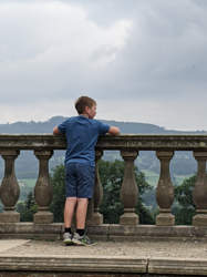
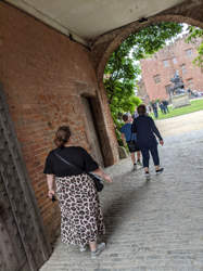
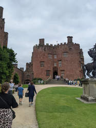
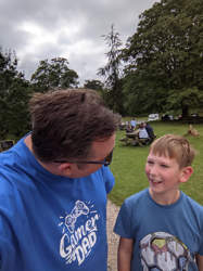
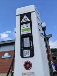
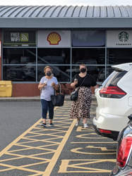
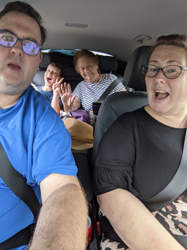
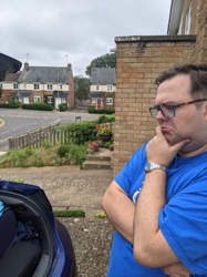
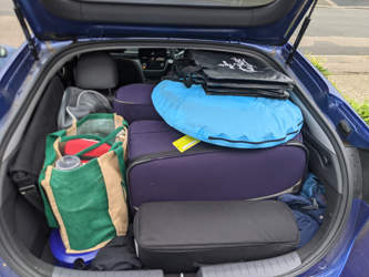
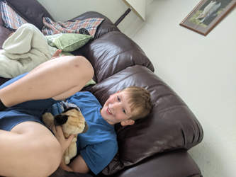
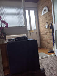
I started my own photo comic by using the time I would be taking on holiday. This meant that I couldn't really plan out the narrative of my comic very much. However, I needed to make sure I kept pace with my exercises whilst on holiday so that I could get all my work completed in time for assessment. So instead I had a general idea of documenting the outward journey of our holiday to Wales. My wife and son were kind enough to get in on the exercise and were at times able to pose for hypothetical frames. Below, you can see a gallery of all the shots I managed to take on that outward leg:
After the holiday, I reviewed the photos and started to try and pick out a narrative. I ended up opting for a 4 x 4 grid on a single page. In my head, I was trying to emulate the one-page narratives in those old magazines. I thought that after some swapping and tweaking for wider panels, I had achieved a selection that brought a readable narrative.
Given I had been driving the whole way, I had forgotten to take a photo from inside the car. Luckily I had a useable photo in Exercise 3.3, so I decided to get a stock photo of an English motorway and do a photo composite of the two images. I think the resulting image in panel eight works well and keep the storytelling smooth. I decided to split panel nine into two halves to emphasise that they both exist in the same location. This was a bit of an experiment for me, so I am glad that it worked as well as it did.

Inspired by the magazines of the 70s and 80s, I decided to try and give the comic a vintage feel. I used some photo processing to give the comic a vintage printed feeling, and the look of poor paper and limited printing processes. I did try a black and white option, but I couldn't get a balance between the tones that I was happy with. The first panel in particular lost most of its detail. So choosing a colour option seemed to be the best approach for this exercise.
I opted for Cooper Black for the title to give it an authentic 70s feel, and then used a rounded comic font you'd find in magazines of that time - it's slightly anachronistic (suited better to vintage horror comics) but I felt it gave the right feeling to the comics of the 70s and 80s. Remembering my tutor's feedback for Assignment Three, I did the photo processing first, and then added in the bubbles afterwards - whilst it means that they are not aged in the same way, it does make the text more readable.

This was a fun exercise, and a nice way to remember the holiday. Whilst I don't think doing this for my comics is very appealing, when playing with the photo processing effects I was able to achieve some interesting pop-art effects, and I think for the right project I could use photos and composites effectively. This could have applications for non-fiction business and biographical strips for example.
References
Daily Star, 2019. Christmas Double Trouble. [image] Available at: https://www.pressreader.com/uk/daily-star/20191209/282299617045043 [Accessed 31 August 2021].
Jackie Magazine, 1982. School For Software. [image] Available at: https://flashbak.com/jackie-magazine-1982-rebel-bev-is-banned-from-using-the-new-zx-spectrum-4080/ [Accessed 31 August 2021].
Kolk, H., 1992. 'Mannetje & Mannetje' (Sjors & Sjimmie Stripblad #3, 1992).. [image] Available at: https://www.lambiek.net/artists/k/kolk1.htm [Accessed 31 August 2021].
Marvel Comics, 1984. Marvel Fumetti Book Cover. [image] Available at: https://marvel.fandom.com/wiki/The_Marvel_Fumetti_Book_Vol_1_1?file=The_Marvel_Fumetti_Book_Vol_1_1.JPG [Accessed 31 August 2021].
National Lampoon, n.d. National Lampoon Foto Funnies, 1971: Whole Earth Catalog. [image] Available at: https://www.flickr.com/photos/flannagan/27163189236 [Accessed 31 August 2021].
The Sun, n.d. Seb's Sexy Wife: Day 1. [image] Available at: https://www.thesun.co.uk/wp-content/uploads/2017/11/tp-deidre-photo-casebook-frame-1-1.jpg [Accessed 31 August 2021].


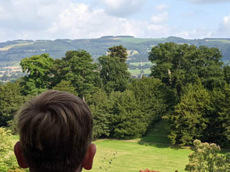


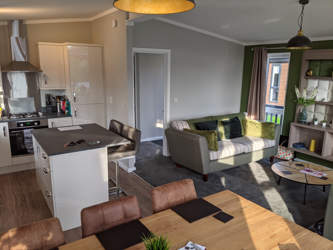

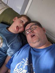

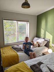



























コメント