Introduction
After completing exercise 2.4, which was frustratingly similar to an exercise from another OCA module. I was disheartened to discover that this exercise was essentially copied from an exercise in one of the Creative Arts modules. Thankfully this time, it was not a module I had done so I was able to look at this research task with fresh eyes and bring my own research approach to it.
I found searching for relevant information quite difficult. Particularly when using the online OCA/UCA library - it returned very few useful results, and the list of books and journals were so academic in their presentation and description that it made filtering anything extremely hard. What it did give me, however, were ideas and breadcrumbs for research terms which I could also apply to the general web.
I indulged my brain's propensity to make connections by jumping from tangent to tangent. This stream of consciousness can be very unhelpful when trying to create a cognizant and logical summary; however, it's extremely useful to mentally build a picture in my head of the subject. With a picture forming, I started to gather relevant books from my collection to use as potential references. I also created a mind-map to start documenting and linking the different ideas, mental observations and threads that I had been building up. It also started to give me an idea about how to structure the research, which I will now begin.
Perspectives & Composition
The first theme that emerged for me is how a sense of place has evolved over the many years of humans using visuals to communicate with each other. In its earliest forms, visual storytelling was limited to the canvas of caves and other early human dwellings.

Cave paintings have no sense of place other than the collective understanding of the viewers. They would have a first-hand experience of where the activities (of which the images mostly depict) took place. Like in the image above, larger scenes are seen from an illustrative top-down view.

Later, in ancient Greek times, we still see a very literal representation of scenes. Smaller imagery was placed onto ornamental as well as everyday items like urns, vases and crockery.
This almost abstract view of activities would also be used later by other cultures, including the Mayans in ancient South America.
For larger scenes, there was still a reliance on a top-down view. The ancient Greeks adorned buildings with scenes of storytelling, and this gave an opportunity to depict large vistas and scenes with a lot going on. Rather than one story, we started to see the emergence of multiple smaller stories and a linear progression mixing these smaller tales into a wider narrative.


The Theran Frescos are a good example of this. The wider picture tells a tale, top-down of a historical event. When you look in towards the individual scenes, they each tell a part of the narrative. The difference we start to see in these larger images is a much stronger depiction of place. Whilst not literal, the shape and layout of the fresco above is recognisably the Theran caldera. In the close-up, you can see a specific choice in the colours used in the rocks, which are a literal depiction of the colours found in the strata of the modern-day landscape even today. Interestingly, for this particular fresco, the scene could actually be a representative depiction, as the scene could have been observed from the cliffs on the opposite side of the caldera [32].
These visual choices also influenced the ancient Egyptians, who carried on the traditions of showing scenes in their murals and scrolls.

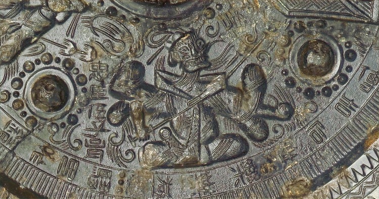
Later, in the middle ages, we still see images lacking any kind of perspective. This seems to be a universal approach across cultures. However, each culture's approach to depicting a sense of place seemed to be related to the needs and interests of its culture. Oriental imagery took a planar approach to its image, which is reminiscent of the isometric images we see even today [12].

Islamic images often went alongside the poetry and scientific discovery that was happening in its Golden Age, far removed from the Dark Ages of western Europe.
The images varied from very matter-of-fact illustrations combined with captions or annotations (for example, to explain sutures) to contextual pieces depicting a whole scene as shown here.
In this context, the words and pictures together work to amplify the message, information and visual storytelling.
After the Dark Ages came the Renaissance. It is here in the 15th century where we start to see the first proper evolution of mathematical perspective. First with a one-point perspective, and then later with two-point perspectives. There was an increased cultural need to accurately depict the spaces we inhabited.

As paintings increased in their accuracy, so emerged Genre Painting to depict scenes with narratives. Often showing scenes of everyday life, they painstakingly tried to give a sense of time and place, to put the actions of their actors in context.

With no other way of capturing the realities of life, images continued to be focused on creating accurate representations of reality. This started to change with the advent of photography and then film. As these media were able to capture reality much more effectively the notion of the 'camera's view' took over.
To start with, a lot of sequential illustration was positioned in a fixed camera position, akin to a theatre audience watching a play. As the visual landscape broadened, image-making responded to developments in photography and filmmaking. Sequential imagery, used these ideas to make much more use of the 'camera angle' to focus, add drama and help direct the viewer to notice what the illustrator wanted them to.
Interestingly as visual media moved into an interactive format with the advent of computer games, technology and skill again became a barrier. Early games were limited at first to two-dimensional static or horizontal interfaces. As technology and skills to use it advanced they were able to get a false sense of perspective by using a top-down view, much like the early images of scenes and landscapes above. Just like in the Renaissance, eventually, the maths and skill needed to depict proper perspective and fully three-dimensional environments took over. Just like the images after that period, the focus shifted towards ever-increasing realism which continues to this day.

Content & Detail
Early human visuals were very-much centralised around activities based on the day-to-day lives of the inhabitants. Animal, in particular, were the stars of the show. The earliest rock and cave paintings often show images of the hunt. Humans are, by comparison to the animals they hunt, shown in relatively little detail.


During the times where a sense of place was not really depicted. It was the subject matter that became more important. Ancient images were focused on people. Increasingly the focus shifted towards specific people and theological entities.
In Egyptian murals, Gods and Pharaohs are depicted at a much larger scale than normal people, signifying their importance. The ancient Mayans, like the Greeks before them, used crockery to depict their stories, using the space to the full to tell their stories, which related to their beliefs and superstitions.
In the ancient Ajanta cave paintings, various scenes accurately depict stories of deities.


Increasingly, images seem to focus more on history and allegory. As religions became more prominent, religious storytelling became the primary focus of a lot of images, reinforcing doctrine and replacing the moralistic fables as the way of communicating society's moral norms. Islamic imagery seems to buck this convention, focussing more on more traditional stories that support the ideology.
Islamic works also had a large focus on 'illuminations' marrying pictures and words together. This was true of Christan texts as well, which increasingly had imagery focused on reinforcing Christian doctrine. Islamic work, additionally also had a rich tradition of illustrated poems and scientific documentation well before the Renaissance in Western Europe.

In more recent media, conventions of time and place have become more metaphorical as well as literal. Visual comparison between things and people ageing or decaying shows the entropy of time passing. The passing of daylight and the burning of candles harks back to our earliest methods of telling time. And nowadays the passing of time can be handled literally by a calendar losing its pages or the progression of a timepiece.
Media
Visuals of time and place have also had changing conventions linked to the media they are created with. The earliest images were created for and by the same people. Their depictions of everyday life augmented oral traditions and reflected a human need to be seen, if only by themselves.

As civilisations emerged, there was a cultural need for permanence from images. Particularly to record the life and deeds of kings, queens and other rulers. Images depicting their lives, deeds and ultimately deaths were immortalised using stone carvings and reliefs, sculpture and metal casting.
Some of the most interesting conventions to depict place and time have emerged since the age of photography. When images were able to be taken reliably they were used to create multiple images of people and animals in motion. Using rotating wheels the images could be placed and spun, creating the illusion of movement and the first animations outside of flipbooks.

One of the most interesting conventions to develop after this is in film (and subsequently in comics) and involves the use of colour. As our technology has evolved to give better, crisper and bigger images, we immediately associate any representation of previous technology as 'old'. This trope is often used in TV and Film - using black and white or sepia effects to denote a section of the film that occurs in a long-gone time period. This mechanic has translated to comics and sequential illustration, often used in flashback sequences.
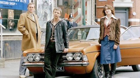
Colour is also used in a much more nuanced way the same present & past comparison has been used in films like the English Patient [4] as well as TV shows like Life on Mars: See how the present day has an overall washed-out blue tone, while the 70's fantasy has saturated warm yellow tones to the photography.
In addition to overall colour psychology color can also be used to depict the passing of time for the same character. This was used effectively for Denzil Washington's eponymous character, Malcolm X [4].
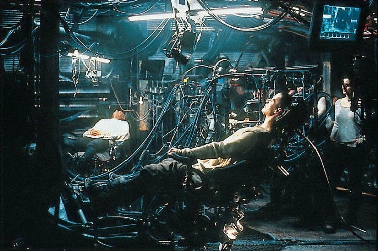
Similarly to time, colour can be used to denote a sense of place. In the film The Matrix, colour is used to denote and signpost whether the action is happening in the real world (blue), or in The Matrix, a complex simulation capturing the whole of humanity (green).
Another convention was established by filmmaker Steven Spielberg in his Indiana Jones films, using a plane travelling across a map to denote not only the passage of time but changing location.
Colour has also been used in comics and other sequential art. In the graphic novel "One Story", the author Gipi not only uses colour to denote various different time periods but dramatically changes the style of render to draw on other visual conventions: Scratchy shaky black and white to give a febrile sense of madness, rich colourful segments to depict youth, happiness and health.

Sequence, Pace & Rhythm
One of the first examples I could find where a visual pace was placed on telling a sequence of images was on Trajan's Column in Rome. The exploits of the Roman General were depicted in a linear fashion, but it wrapped the column in a spiral from bottom to top. You can find an interaction version of it here [24].
The pace of visual storytelling outside of moving images is dictated by the reader. Even when viewing a single image, it is not a single moment. As the reader scans the images they focus on individual areas. Those areas only 'happen' when they are focused-on.
When combined with a whole area or page of images this paradox is fractal - we can take in the whole page and subliminally take in the information, reading the meta-story at play. However, each pane only occurs in time once we take the time to read it.

This can be seen in the book "99 Ways to Tell a Story - Exercises in Style" [13]. While most of the book deals with different (but relatively standard) ways of re-telling the same story, the most interesting to me is where the author takes on the challenge while imitating the historical style of others.
Here you can see the author's take on telling his story in the style of Richard F. Outcault. All the elements of his original story are present, even if it's a one-image comic. He's carefully placed the figures and words to ensure that you are likely to read them in a specific sequence - retelling the original story but this time in a brand new context.
This pacing was present hundreds of years before the modern comic. The Bayeux Tapestry (an embroidery, if we are getting technical!) plays out like a story. Showing the reader a chronological order of events depicting the Norman invasion of England in 1066. You can find an amazing interactive version of the tapestry here.

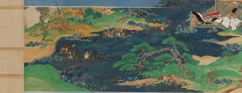
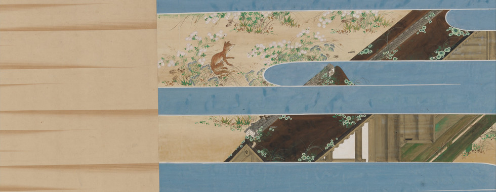
Nominally, these formats evolved in line with the reading conventions of the particular culture meaning you can find examples of linear storytelling in left-to-right, right-to-left, top-to-bottom and bottom-to-top! One example that I found that managed two at once were Japanese handscrolls [36], These were a horizontal reading experience, but the accompanying words were read top-to-bottom.

One of the key developments that has helped pace and segment sequential images has been the evolution of the panel, or frame. By separating out the action, it created a liminal space by which you asked the reader to fill in the blanks.
This allowed the illustrator to change from place to place, time to time or both easily. It solved the problem of the "temporal map" [15] created by the liner storytelling mechanisms of the past by being able to break up the timeline and place it into the printed format.
In more modern times, it has given artists the opportunity to use the dissection of the temporal map to their advantage. The new convention that panels are adjacent sequences in time and/or space can be used intentionally to slow down or speed up the reader. Likewise, placing this map onto double-sided paper means that the page turn can be used to invoke tension, suspense or misdirection.
Lastly, one of my favourite graphic novels, "Here" [17], pushes this to the extreme. Instead of making any change in space, the author absolutely anchors the location. What then happens is sequential and concurrent storytelling at once in time! I think it's a masterly use of the evolution of conventions for depicting time and place. It makes reading the book paradoxically linear and non-linear at the same time.

I am interested to see how the continuing evolution of webcomics similarly may take the way we read comics and sequential art in new and exciting directions.
Reflections on research
I have found this exercise as mentally gruelling as I found 2.5 physically difficult! I have enjoyed doing extensive research into this subject, and it was good practice for me to read around a subject and order my thoughts on the topic, so as to build up a holistic picture.
I found the process of using the OCA library cumbersome to find useful full texts, and I lament not having access to a visual library as well as a written one. That being said, I did manage to find some interesting texts that gave me insight and context that I would have otherwise missed out on.
I am not 100% sure I have fully covered all aspects of this brief, but there that means there is an opportunity to review and reflect on that going into Assignment 2.
If not stated elsewhere, all images in this blog entry are © their respective owners and are used here under educational fair use.
References
2018. Raiders of the Lost Ark: Flight To The Nepal (1981). [image] Available at: https://youtu.be/QWfHIlUkmtg?t=138 [Accessed 19 February 2021].
2021. Miniature paintings of the Riddle of Bihzād of Herāt. [image] Available at: http://www.artefacts-berlin.de/wp-content/uploads/2018/06/miniatures-002.png [Accessed 19 February 2021].
Bayeux Museum. n.d. Explore the Bayeux Tapestry online - Bayeux Museum. [online] Available at: https://www.bayeuxmuseum.com/en/the-bayeux-tapestry/discover-the-bayeux-tapestry/explore-online/ [Accessed 19 February 2021].
Bellantoni, P., 2005. If it's purple, someone's gonna die. Amsterdam: Focal Press, pp.14, 54.
Christies, 2017. An Attic red-figured Pelike, attributed to the Carpenter Painter, circa 500-490 BC. [image] Available at: https://www.christies.com/media-library/images/features/articles/2017/06/22/greek-vase/an-attic-red-figured-pelikeattributed-to-the-carpenter-painter-circa-6084738.jpg [Accessed 19 February 2021].
Contadini, A., 2007. Arab painting. Leiden: Brill, p.191.
Encyclopædia Britannica, 2021. Egyptian Book of the Dead. [image] Available at: https://www.britannica.com/art/Egyptian-art/Relief-sculpture-and-painting#/media/1/180644/155569 [Accessed 19 February 2021].
Fox, E., 2018. The Most Magnificent Cave Art to View in Northern Spain. [online] Culture Trip. Available at: https://theculturetrip.com/europe/spain/articles/the-most-magnificent-cave-art-to-view-in-northern-spain/ [Accessed 19 February 2021].
Freiberg, C., 2019. 25 Underrated NES Games | Den of Geek. [online] Den of Geek. Available at: https://www.denofgeek.com/games/underrated-nes-games/ [Accessed 19 February 2021].
Gershon, L., 2020. Tens of Thousands of 12,000-Year-Old Rock Paintings Found in Colombia. [online] Smithsonian Magazine. Available at: https://www.smithsonianmag.com/smart-news/tens-thousands-12000-year-old-rock-paintings-found-colombia-180976427/ [Accessed 19 February 2021].
Gipi and Richards, J., 2020. One story. Seattle: Fantagraphics Books, Inc., pp.8-9.
Janson, J., n.d. The History of Perspective. [online] Essentialvermeer.com. Available at: http://www.essentialvermeer.com/technique/perspective/history.html [Accessed 19 February 2021].
Madden, M., 2007. 99 ways to tell a story. London: Jonathan Cape, p.85.
McCloud, S., 1994. Understanding comics. New York: William Morrow | Harper Collins, pp.94-117.
McCloud, S., 2002. Reinventing comics. New York: HarperCollins Publishers, pp.216-221.
McCoy, E., 2019. From the Ice Age to Instagram: Visual Storytelling Through the Ages. [online] Killer Visual Strategies. Available at: https://killervisualstrategies.com/blog/history-visual-storytelling.html [Accessed 19 February 2021].
McGuire, R., 2014. Here. London: Hamish Hamilton.
Meagher, J., 2008. Genre Painting in Northern Europe. [online] Metmuseum.org. Available at: https://www.metmuseum.org/toah/hd/gnrn/hd_gnrn.htm [Accessed 19 February 2021].
Minoanatlantis.com, n.d. Theran Flotilla Fresco. [image] Available at: https://www.minoanatlantis.com/pix/Minoan_Miniature_Frieze_Admirals_Flotilla_Fresco_Art.jpg [Accessed 19 February 2021].
n.d. Life on Mars screenshot - the 1970s. [image] Available at: https://televisionheaven.co.uk/assets/life_on_mars_2.jpg [Accessed 19 February 2021].
n.d. Life on Mars screenshot - modern day, Sam Tyler hit by car. [image] Available at: https://static.wikia.nocookie.net/lifeonmars/images/d/de/Tyler_Crash.jpg [Accessed 19 February 2021].
n.d. Neo aboard his ship in The Matrix. [image] Available at: https://walkalongthenarrowpath.files.wordpress.com/2014/01/jacked_in.jpg [Accessed 19 February 2021].
n.d. Neo and Agent Smith fighting in the Matrix Revolutions. [image] Available at: https://d13ezvd6yrslxm.cloudfront.net/wp/wp-content/images/the-matrix-revolutions-e1594740195155.jpg [Accessed 19 February 2021].
Nationalgeographic.com. n.d. Trajan's Column - Reading an Ancient Comic Strip. [online] Available at: https://www.nationalgeographic.com/trajan-column/ [Accessed 19 February 2021].
Niveditha, 2016. The Ajanta cave paintings - a brief note. [online] OpenArt. Available at: https://www.openart.in/history/ajanta-cave-paintings-brief-note/ [Accessed 19 February 2021].
PALLEJÀ DE BUSTINZA, V., 2016. How Early Islamic Science Advanced Medicine. [online] National Geographic. Available at: https://www.nationalgeographic.com/history/world-history-magazine/article/muslim-medicine-scientific-discovery-islam [Accessed 19 February 2021].
Papageorgiou, I., 2016. TRUTH LIES IN THE DETAILS: IDENTIFYING AN APIARY IN THE MINIATURE WALL PAINTING FROM AKROTIRI, THERA. The Annual of the British School at Athens, 111, pp.95-120.
RC, D., 2015. Ajanta. [online] Ancient History Encyclopedia. Available at: https://www.ancient.eu/Ajanta/ [Accessed 19 February 2021].
Rozum, J., 2010. Depicting Speed in Comics - Part 2. [online]
Sabin, R., 2008. Comics, comix & graphic novels. London: Phaidon Press Limited, p.22.
Strasser, T., 2010. Location and Perspective in the Theran Flotilla Fresco. Journal of Mediterranean Archaeology, [online] 23(1), pp.3-26. Available at: https://cpb-us-e1.wpmucdn.com/sites.providence.edu/dist/f/106/files/2018/03/strasser-flotilla-fresco.pdf
Tate. n.d. Genre painting – Art Term | Tate. [online] Available at: https://www.tate.org.uk/art/art-terms/g/genre-painting [Accessed 19 February 2021].
The British Museum Blog. 2019. A history of storytelling through pictures - The British Museum Blog. [online] Available at: https://blog.britishmuseum.org/a-history-of-storytelling-through-pictures/ [Accessed 19 February 2021].
The Met, n.d. Mayan Vessel, Mythological Scene. [online] Metmuseum.org. Available at: https://www.metmuseum.org/art/collection/search/310364 [Accessed 19 February 2021].
Unknown, n.d. Closeup of part of the Theran Frescos. [image] Available at: https://i.pinimg.com/originals/f9/d7/5e/f9d75ef3f0dfd4a190c7f6d8a8d245e8.png [Accessed 19 February 2021].
Willman, A., 2012. Japanese Illustrated Handscrolls. [online] Metmuseum.org. Available at: https://www.metmuseum.org/toah/hd/jilh/hd_jilh.htm [Accessed 19 February 2021].











Comments