Graphic Fiction - Research 3.5: 'Silent' Comics
- Dan Woodward
- Apr 22, 2021
- 4 min read
For this research task I was asked to research two of the following:
Frans Masereel, Passionate Journey and My Book of Hours (1919)
Lynd Ward, God’s Man (1929)
Milt Gross, He Done Her Wrong (1930)
William Gropper, Alay-Oop (1930)
Otto Soglow, The Little King (1930-1975)
Shaun Tan, The Arrival (2006)
Jim Woodring, Jim and Frank (1986-2019)
Frustratingly, while the OCA course gives access to search the affiliated UCA library, hardly any useful entries are available as e-books. Likewise, even though I live 15 minutes from one of the main campuses, I am not allowed to take out hard copies as an OCA student.
So I had to resort to purchasing books. Thankfully two of the options were available on Kindle as e-books, so I opted for those.
"He Done Her Wrong" - Milt Gross
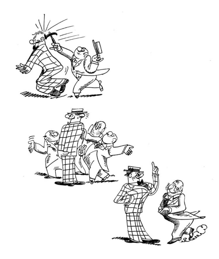
This comic is really funny! I was immediately struck by the loose cartoon style of the images Milt Gross creates. He is able to tell his story through extreme gestural poses and caricatured characters. Some of them are almost stereotypes over archetypes but it plays beautifully well into the narrative of the story. We can see that the 'baddy' is no-good and untrustworthy, which makes it so funny when played against the hero, love interest and how their circumstances change through the story.
What I adored about the story was the pacing and comic timing that Gross employs which is all the more impressive given the lack of words. See the sequence below, where not only is it objectively funny that the two star-crossed lovers miss seeing each other yet again, but the 'meta' joke of that being facilitated by an advert for a movie called 'Fate' oozes irony.
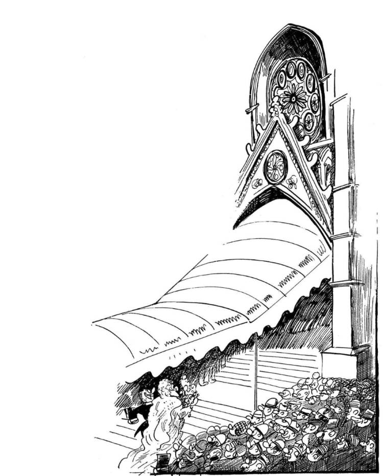
I also really like the way that Gross manipulates the panels. The sizes are often inconsistent, and sometimes non-existent! This is such a clever way to adjust and manipulate the pace of the story, as well as directing the reader's view to exactly where Gross wants. This structure is often used to set up the context needed to land his next joke. It's such a clever use of negative space.
"Passionate Journey" - Frans Masereel
Having been created from woodcut prints, they give lovely conformity to the panels. The lines Masereel creates are stark and blocky. His approach has the strong almost oppressive weight associated with German Expressionism, yet he wields his marks deftly. He is able to produce some remarkably subtle inferences with his images.
However, this comic confused me somewhat. At the start, there seems to be a narrative to the story, but it keeps on abruptly going off at a tangent. It's hard for me to tell if the different sections are different phases of the man's life, or if they are chronologically close together. It's very hard to get a sense of him ageing or how much time has passed until inexplicably he's dead and the final panels take on a strange surreal aspect.
For the sections that do make more sense to me, I like how each of the panels is able to exist in their own context, but when put together, you can get a sense of movement and snapshots of activity as the man moves from panel to panel.

"Carry Me" - Dan Berry
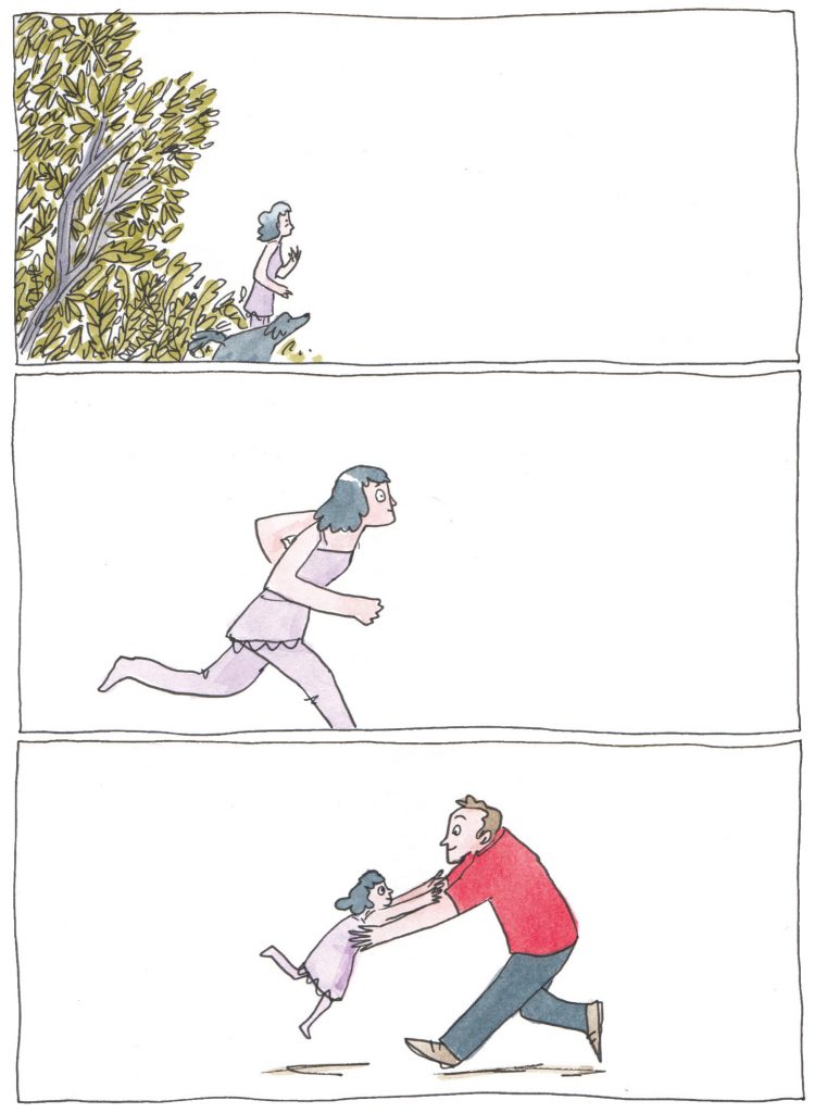
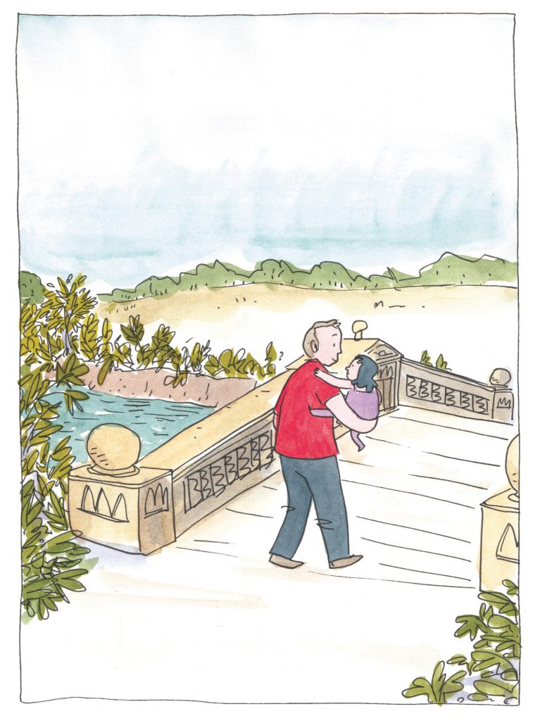
As an aside, my favourite silent comic is one that influenced me to study comics and illustration through the OCA. Carry Me by Dan Berry is a beautiful comic whose narrative is so clear in its own fantastical way but is a poignant and emotional allegory for illness, death and the changing relationships we experience with our parents.
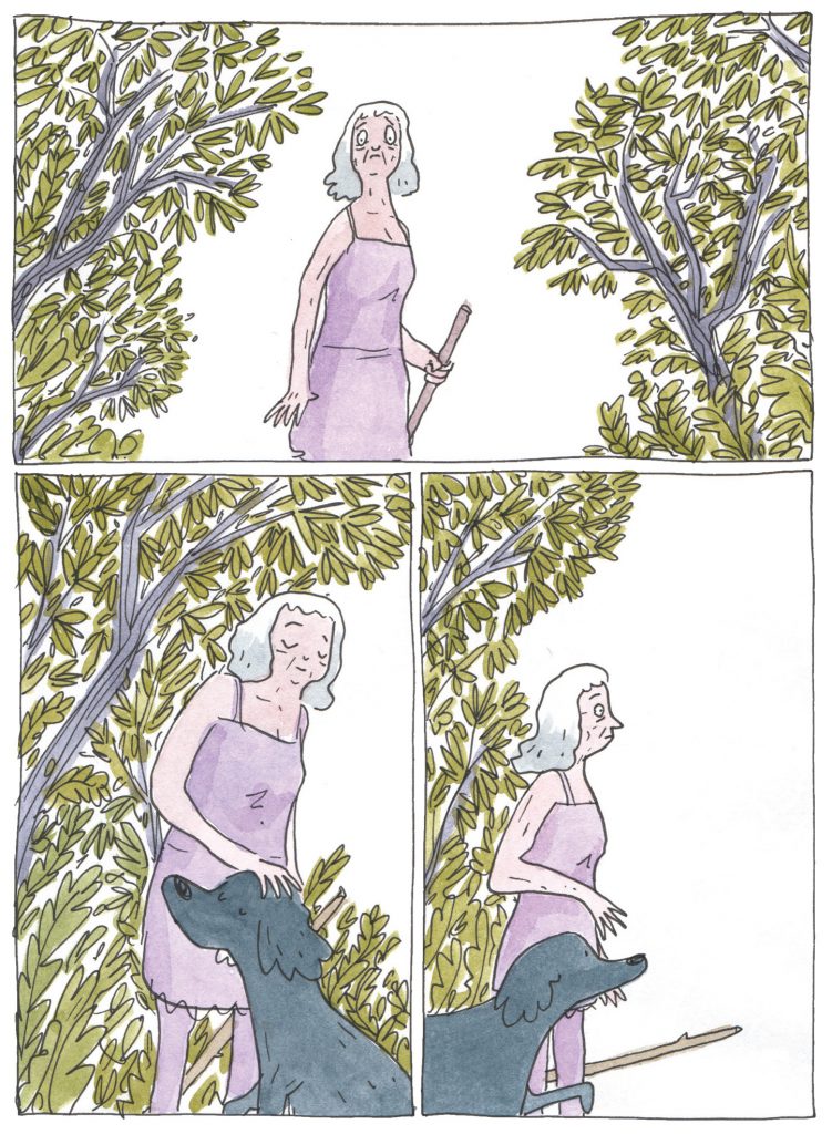
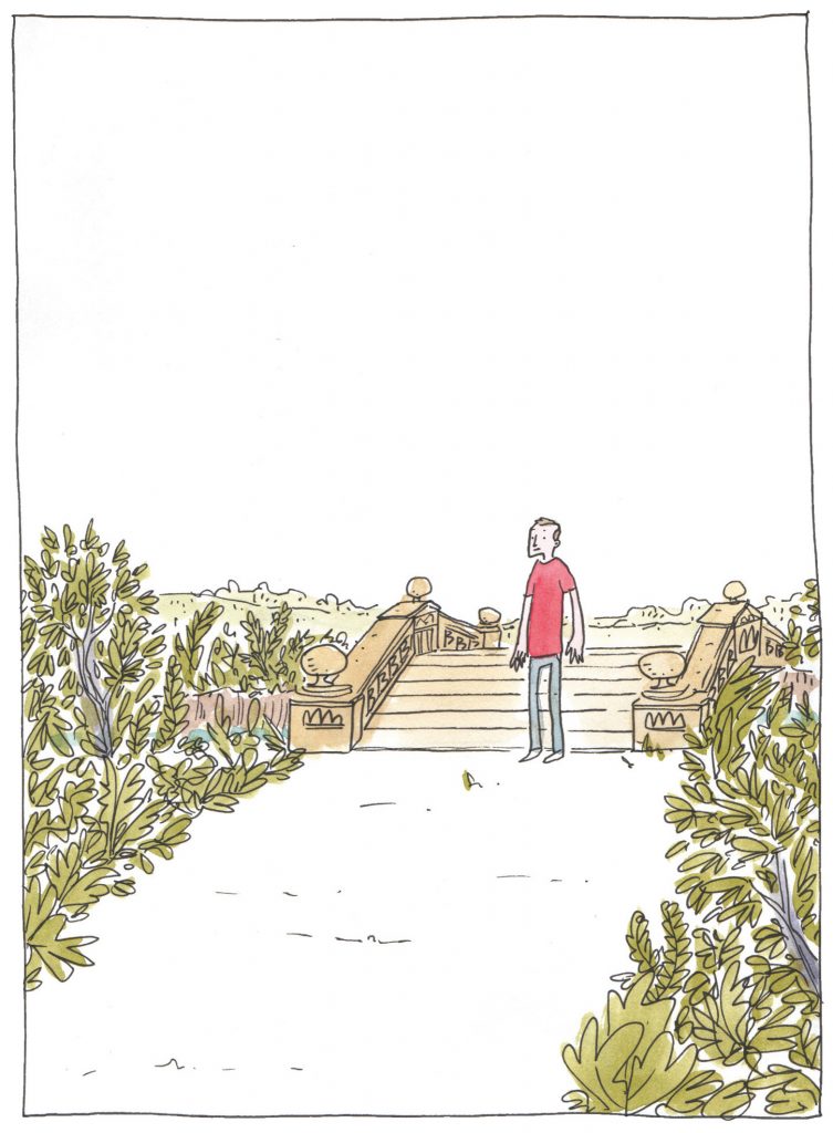
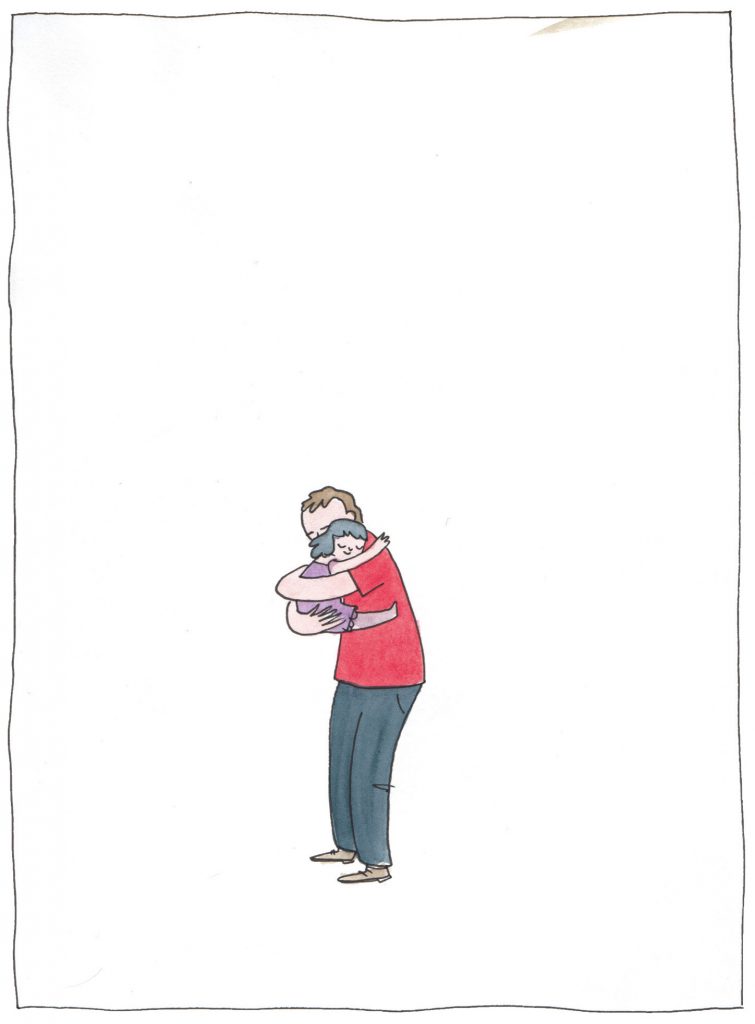
I enjoy the characterisation and expression that he shows in the work, the panel size and number vary throughout the story and I get the sense that this is his way of adjusting the pace. While most of the panels have a rectangular structure with a border, Berry's selective use of negative space in the sequence below is used cleverly to create the feeling of loss and distance.

Both my wife and I lost our fathers to cancer. Reading this comic still upsets me, and all the confusion, pain, anger and loss come flooding back. Berry is, to me, a master at knowing just the emotion he wants you to feel. His loose style suggests that his linework is random, when in fact it's calculated.
Most of all what I feel when I re-read this story is love. No more so than in the following sequence. That feeling of loss, love, pain, excitement and joy altogether; I used to feel it even as a grown man when I had not seen my father for a long time. So when I am not able to see him at all - to feel those emotions and be transported back to the little boy I once was - that's not simply skilful.
It's genius.
References
Berry, D., 2017. Carry Me. [online] Thingsbydan. Available at: http://www.thingsbydan.co.uk/2017/04/read-carry-me/ [Accessed 20 April 2021].
Gross, M., 2006. He done her wrong. [Kindle E-Book] 1st ed. Seattle, Wash.: Fantagraphics.
Masereel, F., 2013. The passionate journey. [Kindle E-Book] New York: Dover Publications.








Comments