This exercise required me to create abstract artwork in response to instrumental music. I spent an evening listening to different works from the example artists in the exercise instructions, but I found that I already had preconceived ideas about the music as they were so familiar to me.
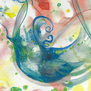
So I researched other instrumental pieces from other bands and artists. I considered Ballad of the Beaconsfield Miners by the Foo Fighters as an unconventional option, but then opted for Flying by the Beatles instead. I listened to it on repeat, over and over while I instinctively made marks in response to the music. I ended up with this:

The music really gave me the sense that time was slowed down. It was languid and poignant all at the same time. So I chose the adjective Suspended for the work. I scanned in the image and then, using my digital photo software, started to play around with the artwork: rotating, zooming and flipping it. Using a square aspect crop, when I found an interesting composition I cropped it and then started again. I then curated the crops to narrow it down to the following candidates:
The final crop gave me the impression of a bird in flight, slowed down so much that it felt suspended in time. This got me thinking about hummingbirds - normally they are a blur because they beat their wings so fast. But when photographed, they can be caught, suspended in a moment. That really felt what this music felt like to me. But the crop I had, whilst it had interesting elements, didn't work for me in its own right.
"You can add forms or create the shape of an element with some representational value."
The next step was to reproduce the selected area. The instructions mentioned a few things to consider, including "You can add forms or create the shape of an element with some representational value." and "Choose any media you like for this exercise and experiment by mixing them. Try not to over complicate the image." So I got to thinking about if I could try and slightly represent a hummingbird in the final work, and also to de-clutter the background whilst still having the abstract waves and whirls I liked so much.
I started be researching hummingbirds, and explored the shapes they had, and made, when photographed. Then I decided to see if I could experiment with my materials. If I could do the background in watercolour, to take advantage of its uncontrollable nature, but then experiment and overlay the background with an abstract representation of a crested hummingbird. I decided, under the prompt of experimentation of materials, to try and do a lino cut print.
I started off with a sketch in my sketchbook of what the image might look like, taking note of how colours might overlay. Then I replicated this onto lino using a black Sharpie. Once I had carved the first cutting, I carried out some test prints on my sketchbook, seeing what colours and pressing techniques worked best.
The next thing was to check the secondary print. I opted (perhaps foolishly) to do a reduction linocut. Once I had finished the secondary carve, I did a further test print in my sketchbook. I had not done any lino printing since I was 16. It was really fun to do, and I enjoyed it a lot, especially the fore-thought needed.

I was reasonably happy with the test, but needed to make sure at the colours were right - the teal I had created was too dark, I needed to get something much lighter.
I then started to prepare for the final piece. Again, listening to the music I started to lay down layers of watercolour with a palette that was more limited. My plan was to have a yellow/orange/red background, and then, by contrast, have a bluey-green hummingbird in the foreground, playing with the normal convention of cooler colours being recessive. The contrast, I hoped would negate that but at the same time be slightly (but pleasantly) discordant - playing on the psychedelic nature of the music.

However, the final print didn't play out as I had hoped. In order to avoid buckling I had opted for a thicker paper, but didn't think ahead enough to remember it was cold-pressed, and therefore textured. This had an effect on the coverage of the ink. This was disappointing, as I had successfully managed to create a colour gradient from light blue to green. It was not entirely unsuccessful though, as in showing the background it gave the work an ethereal nature that I found interesting and pleasant.
Where it really didn't work, however, was how little of the detail that I had put in course be carried across. Like the curves in the belly, or the spiral of the crest. Because there was a lack of definition, the silhouette of the piece changed from being a graceful hummingbird to more of a tripping-out penguin! However, with time against me, I decided to not re-work the entire piece, and tried instead to be grateful and look for the good in this work. Honestly, the fact that the music is called 'Flying' and the image has the sense of a flightless bird dreaming of doing so is something I found ironic and amusing in equal part. I really want to explore printing more, and this has been really useful as a lesson to teach me to give as much thought into my paper choice as the layers of the print itself.

But did it still work as CD cover to the single? I scanned the final piece in (above) and then proceeded to transpose it into a mockup image. I tried to find a font that was on-point for the time and genre it was made. I actually managed to find a font that was close to the original one used for the Magical Mystery Tour album!

I kept the simple palette and used the contrasting colours found in the piece already. I opted for a string orange/red for the artist title, and the same blue as the bird to tie it together. I am pretty happy, and slightly relieved that it still works in its intended format but with it had the intended impact in its rendering. However, I learnt a lot by doing this exercise and I am grateful I can take that forward.


Comments