Creating the title text for the last exercise had made me quite enthused for creating type myself. I have been interested in typography since before starting my studies, but I had always relied on the typographic work of others. All of my text always seemed to end up the same. I really appreciated I could do most of this exercise in my normal smaller sketchbook, it felt really experimental and freeing.
Ahead of this exercise I purchased some books to give me some insight into theory and practice of typography [1-3]. I found the books with work from typographer's sketchbooks [1-2] incredibly useful and inspiring, and the more theoretical book [3] was also really compelling, it introduced me into how type can be used to invoke lots of different feelings, ideas and perspectives, and I found the use of emotion to type really useful for this exercise.
The exercise started by writing the following words in my own handwriting:
Big Small Fat Thin Fast Slow Fun Boring Calm Mad
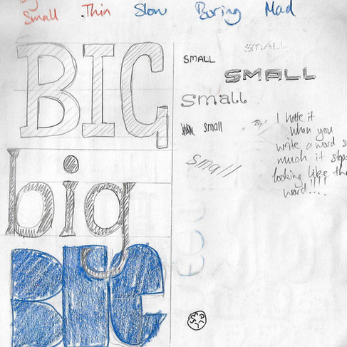
I then needed to draw these words in a way that evoked their nature & characteristics:
This was so much fun. I found myself going back to my reference books every time I got stuck, they were such an inspiring resource. I was conscious that I shouldn't just be copying things, but I thought that the sketchbooks were really useful for noticing things that peaked my interest and got my creative cogs moving again. Next, I needed to review fonts that I had on my PC, and print out the words again using fonts I had that evoked their characteristics:

I challenged myself to not go searching font websites for the 'perfect' font, but to really constrain myself to the fonts I currently had. This constraint was actually really powerful for me thinking about what font to use, to be much more critical in my selection and to think about the structure of the fonts themselves to evoke the right things. Understanding the nature of fonts is very useful, and I found "Why Fonts Matter" [3] essential when I was choosing the 'boring' font, so I could understand why people think different types more boring over other, seemingly similar ones.
I then traced these fonts in pencil, as instructed:
You might notice "Mad" is missing above - I used this word for the next part, which was to create a 'mood board' of the word, thinking about texture, line, shape and colour:

The last step was to then render the other words using appropriate media, materials and colour. To do this I used the traced pencil words and added the render on top:
Big
For this word I used a big black marker, trying to make the words look not only chunky, but imposing too.
Fat
For this word I tried to emulate a feeling of fat cells squashed together, but slightly unconstrained, and how the letters might wobble around.
Calm
My wife has been creating decorative hoops using wool and felt, and I noticed a ball of wool next to her while I was doing this section of the task. So I got the idea to use some of that wool to render the word "calm". I think it was really effective.
Small
The natural choice for this word was to simply render with a fine-liner, but I also added some dashes. Partly to call out the word ("hey, look at me!") and also to give an effect like it's suddenly shrunk, like Alice in Wonderland.
Thin
This word was harder to render, I tried adding vertical lines, and then used a graduated wash to try and draw the eye in to the middle, like optical 'squashing'. I am not sure how well this worked.
Boring
To emphasise the plainness, I left the pencil outline and added a simple light-brown watercolour.
Slow
I decided not to try and replicate the dotted aspect of the computer font, and decided on a solid fill. I tried to get the paint to pool at the bottom of the letters. I had the notion of "watching paint dry" and paint dripping away on a wall, or the accumulation of water damage on a wall or around pipes. So I then experimented with pulling down on the paint with my fingers. I tried to pull slightly to the right, to create a feeling of 'backwards' which I hoped would emphasise the nature of the word.
After the last two exercises, I am a lot more aware about my choice of typography alongside images, and I hope to be able to use that as I progress.
Heller, S. and Talarico, L. (2018). Freehand: New Typography Sketchbooks. London: Thames & Hudson Ltd.
Heller, S. and Talarico, L. (2011). Typography sketchbooks. London: Thames & Hudson Ltd.
Hyndman, S. (2016). Why fonts matter. 10th ed. London: Virgin Books.


Comments