Taking Stock
I started the assignment by following the recommendation of the coursework and taking stock on my reflections so far through this section. The exercises have taken me through a natural progression that has allowed me to appreciate the relationship between text and images in a narrative form.
Ahead of tackling the assignment, I went back to some of my favourite books on sequential illustration to refamiliarise myself, and to get some insight particularly on the authors' perspectives on storytelling and how the words and pictures can be combined to make it effective [1-2,7-8].
For this exercise, I was given a specific constraint of using a 'foldy zine' again. This confused me at first, as when I was researching how other students had tackled the assignment, a number of them had ignored this constraint. However, I have found through this course that constraints are a great way to push one to innovate and solve problems creatively.
The biggest hurdle that I could see was that I wanted to create the assignment as a physical thing, so realistically I would be limited to an A3 sheet, which meant the pages would be small, at A6. I could have gotten around this by sourcing some A2 or A1 paper, but I felt that this would be against the spirit of the assignment. Also, it would mean that I would have to do the final using traditional media. That wouldn't be the end of the world, however, as part of my last reflections, I mused that it might now be time to take ideas from the sketchbook and take them to a more finished level.
I also wanted to try and do some more digital work, given the enjoyment I gained from doing the animations in a previous exercise. If that was the case, then the max I could print would be A3.
Finding Ideas
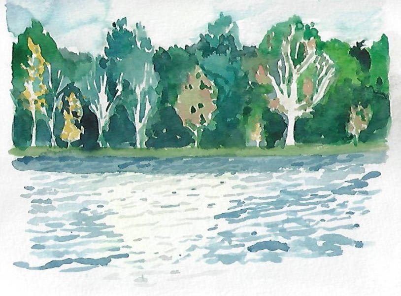
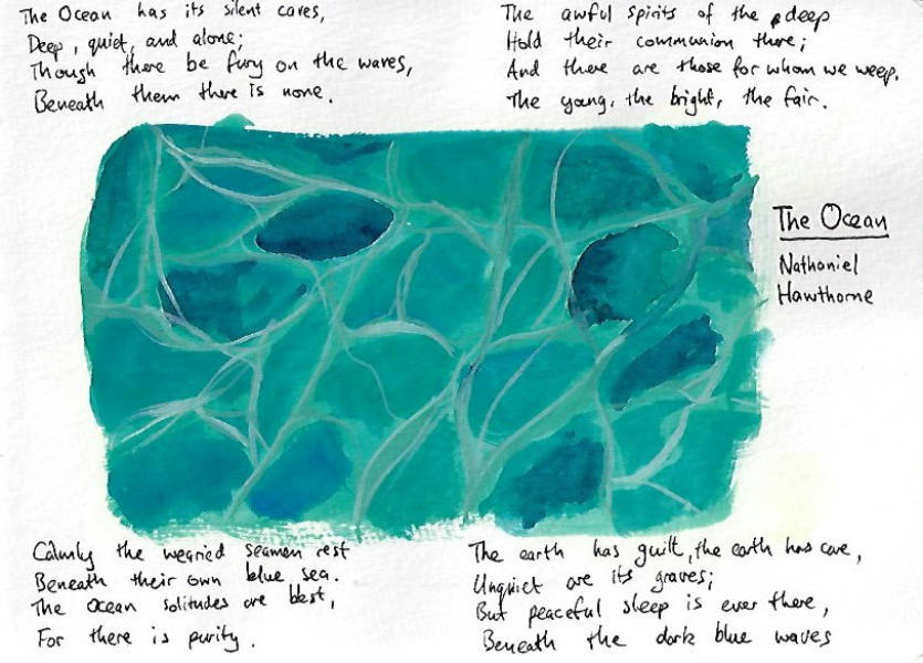
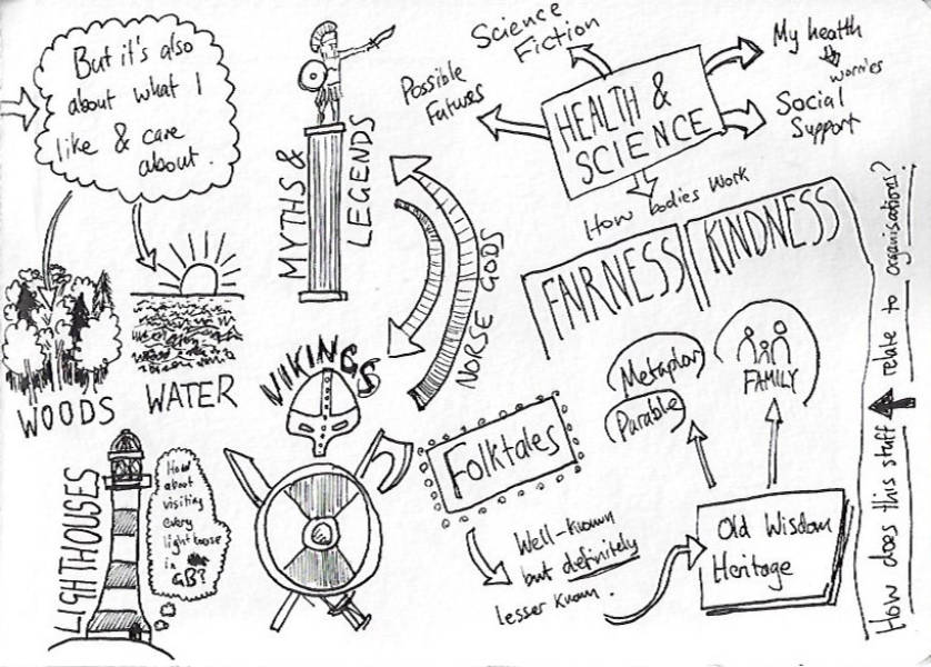
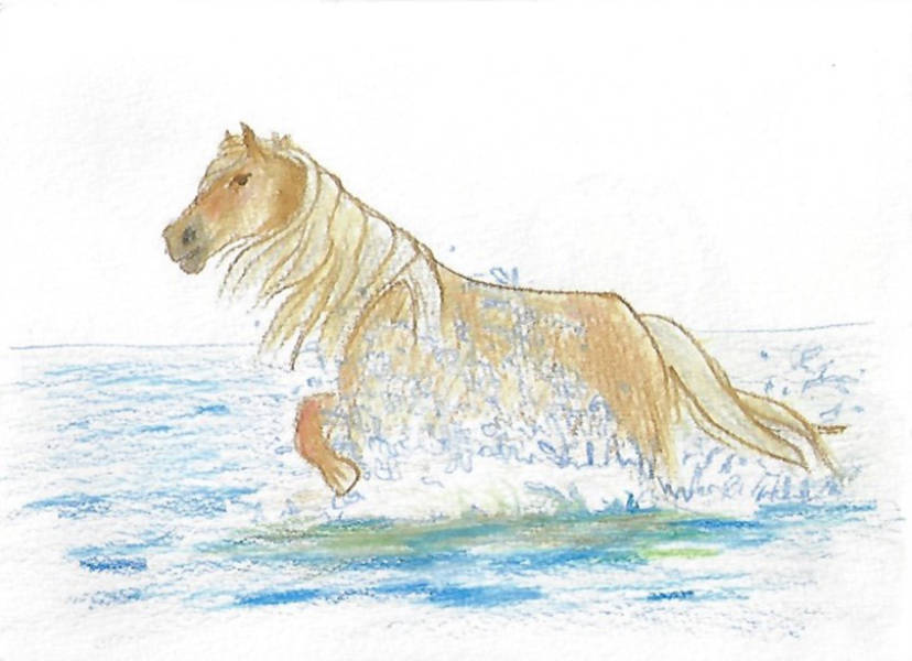
The first task that I had was to come up with ideas for the assignment. The stories I used as an example for Research 4.3 didn't really fit, and I wanted to do something a little more original. So I started pouring through my sketchbooks looking for some inspiration or ideas that I could riff off of. Individually, I couldn't see anything and became quite frustrated. Then, in some more recent sketchbook pages, using SCAMPER, I noticed a potential way to combine some of the ideas that I had into a new narrative:
The idea of folktales stuck with me; I really like learning about folk tales from around the world, and the ancient monsters that we created to explain the world. When I saw each of these pieces I remembered the Scottish folk tales of the Kelpie: shape-changing water demons that would lure people, particularly children into the water to be drowned. I was sure I could make a story out of this! I started by brainstorming some ideas:

From the brainstorm, I had an idea of how a story might pan out. The assignment brief noted that I needed to choose from the eight stages of Watts' arc. Given that a foldy would have eight usable pages, I decided to challenge myself to go through the entire arc in one zine!
I started by doing some research into the folktale to understand more details and common traits [5,3]. Each new resource helped the ideas in my head flourish a little more and I was really excited to do this assignment as a comic, and to do it justice. The story was starting to crystalise in my imagination, and to map this out I did a very high-level plot in my sketchbook:

The Script
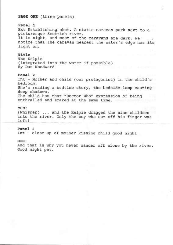
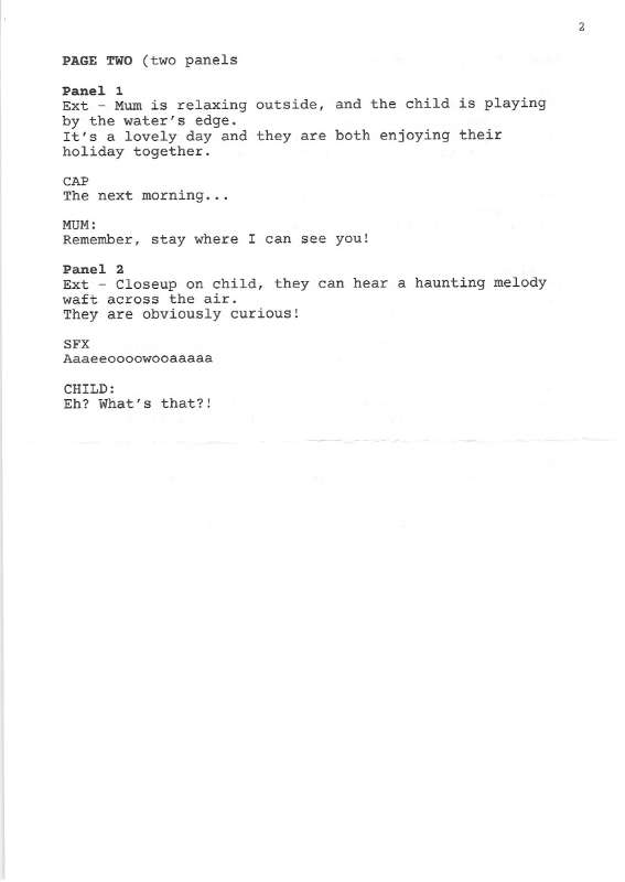
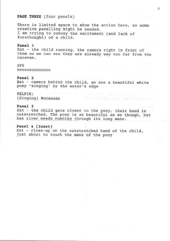
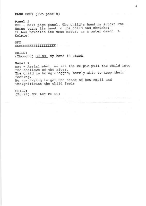
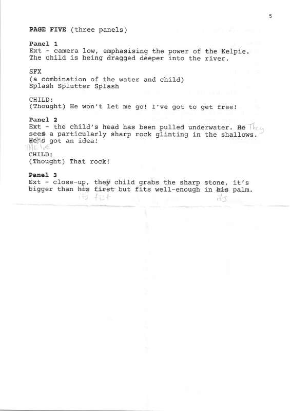
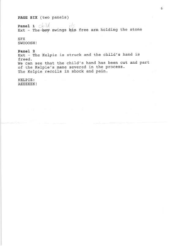
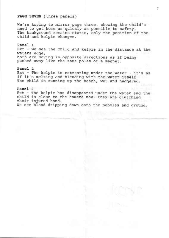
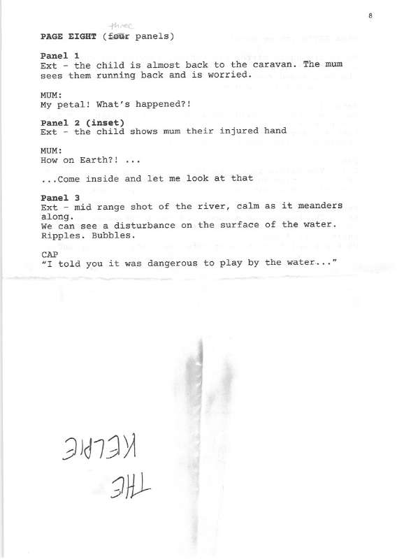
My next stage was to create a script for myself to make sure that I kept to the constraint of using Watts' arc. I had never done a full script before, so it was a little daunting. I did some research [6,9] into how different publishing houses script their stories and then set to work writing my own in a word processor.
You'll probably notice that even after I had written the script there were little details that I edited afterwards in pencil. The script gave me a picture in my head about what the story would look like, but I now needed to put that picture onto paper.
I decided first, however, to prime myself for feeling more confident in rendering the scenes in a way that I was happy with. As I was writing the script I took notes of different aspects that I would benefit from more research. I took those queues and found reference material, putting it in my sketchbook too. Where I thought useful, I took the time to try out my own renditions of the reference material so that I started to build up mental and muscle memory of the things.
I also wasn't sure about what stylistic approach to take to my characters and environment, so used my time to research aspects of silhouette and style choices.
I was inspired a lot by work published by Nobrow books, which seems to have a very specific aesthetic in mind. I also thought of Stephen Collins whose gouache comics feature in The Guardian newspaper.
The greens of the underwater weeds helped me think about what kind of colour scheme I would like to use for my final piece. However, my biggest concern was the small A6 page space I had to work with, and how I would have to be judicial about how much I could show in word and form to convey the story. The best approach, then (I mused) was to draw up some real-life roughs where I could see how the story played out when actually read.
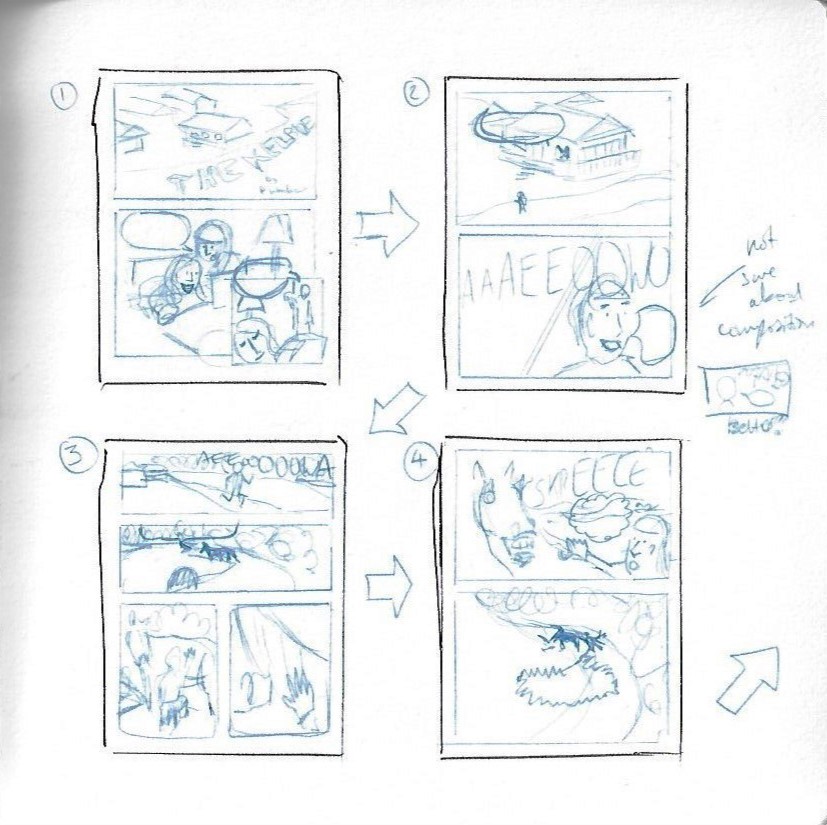
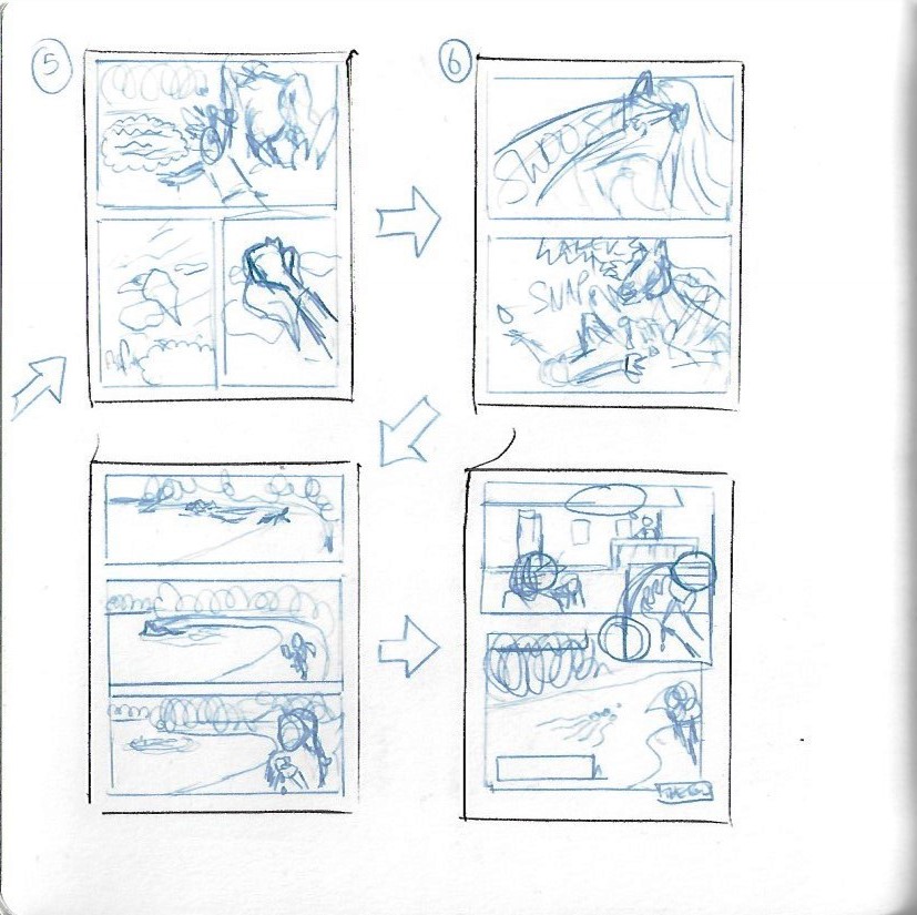
So I decided to sketch each page as thumbnails in my sketchbook, where I could get a sense of how the story told itself, and to think of important queues like the page turn where I could add in surprise or danger for good effect.
Once I was happy with this stage, I moved to the computer, using a digital blue pencil to draw the roughs in my illustration software. Once I had completed the roughs stage, I could get an idea of what worked and what didn't. Actually drawing the panels puts a lot into perspective and I had to make some compositional choices in order to better tell the story. I placed my panels into Affinity Publisher (like Adobe InDesign) so that I could map out the layout on an A3 sheet. I then printed out the roughs so that I could do a practice cut-and-fold and check how my layouts played well with things like printer margins.
As I was not doing a print-and-cut approach, I didn't have to think about bleeds at this point. This was actually a really useful step as I found some of my panels were a few millimetres out, but this was enough for them not to print. I could adjust this in my final renders.

The Final Comic
Once I had the roughs laid down I started to get to work on the final render. I initially started with a combination of vector and raster approaches, trying to emulate the work I had referenced, but it just didn't work for me:

So I decided to go for an all-raster approach, which was a bit more traditional for comics. I used brushes that emulated the fountain pen and watercolours that I have been using traditionally. I really enjoyed using digital versions of effects like salt and granulation in order to add texture.
The final piece to the puzzle was adding in lettering. I had decided during the rendering process to try out borderless frames, which I had never done before, so I also decided to try to do borderless speech bubbles. I think it works really well, although it was tricky working out how to represent whispering / soft speech on the first page.
And here is the final result, it should hopefully show at the same A6 size as it would when printed:
I shared my comic out into the world on Twitter and got a nice comment from Dan Berry. He may even send me a critique, which will be so useful! I also printed out the final comic, so that I could check that it actually check it worked as a physical thing. I am really pleased to say it did and the lettering size worked perfectly for still being legible but not too big that it takes over. This is a major advantage of doing this digitally, as it's easier to preserve detail. It's also easier to go down a rabbit hole putting in unnecessary detail for something that will be too small to see!
Overall, I am really pleased and proud of this assignment. The main issue I have had is with time management. When I got going with the assignment I realised how much work I wanted to put into it. I wanted to do it justice and make it a finished article. This ended up taking a lot more time than I had expected and I am very grateful for the patience of my tutor. Especially as, as I write this, we are in the first few weeks of COVID-19 lockdown, which is having a big effect on all of our lives.
I am pleased that I have recently had the diagnosis I have been waiting for ages for. I have ADHD (which exacerbates the time blindness). Hopefully, with the right medication, I will be able to take my work and studies and push them even further!
References
Eisner, W., 2008. Comics And Sequential Art. 10th ed. New York: Norton.
Eisner, W., 2008. Graphic Storytelling And Visual Narrative. New York: W.W. Norton.
En.wikipedia.org. 2020. Kelpie. [online] Available at: https://en.wikipedia.org/wiki/Kelpie.
Gurney, J., 2010. Color And Light. Kansas, Mo.: Andrews McMeel, p.132.
Historic UK. n.d. The Kelpie, Mythical Scottish Water Horse. [online] Available at: https://www.historic-uk.com/CultureUK/The-Kelpie/.
Images.darkhorse.com. 2020. Dark Horse Submissions Script Guide. [online] Available at: http://images.darkhorse.com/darkhorse08/company/submissions/scriptguide.pdf.
McCloud, S., 1994. Understanding Comics. New York: Harper Perennial.
McCloud, S., 2008. Making Comics. New York, NY [u.a.]: William Morrow.
O'Neil, D., 2008. The DC Comics Guide To Writing Comics. New York: Watson-Guptill.


















תגובות