Illustration Sketchbooks - Assignment Five: Application and Context
- Dan Woodward

- Jul 1, 2020
- 14 min read
Updated: Sep 25, 2020
Deciding Which Option
So here I am the final assignment of the unit. There have been moments when I was not sure if I was going to make it! I had planned to finish the course around the start of April, but a lot of things have happened this year which have impacted everyone, let alone me. Reaching this section amidst the chaos of COVID-19 lockdown has really influenced my approach and my ability to execute, so I am proud to be finishing this assignment and module feeling much more confident and empowered.
I first read the three possible options for the assignment in the courseware, comparing the lists of words to those in my preparatory exercises. All of the options had aspects that were attractive, but option 2 and 3 resonated the most. I really liked the idea of looking into more reportage aspects, but the exercise outputs were pointing me to explore more narrative and sequential aspects. For that reason, I opted for Option Three.
Creating the Sketchbook
Ahead of the assignment proper, I had already given a great deal of thought as to what sketchbook I would like to use for the final assignment. I had experimented with a few different options throughout the module. I had realised that I definitely preferred a square format around 8 inches, and I used watercolour and gouache enough that heavier paper was definitely best. On the other hand, I have also discovered a love for using a fountain pen as my primary tool for sketching and writing. The problem is most watercolour sketchbooks that you can buy are cold-pressed. The ones with smoother hot-pressed paper don't tend to come in square formats.
So it seemed obvious to me that that I should create my own sketchbook so I could make it exactly as I like it. I managed to buy several sheets of Fabriano Artistico 300gsm paper which has a lovely satin hot-pressed finish. Its texture is particularly unique and I haven't been able to find another paper with this exact tooth, it's wonderful.
I then went about cutting the sheets by hand creating signatures, which I then assembled using a Coptic binding - which I like because I can easily use both sides of the book for a landscape and it also lies nice and flat which is really useful for scanning for this learning log. You can see some of my process photos below:
Collecting My Thoughts
With my sketchbook ready and brief chosen, I sat at my desk and started. And stopped; the blank, white pages emptying my head like a kitchen sink. The one thing I had learned through this module is that this happens, and it's natural. The best option for me is to just start with something, and fill the space.
So I decided to write to myself, to get my thoughts down on paper so I could better process them.

The assignment asked me to come up with a list of six words or sentences based on the everyday. I referred back to the list I created at the start of the module to see if there were ideas there that I had not yet explored. I also jotted down things that popped into my head, trying to tune into where my head was at rather than overthinking things.
This actually lead me naturally to write down words as a stream of consciousness:

I then took the time to summarise the brief so I had a reference on hand. It also allowed me to plan and organise my approach. Based on my personal objectives, the first thing I decided to do was to investigate other artists/styles to see what I liked and try out aspects to see how I could incorporate them into my own work.
Inspect and Pinch
Again I collated my thoughts on the page as a way of keeping momentum, I am finding it very useful as a way of avoiding overwhelm and increasing focus. This also gave me very specific areas to investigate. I then set to work:
You can find out more about the individual motivations in my sketchbook tour, below.
Designing the Trailer
As you can see from above, after the exploratory work, I started to plan how I could turn the ideas into a trailer. The more I explored, the more I wanted to incorporate everyday right now. The COVID pandemic is a unique time in our history, and I really wanted to respond to that. It also gave me a way to put aspects of me (particularly how I feel and empathise with my family) into my work in a way that didn't have to be purely autobiographical.
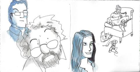
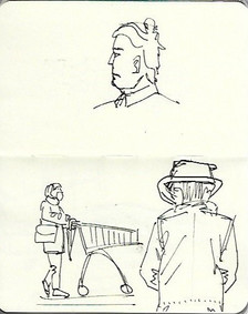
The brainstorm planted the seed of the idea that I wanted to explore. As lockdown took hold, one of the constants in my life became queuing for the supermarket. I soon learned to take my small sketchbook with me, and used the time in the queue to sketch the people around me. I couldn't shake the idea of 'bubbles', particularly as that same language was used more and more as the restrictions started to be lifted.
(You might notice a quick sketch I made when constructing my new sketch easel, a project I gave myself during lockdown so that I could get out and about for exercise and do work en plein air at the same time!)
Learning from Assignment Four, I decided to write out a synopsis to the trailer that I could use to build the story visually. I did this electronically, so you can't see the multiple writes and re-writes that went into it!
This was also a great opportunity for me to research more into how storyboards are created, and I took the time to try and understand all of the different ways that they are put together in different visual industries [1-4, 8-11, 14, 16,17]. Building on the early research in the pages above I discovered that there is actually a lot of variation in the fidelity and style of storyboards.
Once I was happy I then used my sketchbook to create small thumbnails. I found doing the research really useful when thinking about the 'camera' and the composition. I think I managed to find some good angles but I also think that I need to do more work here so that I can explore more options for visual interest in my work.
You might notice little blue stars here and there, this is where I went back over the thumbnails to select potential candidates for my final six images.
I had a good idea about how my thumbnails fit together, and it was really useful to identify particular frames that didn't quite work or needed to be altered. The next stage was to create the storyboard panels proper. Based on the research I had done and combining that with my personal preferences of how best to render them efficiently and effectively. I decided to use ink and then use watercolour instead of grey for the tonal planes.
Remedial Work
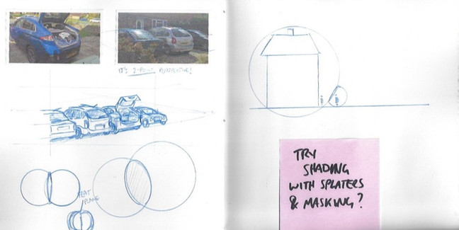
All in all, I thought the thumbnails worked quite well, but there were elements that I really wasn't happy with, particularly frames involving cars, where I couldn't nail the perspective which made the panels a bit confusing. So I set about getting some references and doing remedial work to research visually and practically aspects which would improve my final six choices.
I also was not sure yet about how best to render the final images, so I used this opportunity to experiment. I had watched a video [15] on a technique Sydney Smith uses to stencil to create different effects. I gave it a go, but wasn't happy with the results. I think with more practice I might be able to use some of those ideas, but I wasn't going to take it further for the final images.
After being able to visit my mother-in-law, by coincidence, my wife had brought some bubbles for my son to play with while in the garden. I took the opportunity to take photos, and then used that reference to experiment with watercolour to render the colours I had seen in the garden. Lastly, I did a few quick studies regarding expressions to help me with rendering one of the frames as part of my final choices.
The last bit of research I did was as an extension from the earlier experiments with a retro mid-century look, particularly how comics and ephemera were printed [5,7]. I tried manually doing this effect in my sketchbook earlier, and though that it could be an interesting experiment to use for the final renders. Bringing the styles of the 'dailies' to the 'everyday'.
The Final Six
I talked through all of my storyboards with my wife to select the final six. I had set myself some criteria - I wanted them to work in a sequence to tell a story in their own right, which felt in keeping with the spirit of the assignment. I also wanted them to be able to stand in their own right, and to have enough storytelling to be visually interesting and communicate the theme of people being in bubbles that runs through the panels.
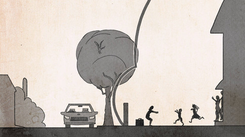
I used the panels as a backdrop to then create some more detailed sketches on. The fifth one didn't get the sketch treatment as I had decided that I wanted that panel to almost appear in silhouette. I used this process to also refine details of the compositions and to address perspective properly. I really struggled with the expressions of my characters, and I still have not found a good balance between stylistic and realistic that suits me. You might notice that I am doing the work digitally, this was so that I could reproduce the 4-colour print process efficiently. To also give it a more retro feel, I worked on top of a scan of vintage mid-century paper.
After the sketched were complete, I moved on to creating the ink linework. I noticed that I am very timid in my use of ink to create deep shadows. I also seem to avoid using linework to add depth and shape (whether that is traditional hatching or comic-style). I am not sure how I feel about this. There is a lot of work out there that I admire that does use ink more confidently, so this is probably an area to explore. Conversely, I also found plenty of sequential work in my research that doesn't use linework in that way, so I think I need to work out how to give myself more permission in exploring different rendering options that cater to all my sensibilities. For example, I just managed to get my hands on a new graphic novel, "The Junction" (Konyu, 2020) which has a very different style which I love, and I think I will be investigating more on how to learn from this style.

I then went into the final rendering stage, layering cyan, magenta and yellow layers on top of each other, each with different ben-day dot sizes to create the amalgam colours I needed. I am happy with the final results, they remind me of comics I read as a boy, but also have a slightly more modern feel to them. The do, however, feel a bit safe. I feel like I wanted to be a little more comic-y and inject more humour into the work. But they feel restrained somehow. The only way I can explain the feeling in my head is that I am scared of doing something which isn't somehow 'proper' - representational, accurate light, form, proportion, perspective etc. I need to work out how I can have fun with my work - make it for me not for others.
I think the sequence still tells a story, albeit rather clipped. Had I had more confidence I would have liked to take the storyboards into the digital space and add in some other slight keyframe changes to be able to create to working animatic. That might be something I follow up on between now and the time I submit for assessment.
Final Reflections
You can see a final sketchbook tour for this section here:
How did my creative approaches to drawing and mark-making develop over the course?
At the start of the module, I was buoyed-up by my progress through Key Steps in Illustration. I think at that point I was still staying in a narrow comfort zone that had allowed me to move forward and solve problems. It gave me much more confidence using sketchbooks than I had at the start of the degree.
But it was definitely a tentative relationship with sketchbooks. I still use them as a tool, but I feel much more open to trying things out, sticking things in and accepting when things don't work out. I have tried hard to be as prolific as I can, and I am really pleased with just how many sketchbooks I have completed over the module.
I have also, for the most part, tried to work traditionally where possible. This has really pushed me to concentrate on fundamentals more, and I am really pleased with my ability to think about form, light and colour.
How did my use of observational drawing as a form of visual research and idea development change?
My observational drawing used to be limited to just sketches here and there. As the module has progressed I have really increased my use of observational drawing, looking for opportunities to draw people and places from life. I have really enjoyed doing life drawing and now have started doing more observational painting too, which is really challenging but I love it. Gouache has become a big part of that and I am enjoying learning this medium.
There was a big shift in my use of observational drawing happened when I started to use a pen instead of a pencil. It has made me much more confident and looking to sketch people in everyday life has become something I actively seek out. Likewise, I have become a lot less precious about having photos in my sketchbook. Having the combination of representational and interpretative work really lets me decide how best to capture and respond to people and places.
What do I feel and think about the processes of experimentation I have undertaken with a range of materials and mark-making?
I still think that I can push myself to just try different ways of mark-making. I feel that I have not pushed myself enough in this regard. I still have a project that I want to do to make my own mark-making textures that I can scan to create custom textures for my digital work.
I really enjoyed the collaged cockerel as part of the sketchbook circle, but I don't think that collage is something I want to use regularly. In terms of materials, I have tried to explore different media, including different paints, pencils and pens. I am creating a sense of what I like to use, but I still enjoy trying out new things. I think it will be interesting to take some of these experimenting ideas back to the digital space and push myself to create unique processes rather than just following 'industry standard' ones.
How have my ideas about the everyday evolved over the course?
Honestly, I have found 'the everyday' pretty annoying. I often find constraints useful, but in this case, it seemed like the everyday was often used in a limited way for the context of the exercises and assignments. The most interesting exploration of the topic was as part of the sketchbook circle. In this context, seeing how each of us tried to interpret it was really interesting.
How has looking at other practitioner’s sketchbooks and reading about their work expanded my understanding of illustration?
I have really enjoyed trying to get under the skin of other practitioner's work by looking at their sketchbooks. Often all we see of artists are the finished pieces, and I have loved trying to look behind the curtains as to how work is made by others. It has made me realise that everyone is in the same boat. Also, everyone has different ways of solving problems.
And that's what it's all about, really: we are just trying to solve problems. To solve problems we need to understand, we need to plan, we need to explore and we need tools and skills in order to do the work. There might be useful tools, techniques, processes, but at the end of the day we all use those things in our own way
What does visual language mean to me?
I have thought about this a lot as part of my last research exercise and had a significant breakthrough during that work, but to summarise:
Visual language is how we visually communicate our interpretation of the world. It's an expression of both our life experience and our response to the present. In communicating in this more nuanced, complex way, we have a better chance to help others understand how we see the world than through just words alone.
What did I learn from being part of the book circle?
I really enjoyed the circle. I helped set up the group of students and we even had our own private channel on the OCA Vis Comms Discord server that I help to moderate. It was great to support and encourage each other. I was always excited to receive the next sketchbook. It was so interesting to see how other people work, and by the end of the circle, I could definitely identify each of the others work on sight.
It was interesting to see what different people focused on, and more so how we each responded to each others' work. It was a really valuable experiment, and I am helping others to do theirs in the future so that they can also get the benefit. You can see a tour of my circle sketchbook and work I made for my fellow students' books below:
Taking it further for Assessment
When it came time to assessment, I realised I had the opportunity to go outside the bounds of just the assignment brief, so I decided to create an animatic of the storyboards I had created for the assignment.
I realised that trying to do an animatic in the style I had rendered the final six images wouldn't work, and the thumbnails that I had done in my sketchbook wouldn't fully communicate the story. I had also learned more about the correct perspective and composition from doing the final images, so this meant that I needed to re-render everything.
I made a start with creating a rendering style that was quick and efficient enough, but also enough fidelity to tell the story appropriately.
I wanted to put this to music, as I would expect from a trailer on TV, I tried lots of options from generic background music to thinking of specific genres. I wanted to evoke a particular emotion that was important to give the visuals the right tone. I then came across this version of "Our House" by Madness:
I loved the community aspect, and as it was not the full version of the song, could work really well for the trailer. I obtained the audio from the video, and then put it together with my thumbnails. Conscious of copyright aspects, I made sure in uploading to YouTube that I made sure I specifically noted that I was using the audio for non-commercial use under the educiational fair-use copyright policy. I realised to understand what extra frames I might need to render, I needed to block out the frames aligned with the music. The beat of the music provided some audio cues that helped to direct the frame cuts:
This gave me a good idea about which thumbnail keyframes didnt work by themselves, and either needed to be embellished or broken up in order to meet the audio cues and tell the story. I recorded my own voiceover at the end of the trailer to go along with the titles, which for me helped give it a sense of place and familiarity; I could envisage something like this coming to the BBC. I also got a sense that the lycrics and the images could work well together in metaphor, which directed my efforts:
Now that I had the blocking set in a way that I thought could tell the story well, I set about creating all the keyframes for the animatic in the style I had created at the start of the video. Doing this really helped me realised where I needed to make changes, and add in semi-animated versions of some keyframes to explain the story more effectively. I am really happy and proud with the final result which I have submitted for assessment:
References
Action Movie Dad, 2017. Kubo And The Two Strings: Opening Scene Animatic. [video] Available at: https://www.youtube.com/watch?v=RrAhGIpxENs.
Adult Swim, 2019. Screaming Sun Animatic | Rick And Morty | Adult Swim. [video] Available at: https://www.youtube.com/watch?v=oyP3I68Zi_E.
Cohen, P., 2015. The Fisherman - Storyboard Animatic/Storyboard Reel. [video] Available at: https://www.youtube.com/watch?v=3ybCJSHJxrg.
DisneyMusicVEVO, 2020. Into The Unknown (From "Frozen 2"/Storyboard To Final Frame Version). [video] Available at: https://www.youtube.com/watch?v=bcgTuVNaoY8.
Hilgart, J., 2010. In Defense Of Dots: The Lost Art Of Comic Books. [online] 4CP | Four Color Process. Available at: https://4cp.posthaven.com/in-defense-of-dots-the-lost-art-of-comic-book.
King, S., 2020. Sarah King. [online] Sarah King. Available at: http://www.sarahaking.com.
LEGION of ANDY. 2016. BEN DAY DOTS Part 7: The Birth Of The Comic Book. [online] Available at: https://legionofandy.com/2016/07/29/ben-day-dots-part-7-the-birth-of-the-comic-book/.
Mateu-Mestre, M., 2015.Framed Ink. 6th ed. Culver City, CA: Designstudio Press.
Paez, S. and Jew, A., 2013.Professional Storyboarding. Burlington, Mass.: Focal P.
Pixar, 2018. Miguel Sings "Un Poco Loco" | Script To Screen By Disney•Pixar. [video] Available at: https://www.youtube.com/watch?v=mBznmFDH9O0.
Pixar, 2019. Miguel Sings To Mamá Coco | Pixar Side By Side. [video] Available at: https://www.youtube.com/watch?v=bb3bV7A8qMU.
Smy, P., 2014. Searching for the Green Man: A sketchbook quest. Journal of Illustration, 1(1), pp.151-166.
Studioaka.co.uk. 2020. STUDIO AKA - TSB Campaign. [online] Available at: https://studioaka.co.uk/OurWork/tsbcampaign.
SYFY WIRE, 2019. Watch Disney Animation’s Head Of Story Share Animation Secrets & Sketch. [video] Available at: https://www.youtube.com/watch?v=IomgUWKjUxA.
The Globe and Mail, 2015. How Illustrator Sydney Smith Uses His Own Stencils To Paint Beautiful Kids' Books. [video] Available at: https://www.youtube.com/watch?v=Dwpwc6NU3Ew.
TheWrap, 2015. 'The Grand Budapest Hotel' Storyboard Animatics. [video] Available at: https://www.youtube.com/watch?v=_oOtIsB2BG8.
WillFanofMany, 2016. ZOOTOPIA-- From Storyboard To Screen (DMV). [video] Available at: https://www.youtube.com/watch?v=fmhr-9eRk3U.


Comments