This Assignment pulls together aspects from all of the work so far, and plays it back in one go, letting me put into practice all that I've learnt. In the run-up to starting the assignment, I tried to think about the kind of place (and people) that I wanted to try and capture. My original route was interesting in terms of its variety but ended up being a bit of a let down where people were concerned. I had to go to Winchester to properly experience that aspect.
So I checked what markets were happening in the local area, as that way I could almost guarantee a good mix of people and place together. Luckily, there was a market in a nearby town, Petersfield, the next day. This also provided me with a good outline brief - after all, I had to research the markets and found that information online. People would need to know about the market and this would be a great opportunity for me to communicate information.
Visual Research
When we arrived, there were also posters dotted around the town telling people about the market. This beefed my brief up even more - perhaps I could have a brief that had to cover a poster as well as the website? I brought my family along for the journey, so whilst they camped out at a coffee house next to the market square, I set about doing some sketches in my sketchbook.
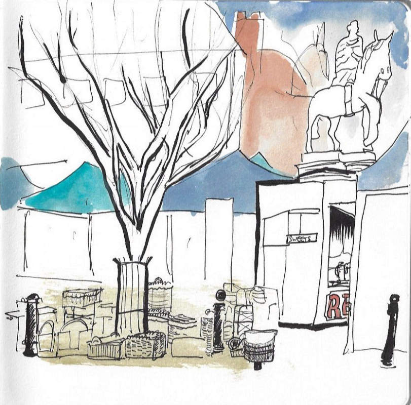
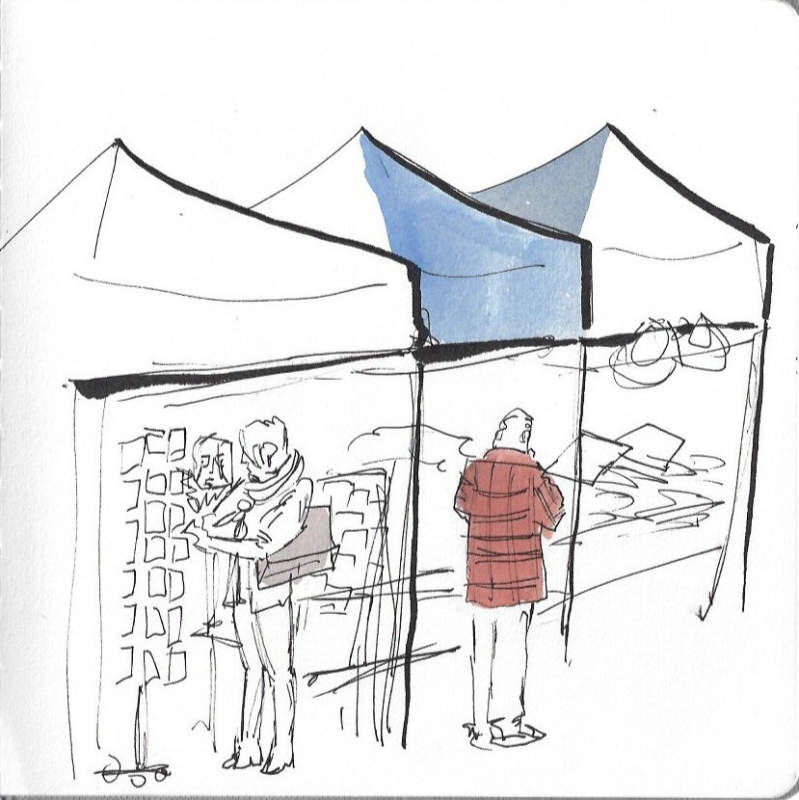
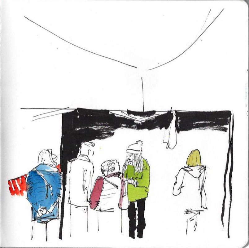
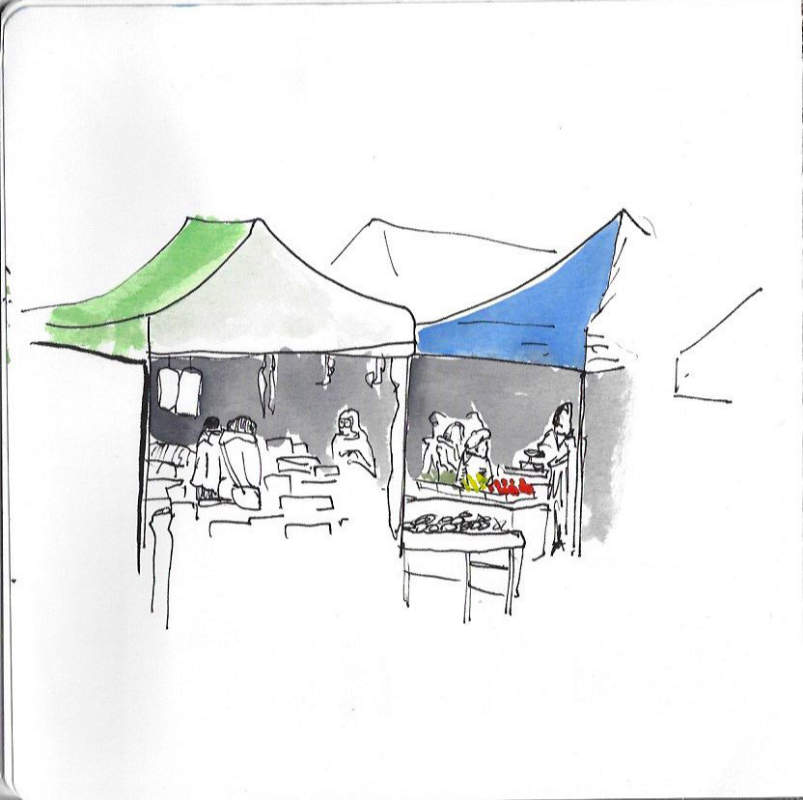
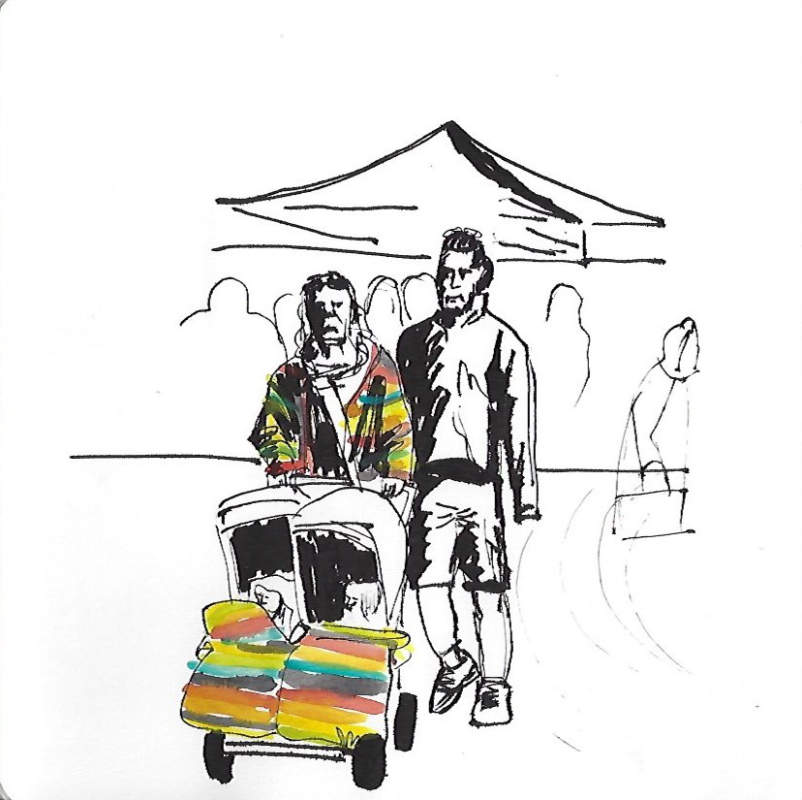
I used ink to work quickly but carefully, and every so often joined my family at a table. That allowed me to capture some colour and use my ink brush pen to accentuate some of the linework to communicate information and hierarchy. You can see the sketches I made below:
By-and-large, the images I have created are actually pretty robust pieces of direct reportage themselves. The last image was also a bit of a study of people more specifically, as the couple were a representation of the area (and SO colourful!). I really enjoyed the number of people, and how fast they were moving around. The scenes were constantly changing and I had to both work fast and be selective about the shapes, figures and characters that I wanted to capture.
I managed to get a good sense of the market stalls with their awnings, but it was hard to get a sense of the surrounding historical buildings. So while and after I was drawing the different market scenes I took photographs to use as references later in my studio
None of the sketches I did seemed to fit what I would want to do in a poster by themselves, but I think the second image was the most successful. There were a number of photos as well that had useful information in them. I definitely wanted to give a sense of the buildings sitting in perimeter of the market, and there were some lovely details like the flower stall, fruit and veg stalls, and the various crates and other jetsam of market life are all wonderful details.
Developing a Narrative
The next task was to start pulling all of my information together in my studio. I wanted the work to be brief-focussed, so I confirmed to myself what I intended it to be used for:
Reportage illustration
Can be used on the web as well as in promotional posters
Conveys the vibrant market life of Petersfield
Creates a feeling of community
Shows the town off at its best
I printed the photos and added them to my sketchbook, going through them page-by-page, and using space I had set aside to note down thoughts, feelings and observations. I wanted my brain to start making connections, but I didn't want to lose them. Having them in my sketchbook would be useful whether I used them all or not.
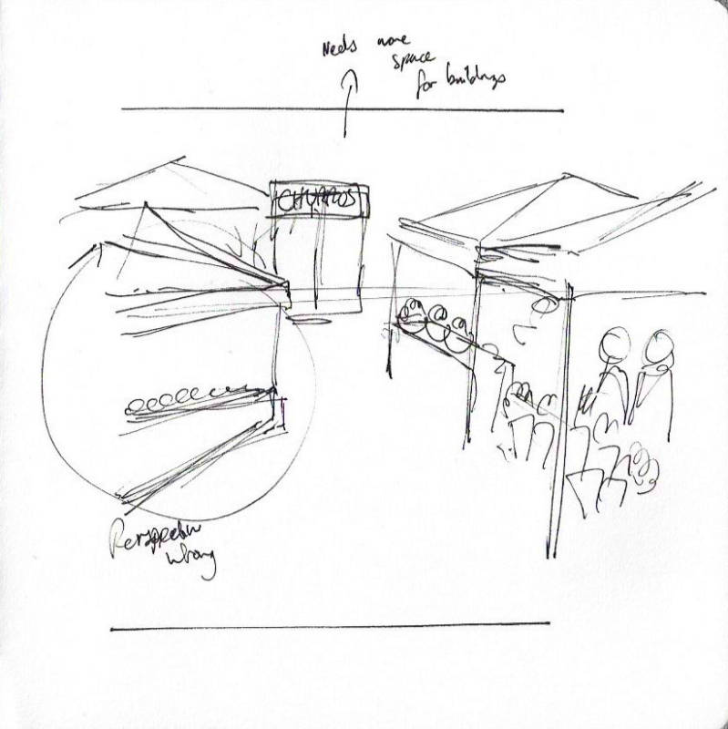
It's been a while since I responded to a brief, so I took the time to remember how I had learned to approach them in Key Steps in Illustration. I created some thumbnail poster compositions, as I was confident I could then make it work on a webpage if needed.

Some of my compositions are more successful than others. I personally liked the idea of doing a reportage illustration that gave a narrative sense of a movie poster but decided that it probably wasn't in keeping with the Town's aesthetic. My favourite was a closeup composition of some stalls, but this wouldn't meet the brief of showing the town off to its best. So I decided to take the 'idealist' composition.
I didn't want it to be a chocolate-box Austen-esque depiction of the town, so I resolved to keep the image feeling modern. I thought that I could integrate some of the other stalls and take a little artistic licence in their positioning to make the best effect.
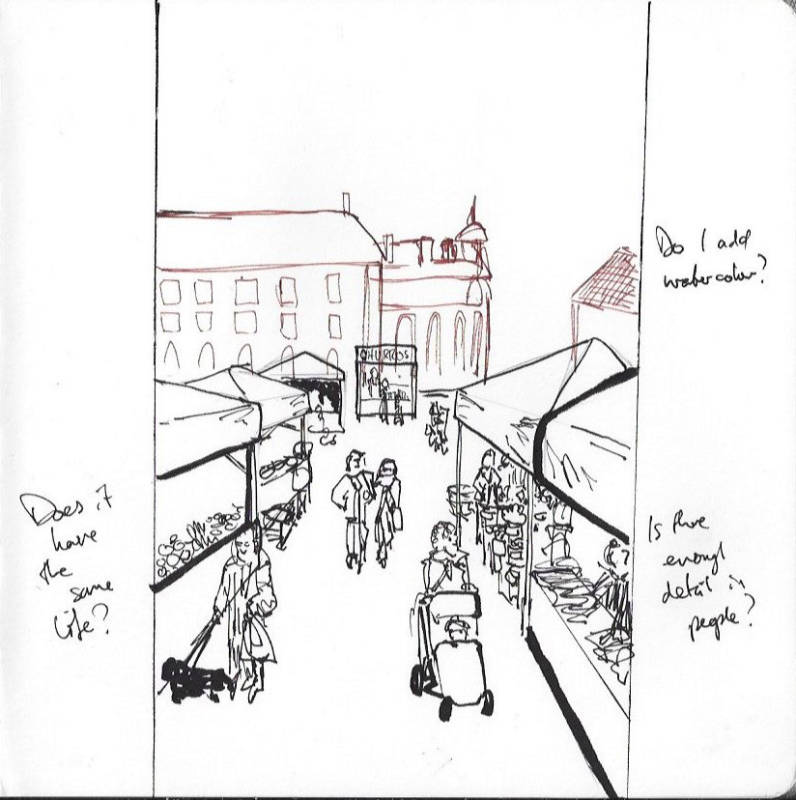
I progressed my sketch and iterated on detail and composition. I tried using different coloured inks to give a better sense of depth and hierarchy, but I wasn't sure if I should try and use more colour as I had in my sketches on-site. the composition worked but felt a little 'placed' and artificial.

I went back to do a little more reference, seeing how others have tackled markets in their reportage. I took a selection and used it in my sketchbook, taking notes about what I liked and what worked well. I decided to then try a final attempt at a more resolved image. I decided (and ran out of space in my sketchbook) to do this version on a piece of A4 paper, if I could work bigger I might be able to work a bit looser and still get enough on the page.
I took ideas from my previous attempts, but rearranged areas. In some places, I laid down colour first and other times filled in after. I didn't have the same kind of people reference as drawing from life, so I decided to draw on some of the stylistic elements I had used for my drawing of the man on the phone. There seems something in that style that speaks to me, but I am not totally comfortable with it. I'm not sure why so I'll need to reflect on that.
I carefully added each section in, understanding my constraints and thinking of the higher-than-normal viewpoint, and how that would affect the perspective. Within those constraints I tried to be spontaneous and fluid, trying to evoke the sense of place and feeling that I (and the brief) wanted to communicate.

I'm actually really happy with the image. It's certainly no Veronica Taylor, but I think it is a good representation of the Market. I think I'll come back after my assignment hand-in and see if I can do some mockups with the illustration in situ. I added some paint splatters to add some life and energy back into the piece and it was good to have some random elements to remind me that this isn't a precious thing. I'll reflect more on this assignment and section once I have my tutor's feedback.
Preparing for Assessment
As one of the first assignments to produce a more finished image, the illustration of the market was one of the first I considered for selection in my assessment submission. However, in preparing my images for Key Steps in Illustration, I learned to pass a critical eye over images to see where they could be improved based on feedback.
My tutor had given me really useful feedback regarding the characters and energy of my assignment piece. I agree that they seem a bit flat and wooden compared to my plein air sketches. So I decided to see if I could iterate on the image, and give it a bit more life.
Given the timeline I had in preparing for assessment, I would have no room for error doing another watercolour image. I decided first to experiment with creating the watercolour digitally using some ProCreate brushes I had purchased that I found to be very realistic. Something that has been really hard to replicate digitally in the past became somehow possible.
I didnt have anything to lose - if it didn't work out I could simply take what I had improved with the characters and translate that to watercolour paper and replicate it properly there. You can see the process and final re-worked image below:

I'm really happy with how authentic the watercolour is, and I think that the characters in the revised piece have much more life in them.











Comments