In learning how to use watercolour and ink, I am fascinated by images others produce that seem to make the most out of incomplete representations.

One of the things that I am conscious that I am not very good at yet, and want to improve on, is the importance of silhouette and shadow. I am envious of the way that these are used in a variety of different media. What stands out for me are things like noir comics and the way the illustrators are able to convey shape, movement and tone. Sometimes with very few marks at all.
I have been trying to notice how light plays out more on objects during my day-to-day travels. However, I still struggle when I put brush to paper.
I appreciated the techniques seen here, where the limited lines are captured first. I thought about how I might be able to take some of these ideas into this exercise. To really think about the essential quality of the lines to describe or insinuate the silhouette. Trying to let the brain fill in the gaps as described by gestalt theory.
Another place where limited lines seem to be useful is as part of fashion illustration. I found the work of a particular fashion illustration, Jacqueline Bisset [2] to be particularly effective in using a reductionist approach to her work I particularly like her portraiture which seems to be able to do so much with seemingly so little.
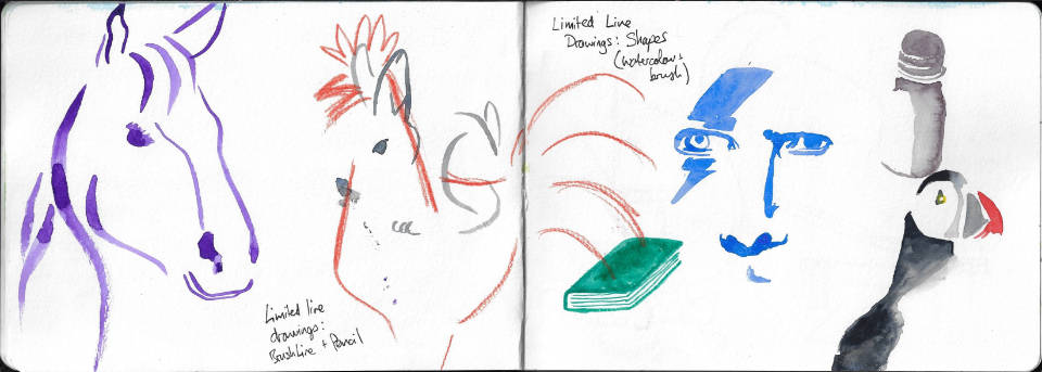
I started with a portrait of my own - David Bowie. I don't think it was particularly successful, and wouldn't have worked if I hadn't added the iconic Ziggy Stardust lightning bolt. So then I decided to try some tonal shapes, trying to capture an ink bottle in front of me. The proportions are a little off, but it works in conveying the essence of the object in three shapes. Next, I tried to capture a puffin in a limited set of shapes, which I think went really well. Picking out the distinctive shapes and colours really allows your brain to identify with what it is. The last set of shapes that I tried was a representation of a book. It was a little bit too obvious.
Next, I decided to move away from shapes and try lines. Borrowing from the animal theme of the puffin, I tried to represent some common animals. The horse was harder to do than I thought, but I am pleased with the rabbit. I also did a cockerel in a more abstract way, trying to capture its essence in a way more akin to logo design, just to see if I could do that with only a small number of lines.
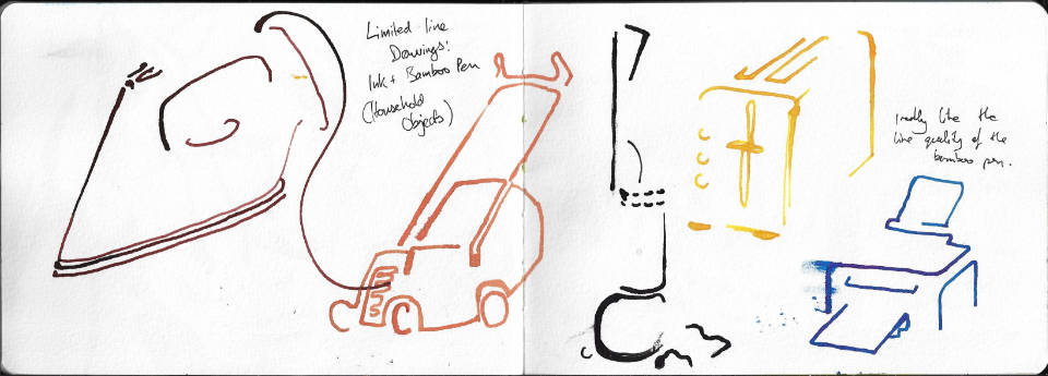
As I was doing this drawing, spilling over the page back over the book I had previously done, I was reminded of how much the book could be taken as an icon found in user interface designs. This made me think about how essential those need to be to convey information to a user efficiently. So I decided to keep with lines but move onto representing household objects using only a few lines. It was a great excuse for me to try out a new bamboo pen with some coloured inks.
Using a mixture of photographic and real references I took my time to study what made each of the objects recognisable. I am really pleased with how they came out, and when showing to my wife she was able to see and identify each of them. I think this technique is going to be useful for me to have in my 'toolbox' especially in think about the contours that really define what something is.
Martinbrough, S. (2008). How to draw noir comics. New York, NY: Watson-Guptill Publications, p.41.
Bissett, J. (2019). illustration-x. [online] Illustrationx.com. Available at: https://www.illustrationx.com/artists/JacquelineBissett.


Comments