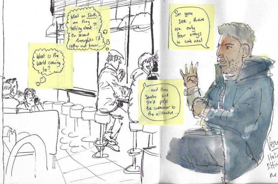
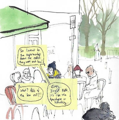
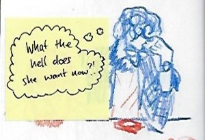
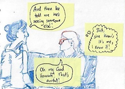
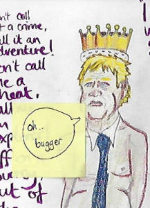
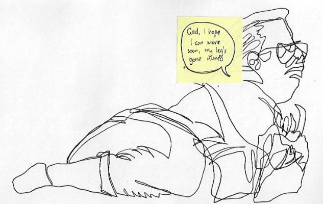
Wow, so this exercise was a good deal of fun! To start with, I had to review my sketchbooks and add in dialogue to the characters. The easiest way for me to do this was to use some small post-its I had and then re-scan the images. You can see the results below:
I was encouraged to redraft any images which I liked or thought successful, so I chose a couple that I liked the most, and used them to redraft. I used the opportunity to try and render them in a more finished way, to build upon the sketches.

This first image allowed me to experiment in making it looks a bit cartoony, like it had come out of a comic strip. I had to be selective about what I kept in, and what I left out. To add to the sense of narrative I adjusted the bearded man's hands to be gesticulating, as I felt that would help tall the narrative better.

For the second piece, I experimented with gouache again. It was interesting to do, and I got a better handle of layering the paint. I opted for a more stylised realism, particularly with the shirt pattern. I got my drawing wrong a bit, so the hand is quite wonky but I am happy with what I learned from making the image. I would probably use a different background colour next time to give more contrast, and it would be fun to experiment more with adding in some light and shadow. I know flat illustrations are quite commercial, but I am not sure it's really what I like.
The last part of the exercise was to create a letter. Going back through my sketchbooks I happened up the sketches I drew whilst I was in the Harold Hillier Arboretum in October. It was such a peaceful day and it made me remember how I was feeling at the time. Being able to sit and sketch was wonderful, and it helped me reflect and introspect. There was one drawing in particular where I thought of my Nan, who had passed earlier in the year.
So I decided to write her a letter, to let her know I am thinking of her. Being linked to the arboretum made me think about what sort of paper I should use. I managed to source some hand-made stationery with leaves integrated into the paper. It's beautiful. The paper is soft and textural, so I had to think about how I was going to write on it, and how I could incorporate illustration. I did a few tests and my fountain pen would not hold up to the absorbent and toothy paper, but my fineliner pens seemed to work well. I decided to replicate the sketch from my sketchbook in sepia, and contrast that with the writing in black. I think it works well and it was nice to use this exercise to do something that was meaningful to me.











Comments