This exercise had three parts, each showing elements of transition and how they are used to tell stories. Each part is designed to help me understand story arcs a little bit more, from different perspectives.
Task 1

The first task was to take an image from my sketchbooks and duplicate it three times in pencil. I was to then alter it to show a sequence: a beginning, middle and end.
I decided upon a doodle I had made of a fish swimming. I thought that it might be interesting if I could show it in different positions to represent it swimming.
A month-or-so ago I bought myself "The Animator's Survival Kit" [4] as I had been really interested in the rise of animation in the illustration industry, and wanted to know more about the theory and how I could apply it. It's an amazing book with a lot of content, and I haven't been able to get through it all yet.
But this seemed like a good time to try it. I considered trying to do this exercise with layout paper or create a flipbook. But, as usual, just doing the bare minimum didn't excite me enough. I wanted to stretch myself to try and make a simple looping animation. Procreate version 5 on the iPad had recently added in simple animation tools, so I decided to go against my self-imposed constraint for this module to not use digital media. And decided to do this part on my iPad
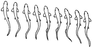
I imported my doodle into the program and sketched on top of it using a 'pencil' I adjusted the image to be at one extreme of the motion, and then added a middle and mirroring extreme. To understand the shapes I did research into how fish swim [1-3]:
I also did some image reference for catfish, so that my doodle was a little more anatomically correct! I now had a very simple sequence. However understandably, when animated the image was very jumpy. So I decided to add in some extra frame to create an ease-in, ease-out effect:

This works quite well, even if the physiology isn't perfect. The animation is designed to loop back and forth, but because of the water trails, it shows that this is happening. So I thought about how to best solve the problem. I reasoned that I somehow needed to separate the 'water' from the fish's movement. So I decided to try to add an extra frame at each end of the loop, where I left the fish as it was but re-drew the water lines. The result seems to have fixed the problem:

I am really pleased with the little animation and I learned a LOT doing it. This was enough for the exercise, so I decided to move on, but I hope to come back to this little loop and render it out properly.
Task 2
For task two, I had to take the same or different image from my sketchbooks and show the passing of time. Because my sequence represents 'real-time' the instructions suggested that I show the passing of time over a greater period.
I looked through my sketchbooks to try and find an image that I wanted to use. I found the lighthouse image which suited a plan to show the lighthouse over time (as day turned into night). However as I went through I noted a little reminder on a page with horse studies, and I thought that this idea (whilst not an image in itself) would prove an interesting subject to use for this task.
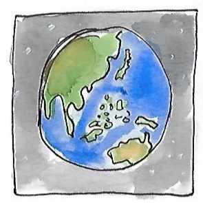
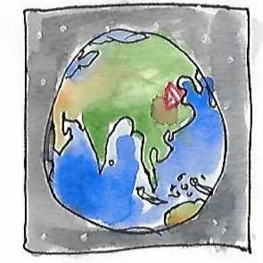
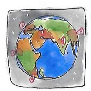
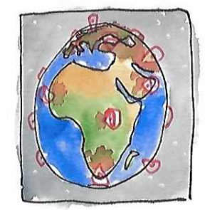
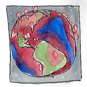
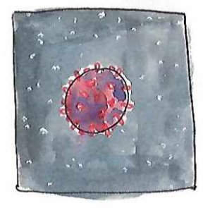
I started by doing a sequence of thumbnails in my sketchbook, a little bit like storyboarding - but as I started I found that these images themselves seemed to work. I used Google Earth as a reference for how the Earth actually looks as it rotates (western maps make Europe disproportionately large) and then added some watercolour in for effect.
I am quite pleased with the result, and I wonder if it's worth coming back to this idea to make an editorial illustration from the final image. I think the sequence would also make a good animation, but I think that might be out of my skill set at the moment!
After I had finished this sequence, I wanted to do the lighthouse anyway, so here it is:

Task 3
For this final part of the exercise, I had to take an image from my sketchbooks and then morphing its shape somehow. The biggest struggle I had was actually trying to choose an image that would work well. I have found that whilst I have been using sketchbooks a lot more, they don't have the variety of random things that I needed to pull ideas from. This in itself was a revelation, and I think between now and the end of part five I will try and spend a lot more time adding in for-the-sake-of-it sketches. Somewhere in between a doodle and a study.

As it was I finally took inspiration again the doodles of one of my smaller sketchbook, in this case - the cover illustration I did of a fox.
There is a story in the novel A Season of Storms [5] about a magical creature called the Aguara which, while it usually appears as a fox, can transform itself into a female human form.
I read the story again recently as part of re-reading The Witcher Omnibus comic book [6] (for fun, but also prompted by exercise 4.2: I wanted to see how comic artists use similar/different/additional techniques in order to progress their narratives. As an omnibus, the book had work by multiple artists and writers, so I had a lot of options to compare).
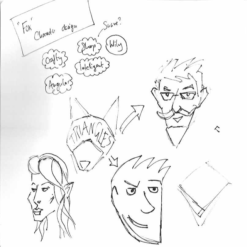
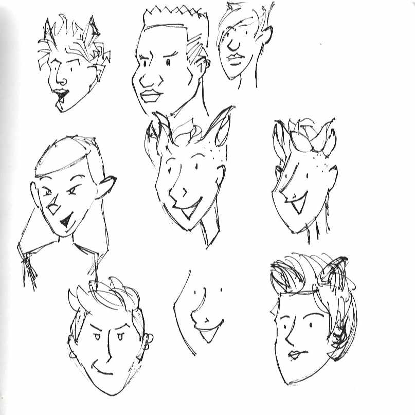
And so this inspired me to see if I could morph the fox on the sketchbook cover into the portrait of a person. I wanted to see if I could still keep the essence of the fox in the portrait, so I did some research into the language of shapes in character design [7,8].
I wanted to get my final result nailed so I could work out how to morph the shapes, so I spent a good amount of time playing with ideas in my sketchbook:
Once I landed on the kind of face I wanted to use, I decided again to use Procreate to help me make an animation of the morphing. This time I wanted to use more than just pencil lines, so I did my best to give it the feeling like it had been painted in watercolour and gouache. You can see the development of the images below:
You can see that I simplified the fox so as not to make it too complicated, but I kept the swirl around the eye. I turned this into a tattoo around the eye of the character, tying the two together. I seriously enjoyed this part and found adding in colour added another level of complexity to animation, I tried to use blending and graduations of colour to help with the transition of fur to skin. It was really challenging!
Here is the final animation:

These are the keywords of things I took away from this exercise:
Composition
Angles
Liminal space
Pacing
Shapes
Silhouette
Closure
References
Florida Museum, n.d. How Fish Swim. [image] Available at: https://www.floridamuseum.ufl.edu/discover-fish/fish/how-fish-swim/
Mackean, D., n.d. Fish Swimming. [image] Available at: http://www.biology-resources.com/drawing-fish-swimming.html
Hoar, W. and Randall, D., 1978. Fish Physiology. New York: Academic Press.
Williams, R., 2009. The Animator's Survival Kit. London: Faber and Faber, p.50.
Sapkowski, A. and French, D., 2019. Season Of Storms. 1st ed. Gollancz.
Tobin, P., Pugacz-Muraszkiewicz, B., Stachyra, K., Currit, T., Querio, J., Bertolini, M., Kowalski, P., Badilla, C., Simpson, B., Piekos, N. and Sapkowski, A., 2020. The Witcher Omnibus. 1st ed. Milwaukie, OR: Dark Horse Books, pp.125-244.
Grünewald, S., 2019. Sketch Every Day. 1st ed. Worcester, UK: 3Dtotal Publishing, pp.44-53.
Lewis, M., 2018. Creating Stylized Characters. 1st ed. Worcester, UK: 3dtotal Publishing, pp.38-41.










Comments