I actually finished this assignment on time, in November. It's hard to imagine that now, these months later. Revisiting it again to write up the end of this section of the module, I find dealing with the conflicting emotions a little difficult.
On one hand, I am proud of the work that I produced for this assignment, but I am also still a little traumatised by the severe burnout that I experienced not long after. For this assignment, I was asked to create a short comic, about two to three pages long.
Rather than get bogged down with worrying about a story, I originally decided to use a script from a previous 2000AD comic competition. By the time the module came around, I realised that the real competition was six weeks away. Somewhat foolheartedly, I decided that I would face my fear of criticism and enter the real competition! This year you had to also submit in person, so I booked tickets to go to the Thought Bubble comic convention in Harrogate along with my family, which then meant we also had to book a hotel for the weekend and drive most of the country!
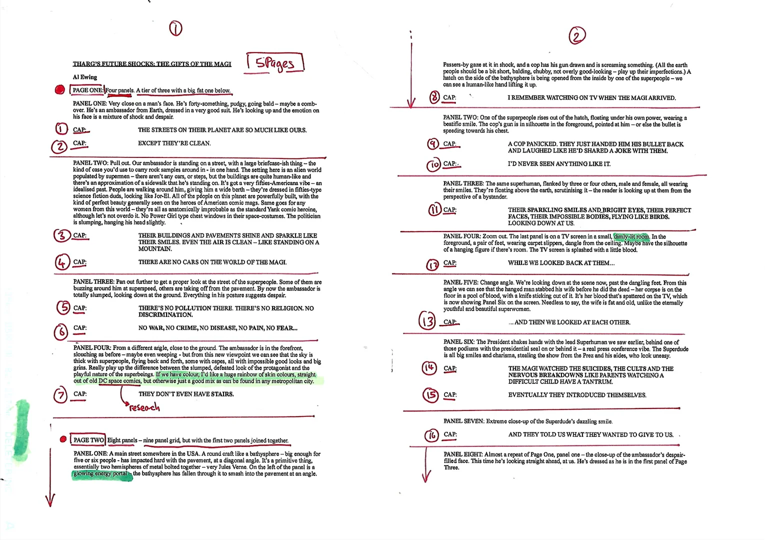
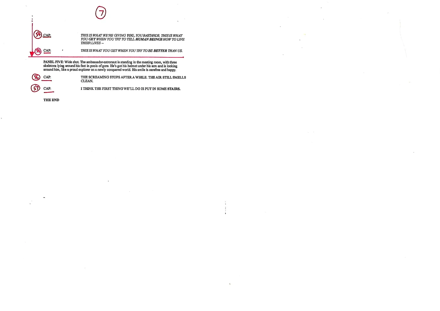
I continued with the early exercises and research tasks, and as time kept creeping closer, I realised that I would have to skip forward to the Assignment and then finish off the remaining tasks later. I started by downloading the script from the competition website. I then went through it to understand the page layout and story.
This gave me a good idea of the things I needed to focus on. It was five pages long, which was more than the assignment needed, but not something I had a choice about for the competition! It was going to be a lot of work. I chose to not do a cover page given it was not asked for in the competition, and I had extra work to complete over the assignment's brief of three pages.
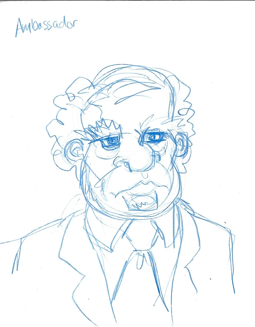
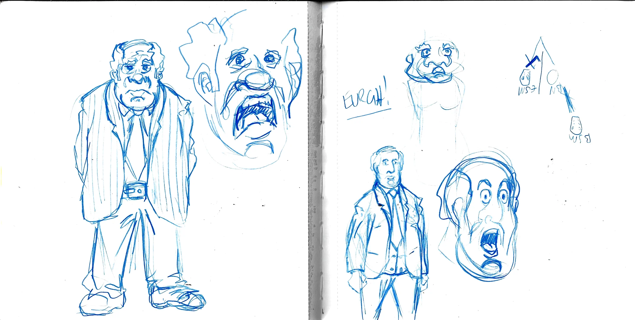
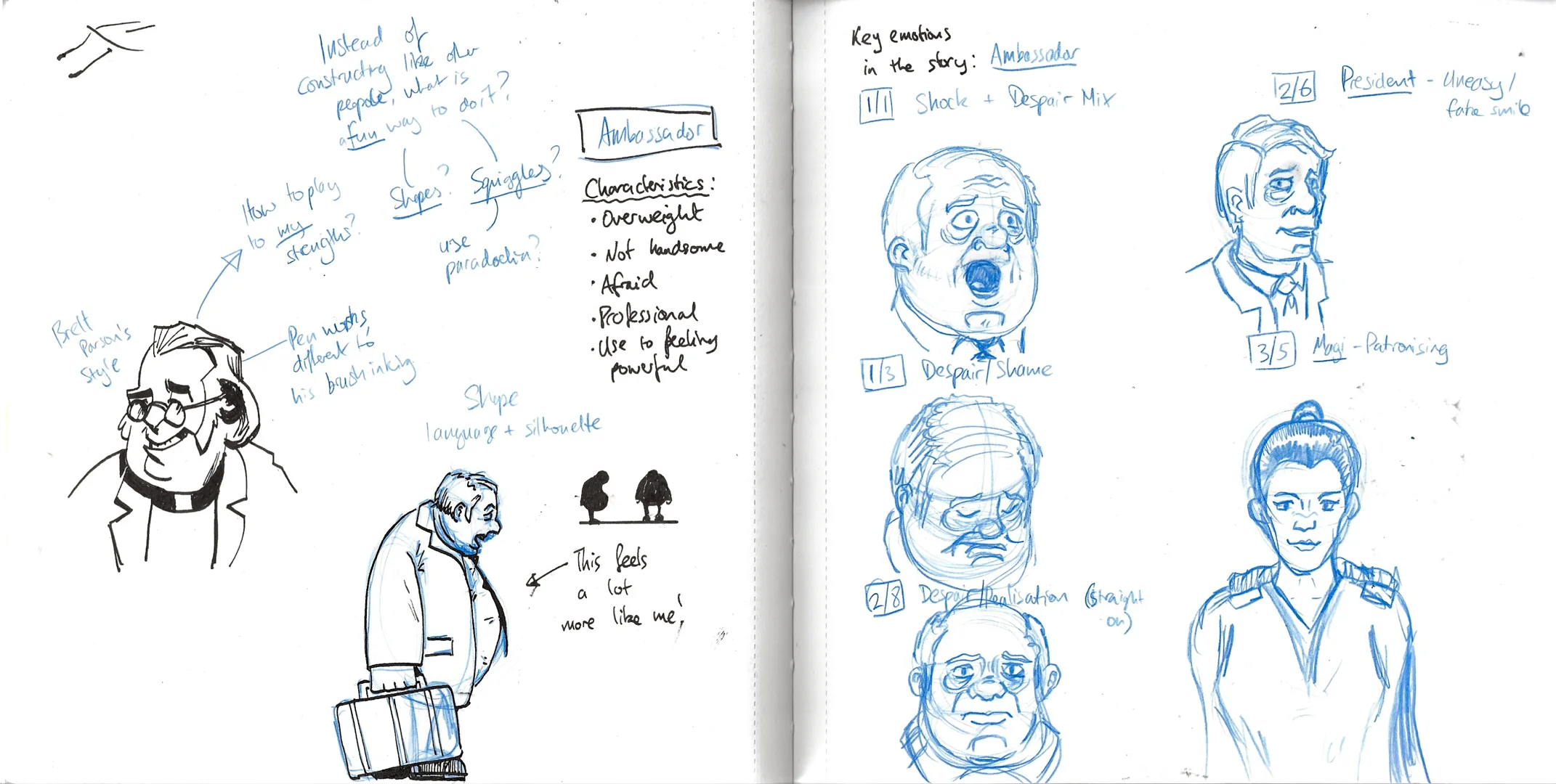
I wanted to explore some of the story's characters a little more, so I used my sketchbook to explore some of their character designs until I started to get comfortable with the style that I wanted to use. This took me a while, as nothing seemed to click, and it really felt like I had forgotten how to draw!
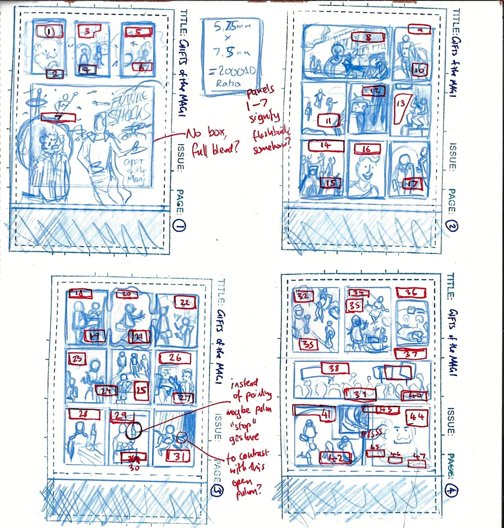
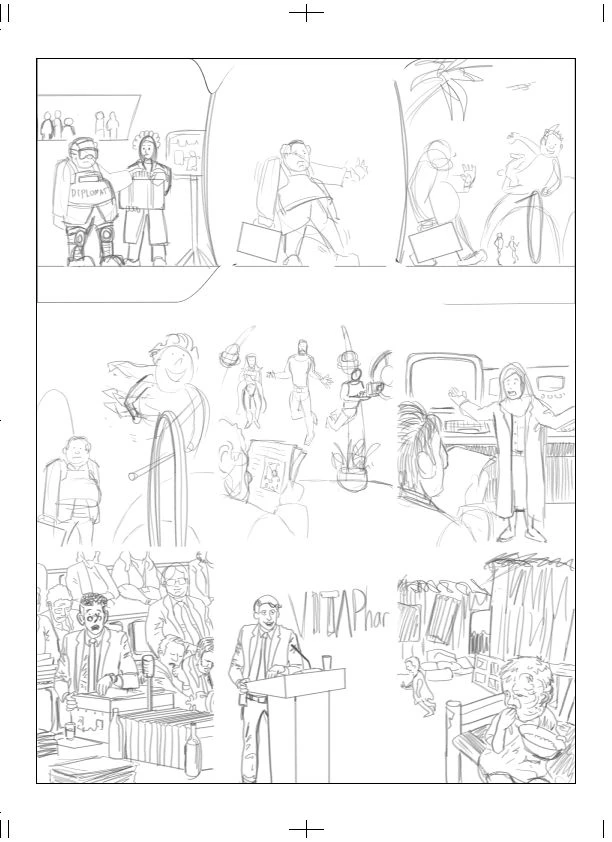
Once I had decided to permit myself to use a more cartoony approach, I felt more comfortable planning out the visuals for the story. I took my annotated script and used my thumbnail stamp in my sketchbook to sketch. I used the thumbnails as an initial layout guide. The dimensions of 2000AD are different to US comics, so I made sure to crop the thumbnail stamp so I could plan the layout accurately.
On the thumbnails, I added where I planned for the words to go. 2000AD stories can tend to be a bit wordy, so I had to be careful with the limited space. I was ready to start doing the real thing. First, I started by researching the 2000AD print guidelines and created a template for myself to use.

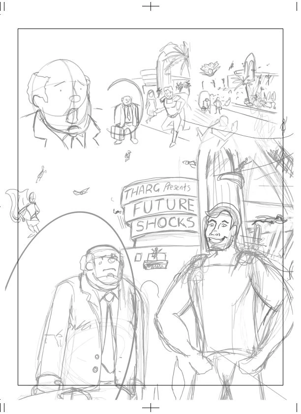
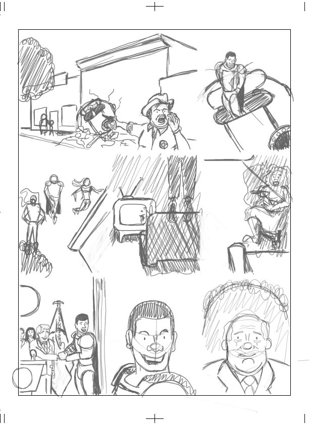
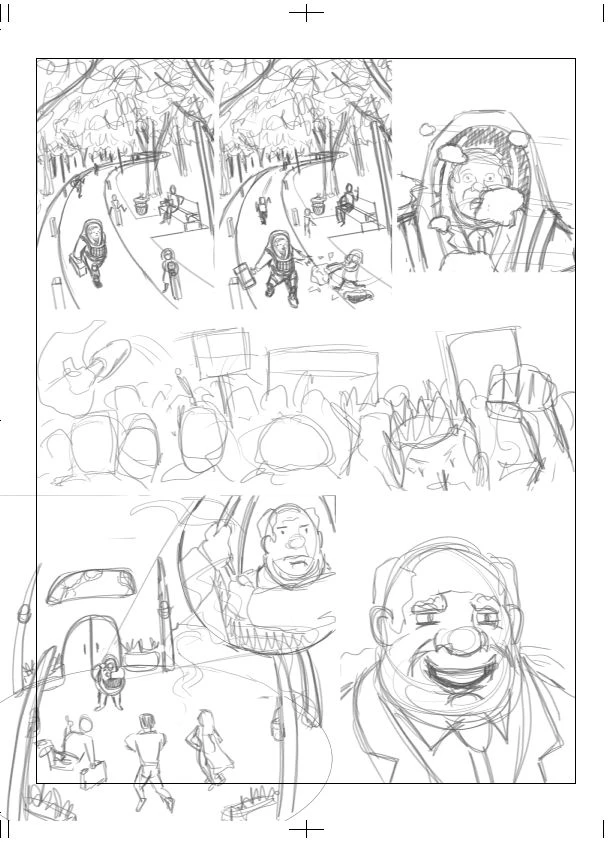
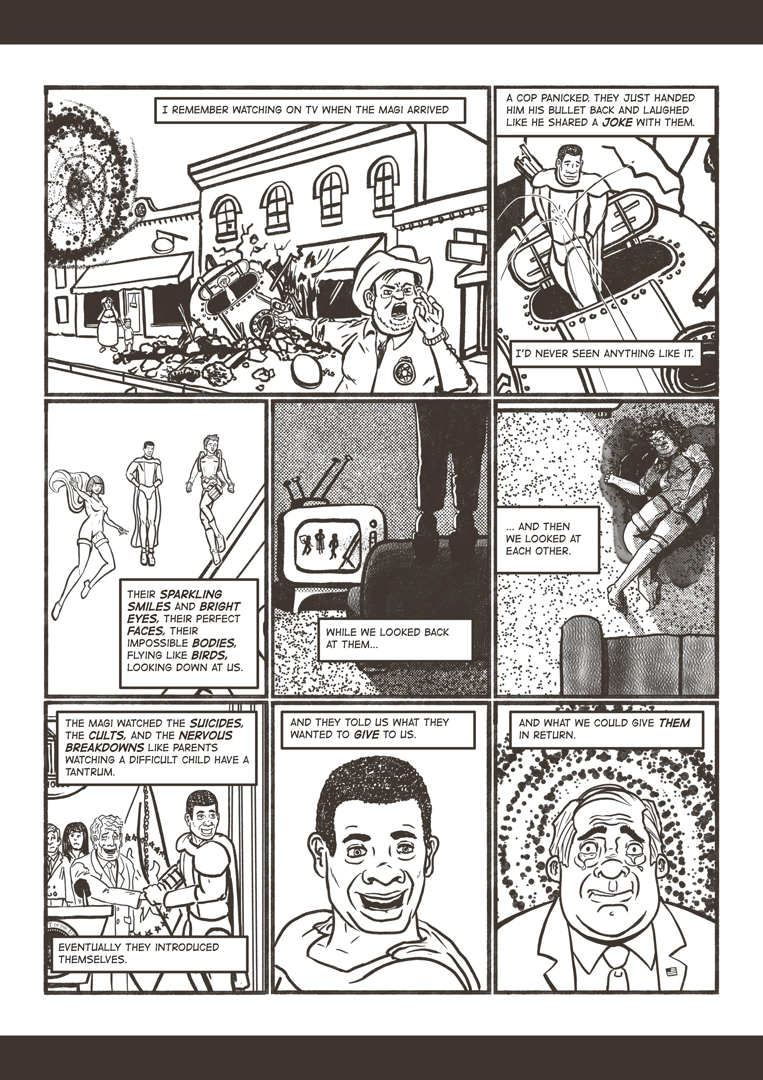
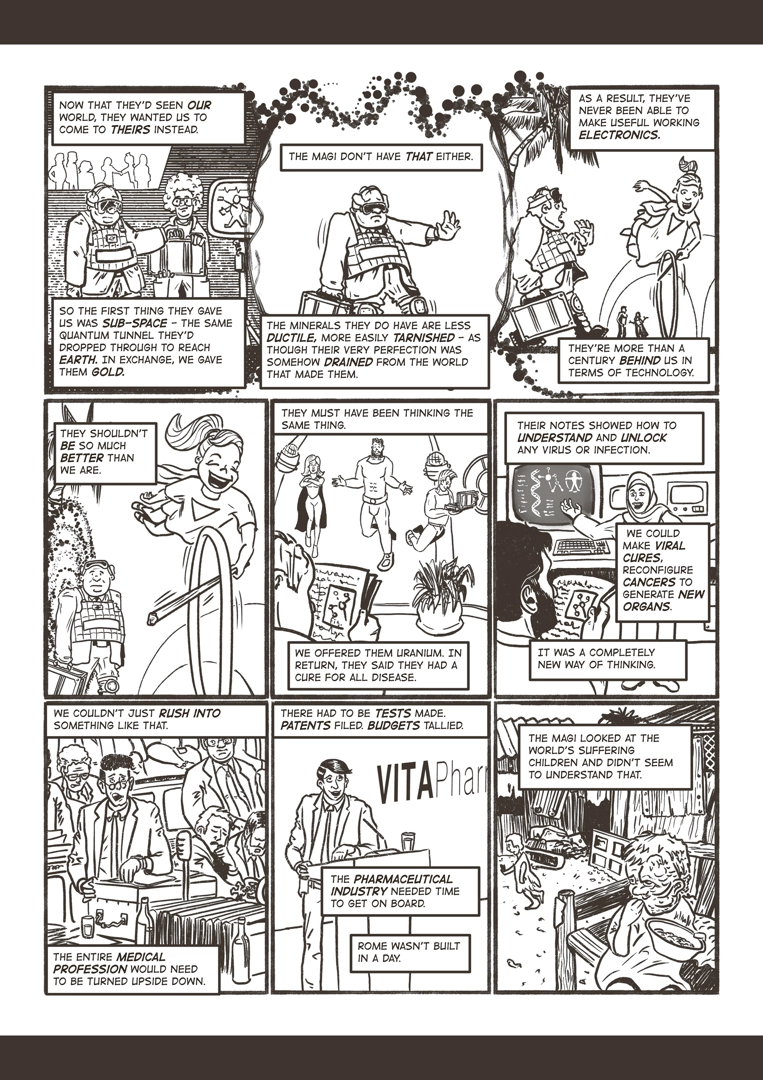
Next, I started by laying down roughs. I worked fully digitally for this phase to save time with the looming deadline approaching! On the page, I created each of the frames based on my thumbnails, and then I added in the pencil roughs. You can see these below, minus the page borders which I forgot to export for this learning log!
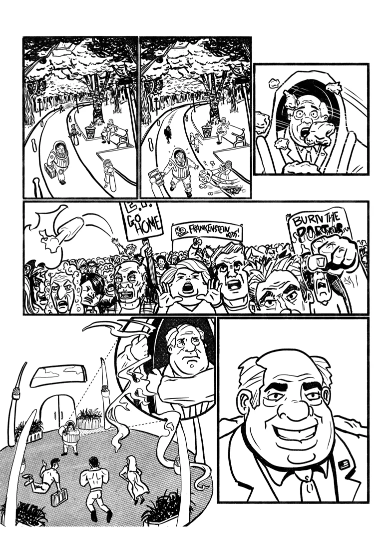
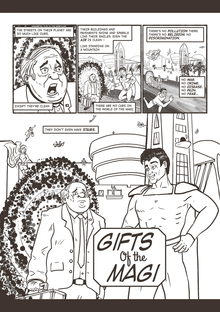
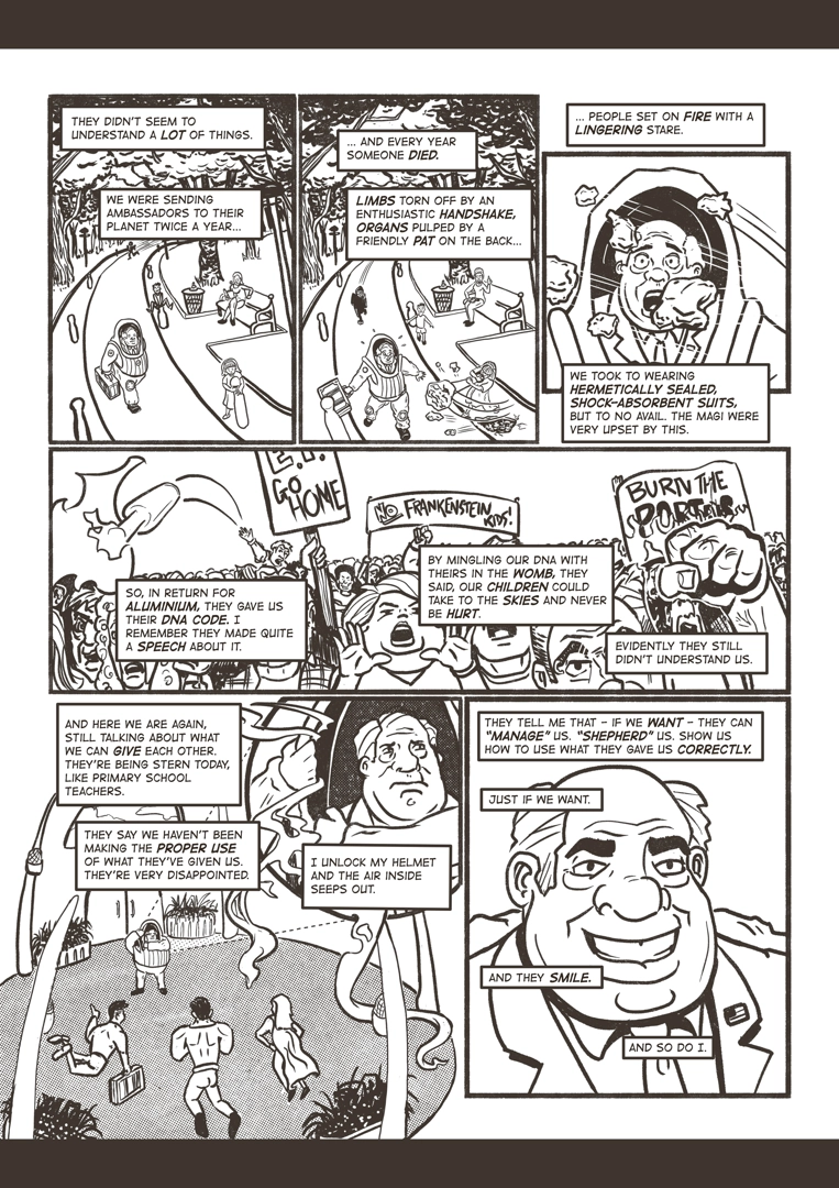
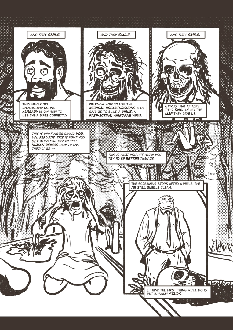
Working on the pencils allowed me to play around with some of the compositions and layouts. I tried to make a conscious decision to make sure that my story had a wide range of diverse people represented, as I was reticent to conform to the tropes of the mainstream comic industry. Once I was happy with the pencils, I laid down the ink lines on top. This was a time-consuming process - so much so that I almost ran out of time, and was inking the pages into the early hours of the first convention day!
On the morning of the convention, I added the wording. This was far more time-consuming than I expected, and time was quickly running out before the submissions opened in the convention centre. I was panicking, as I was also very tired. I had already made trade-offs about the level of detail in some of the panels due to time, and now I was worried I would miss the deadline altogether.
However, I was pleased with my efforts and final result given that I had managed to pull everything together in about a week, alongside my normal day job which at the time was extremely stressful and draining. I loaded the finished document onto a USB drive and headed to the convention with my family. The submission line was long, and they did not have a very efficient process, so I ended up standing in line for the better part of two hours! It was very tough for someone with ADHD like me, and there were a few times when I almost walked away due to the combination of frustration and anxiety.
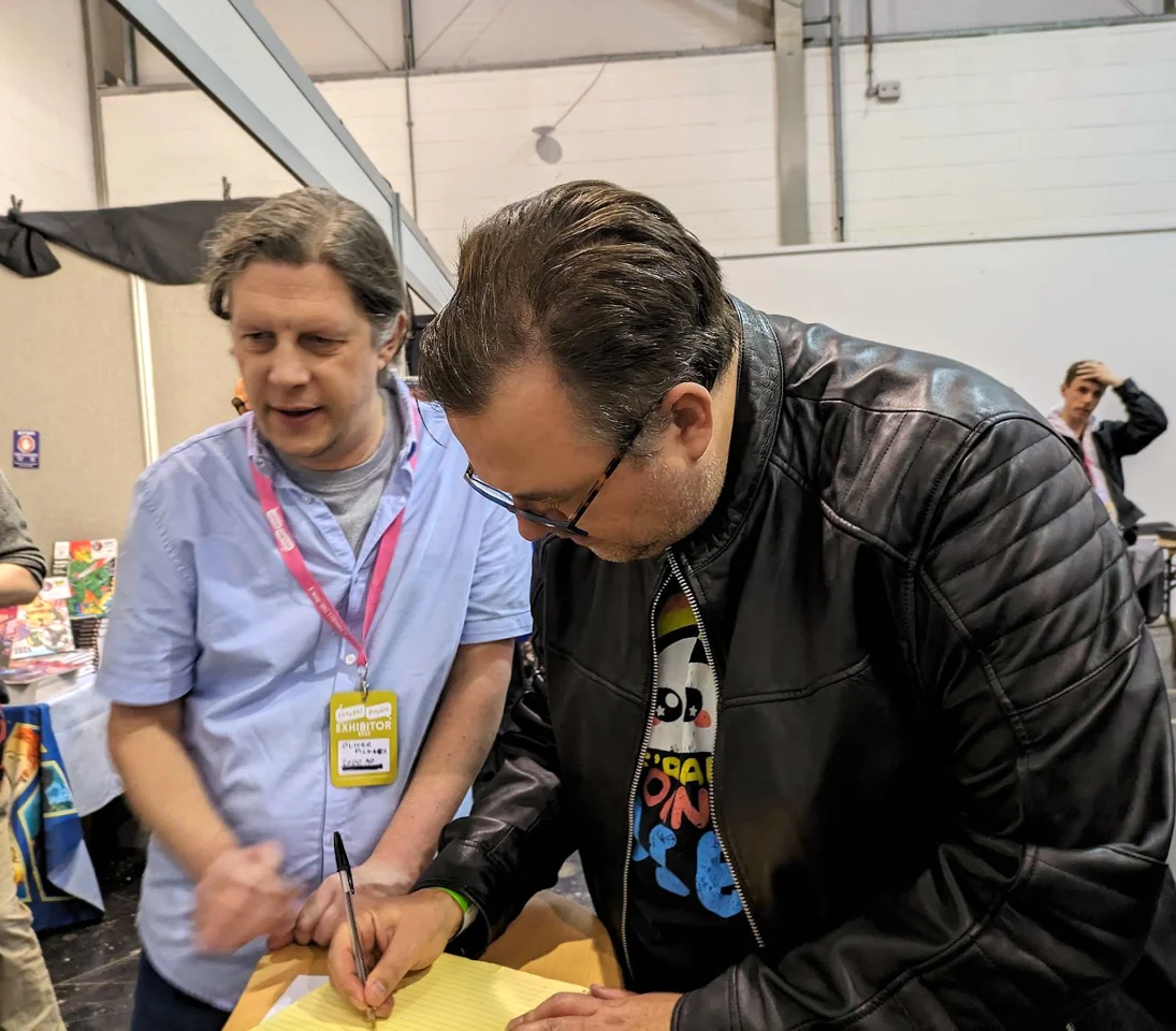
However, I persevered and submitted my work and was able to receive feedback from the 2000AD team.
I knew as soon as I got there that I didn't stand a chance, but I had not gone there to win. I had gone there to show up and show my work. It was clear to me that my particular style wasn't really what was typical for Future Shocks. However, I would rather do something that represented me as an artist than try and conform. Some of the other artists' work was beautiful and they obviously had taken a lot of time on their pieces, yet at the same time, so many of the entries just blurred into one.
The judge gave me some feedback, though he spent a lot less time with my entry than with some others, it felt like being written off right at the start. There were some useful bits of feedback on areas that I can concentrate on. Particularly to practice drawing people doing things. Some of my posing didn't read very well or seemed awkward. He also gave me some useful advice around word placement so people don't think you are trying to hide bad art! He also said that based on the final page, I do gruesome really well! What let me down was some of the larger frames lacked detail, which given their prominence they needed for a better visual payoff. This was fair, and a lot of my choices were driven by the fact that I had run out of time.
They made no mention of the work I had done to add humour and diversity to my panels. The constructive criticism definitely stung, but I found that I was able to sift out the useful parts without getting too emotionally invested. This was a big step forward for me. I also learned while I was not a good fit today for Future Shocks, that didn't mean I wasn't a good fit for somewhere else. Likewise, if they didn't notice the humour and diversity, then maybe these are not the kind of comics I should aspire to be in right now. Realising this gave me a lift, and I came away excited to explore the convention over the weekend and get a better sense of who my people might be...








Comentários