I have been in somewhat of a crisis. My mental health has been at rock bottom and it's left me at times considering very dark thoughts indeed. I am proud to write that I eventually asked for help, and while there is still a lot of uncertainty and anxiety around income and looking after my family, I am moving forward. I have had constructive conversations with different people, and all of them influenced how I approached this assignment.
My original plan for Assignment Four was to create a bass guitar whose body was illustrated based on the assignment's theme of "You are here". However when I came to starting the assignment months later than planned my tutor and I agreed that the guitar plan was likely to be too ambitious given the timescales and my mental health. She and others gave me suggestions along the lines of turning the current circumstances into a project.
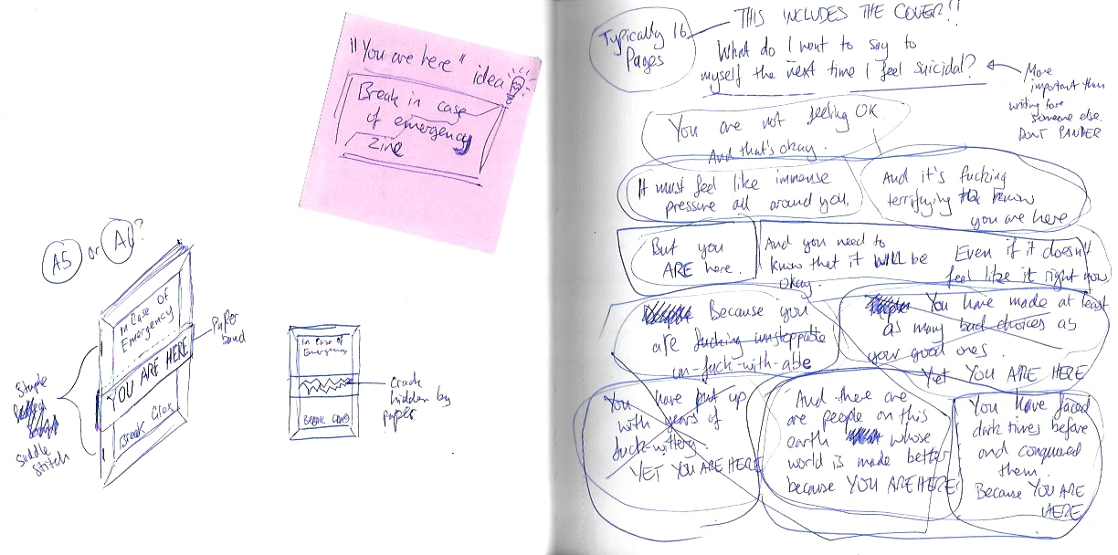
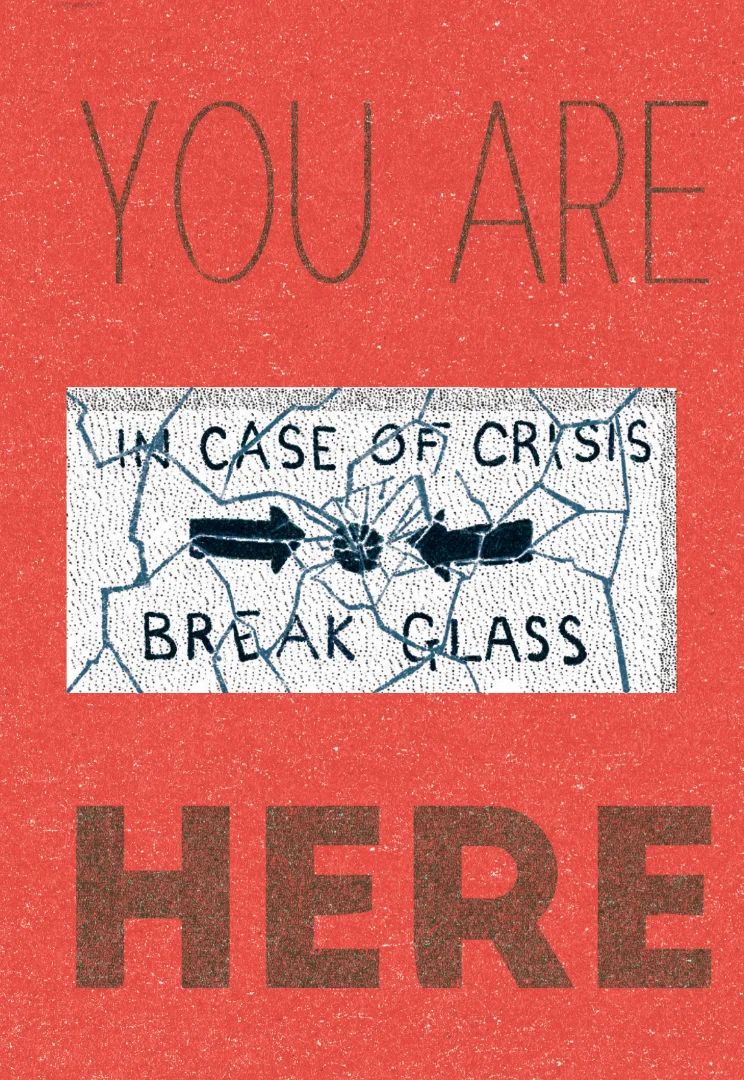
While I was having one conversation, the mental image of a fire alarm appeared in my head. I wrote the idea down on a post-it and placed it into my sketchbook so I wouldn't lose the idea. As I worked on my final exercises, the idea had time to percolate in my subconscious, and I realised what I needed to create. I needed to make something that was for me and of my sensibilities. No consideration of pandering to someone else.
So I decided to create a zine for me to read the next time my thoughts became dark. I made some quick sketches in my sketchbook - the idea was to have a zine that was bound by a piece of paper to 'seal' the book. When it was needed you would break the seal as an analogy to a fire alarm breaking its glass. I decided not to pursue other investigations - I had a strong personal need to create this, regardless of the assignment.
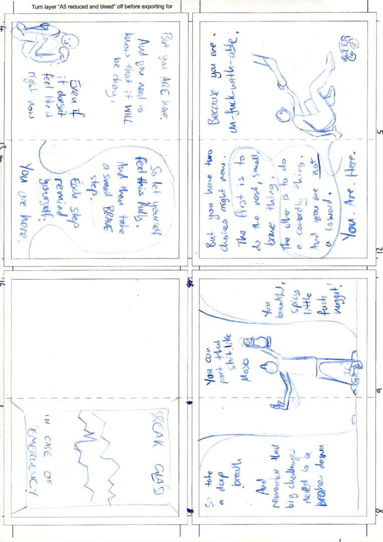
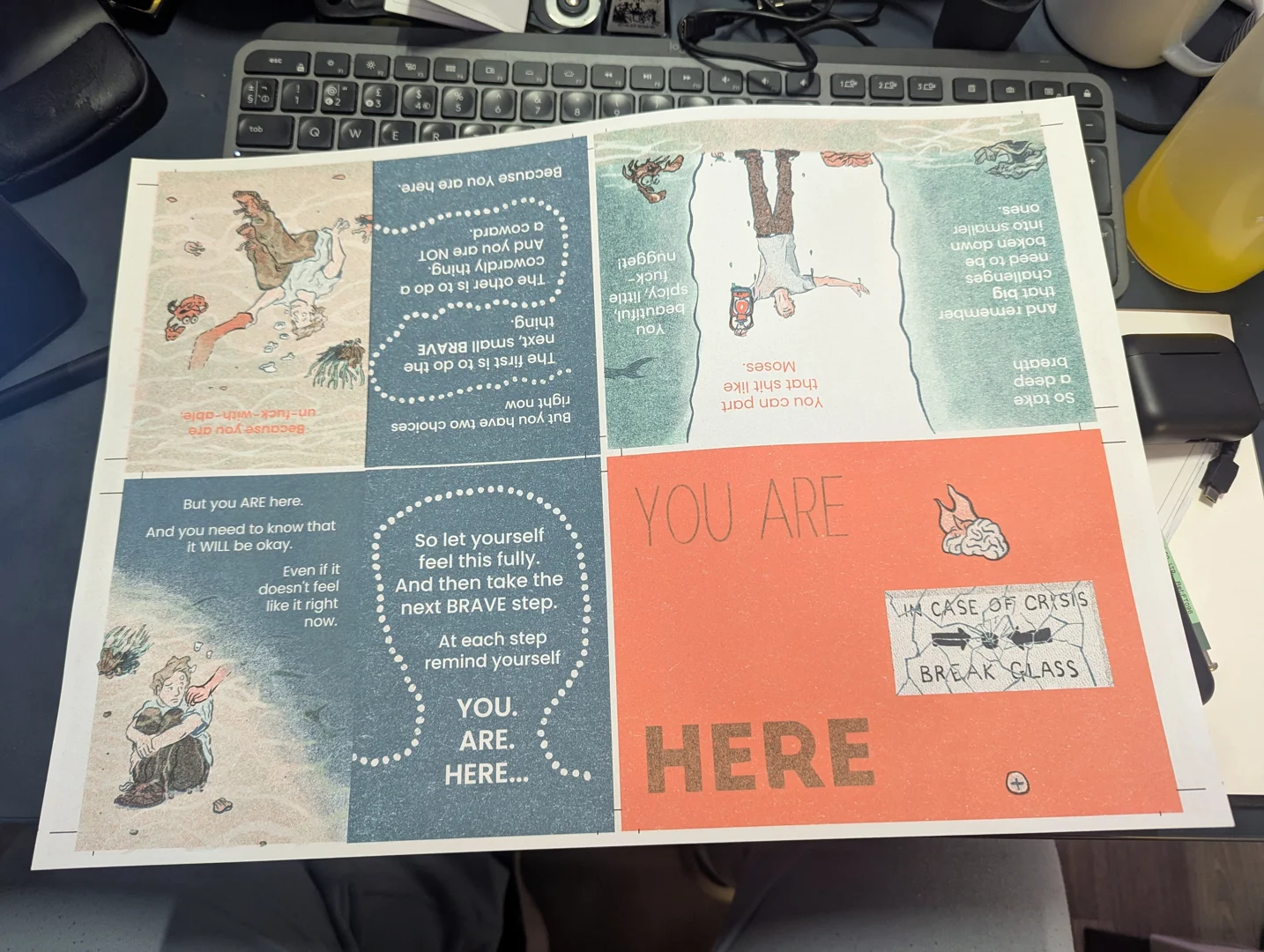
I started writing the text first, trying to brain-dump my thoughts and feelings onto the pages. I used the time to refine and edit some passages. I had decided to saddle-stitch the zine using staples, and through research found a useful A3 template to help me lay out the zine using one sheet. I first printed this out on A4 to check the alignment printing double-sided (I used a lightbox to check the crop marks). It was not perfectly aligned, but within a margin that I felt I could tolerate. I had printed out two copies, so first used one of them to cut out and assemble, so that I could get an idea of how the pages related to one another. This was useful for my spatial awareness!

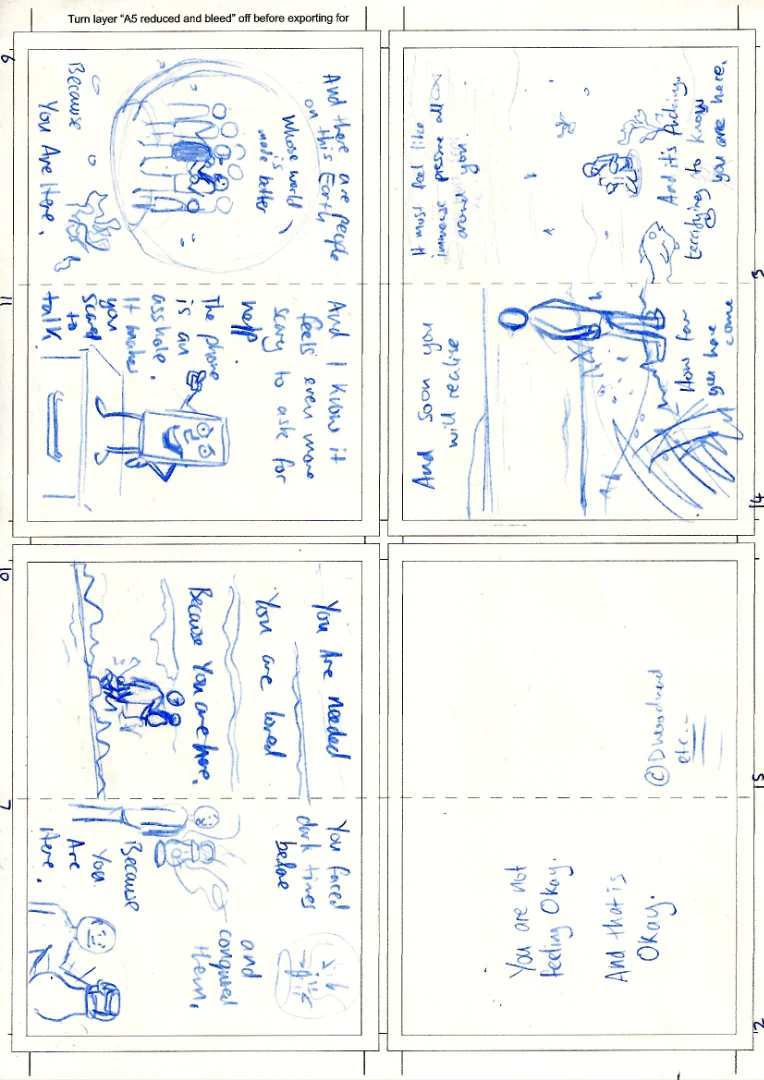
On the other copy, I decided to use it as the sketchbook, drawing out my ideas as rough thumbnails, and incorporating the text as I went. This required me to re-think certain ideas as I went, and I tried to work out a good flow for the text. It was tough to gauge how much to put on each page, and I iterated quite a few times in my sketchbook (you can see the circles grouping passages) to get a flow that worked for the 'story' as well as the overall zine layout and number of available pages.
After a while, however, I was left with two pages of roughs. To get a sense for the overall pacing and readability, I then decided to cut out and assemble the roughs as well, which ended up being extremely useful. I was able to get others to read the rough draft and their feedback helped me to make editing choices that were very helpful when it came to the final artwork.
As I didn't get a chance to try the Risograph look for my previous Zine exercise, I used this as an opportunity to follow through. I did research on different Risograph colours and looked at a number of popular combinations. None seemed to gel with what I was looking for, so I looked at some comics and books I had that used limited palettes, and I used this inspiration to come up with a three-colour combination that I hoped would give me a lot of tonal combinations, had a certain sombre gravitas as well as a bright spot colour for energy.
I then started to create the final image, which allowed for a lot of trial and error on how best to tell the story as well as practical considerations about creating the risograph effect. You can see the full process including my stumbles and re-works in the video below:
Once completed I checked the colours for printing on my office printer, and printed the finished work out at full A3 size:
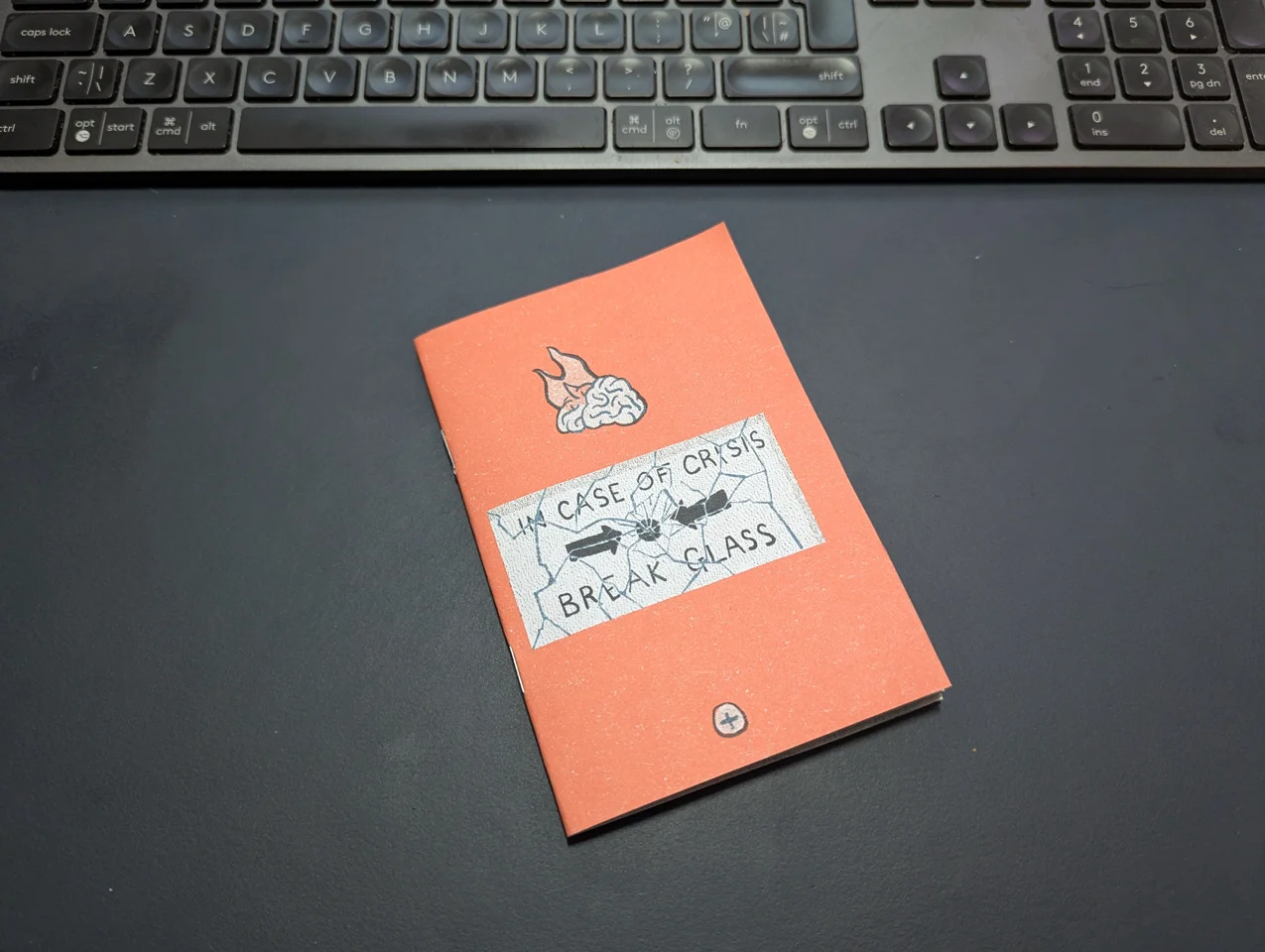
I knew that the alignment wouldn't be perfect, so I decided to cut out the pages by hand instead of using a guillotine so that I could make adjustments on the fly. There were some errors (from a technical and human perspective) along the way, but I was able to overcome them enough that it would be difficult to notice them. I assembled and stapled the zine together. I was very conscious at this point that I wanted to get the assignment completed, so decided to defer the paper strap until after I had written things up, as it would require some separate design and printing that was not necessary to make progress.
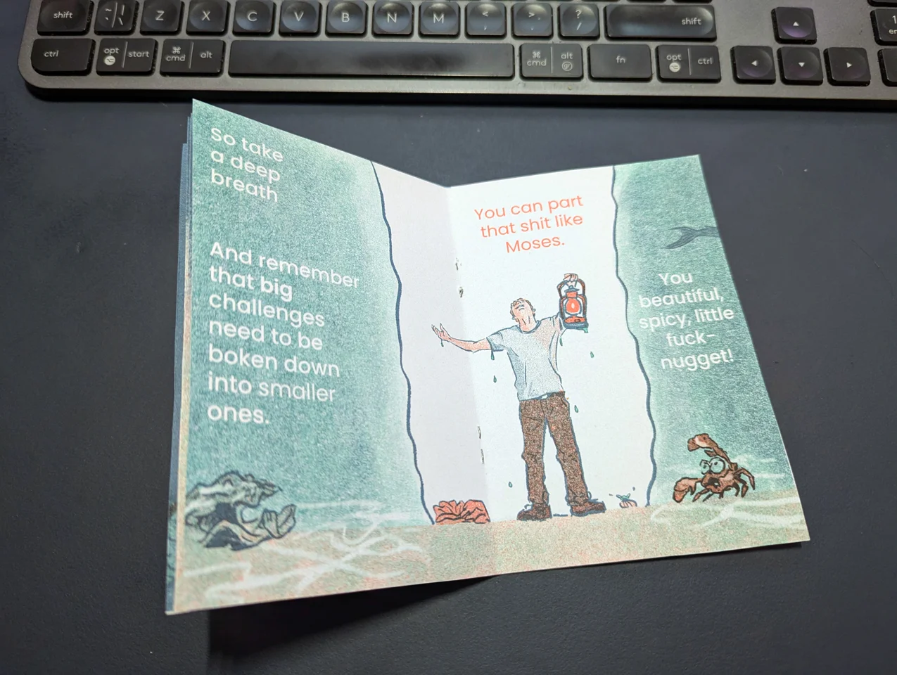
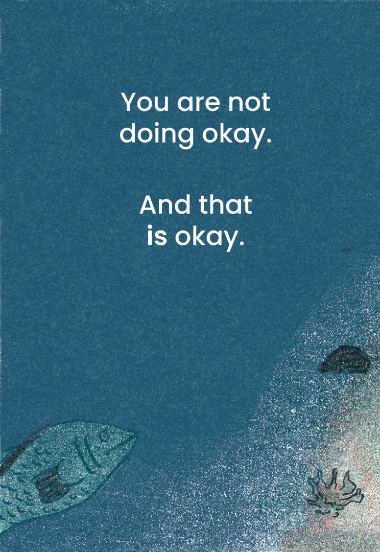
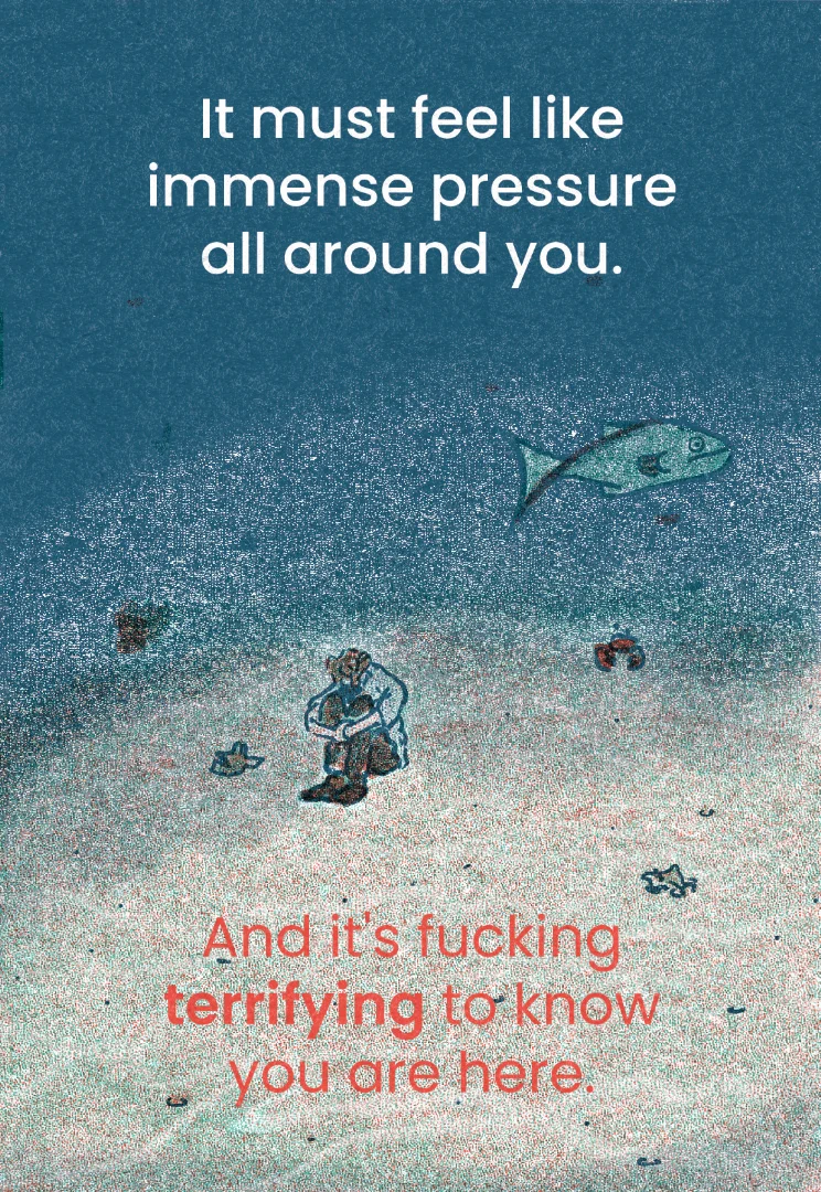
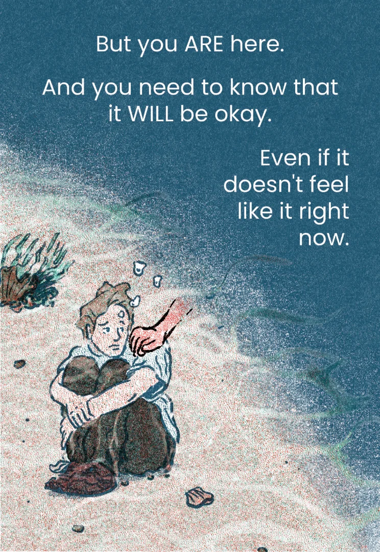
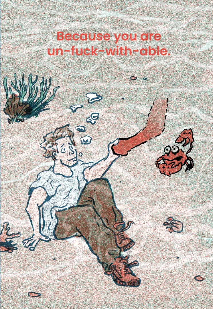
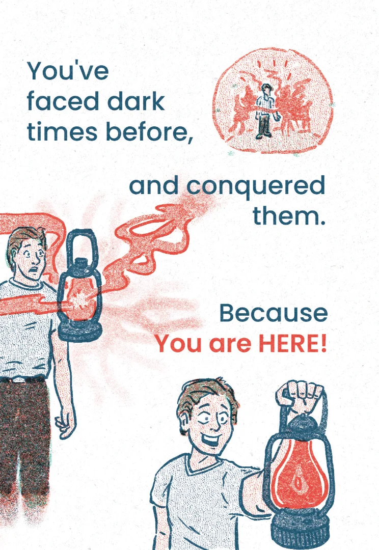
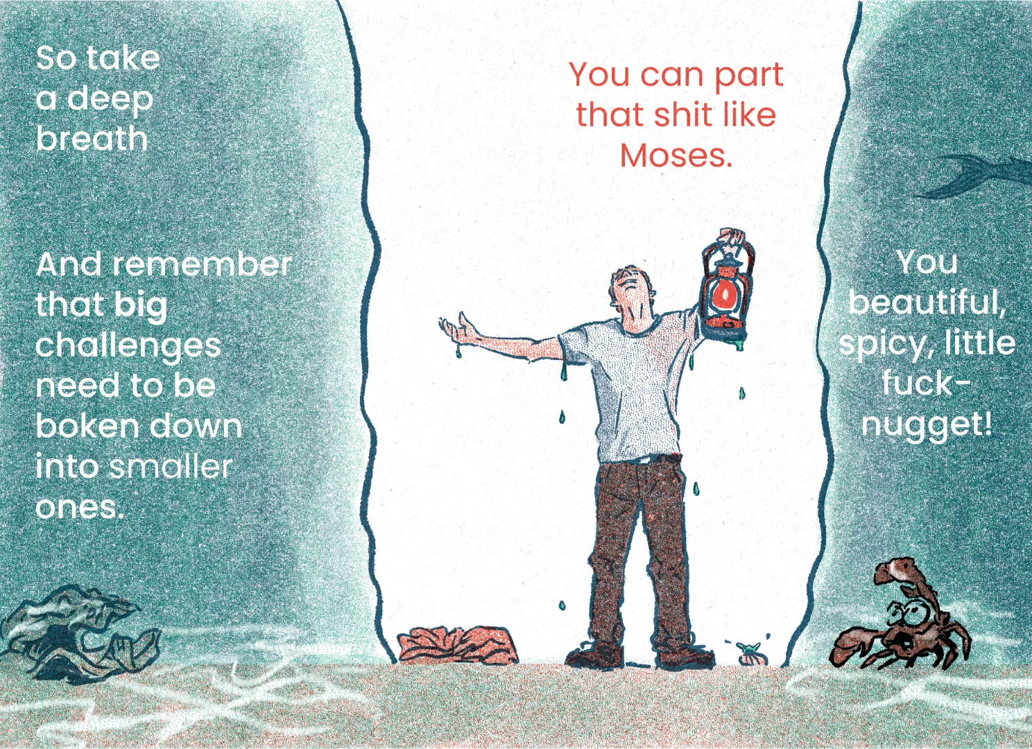
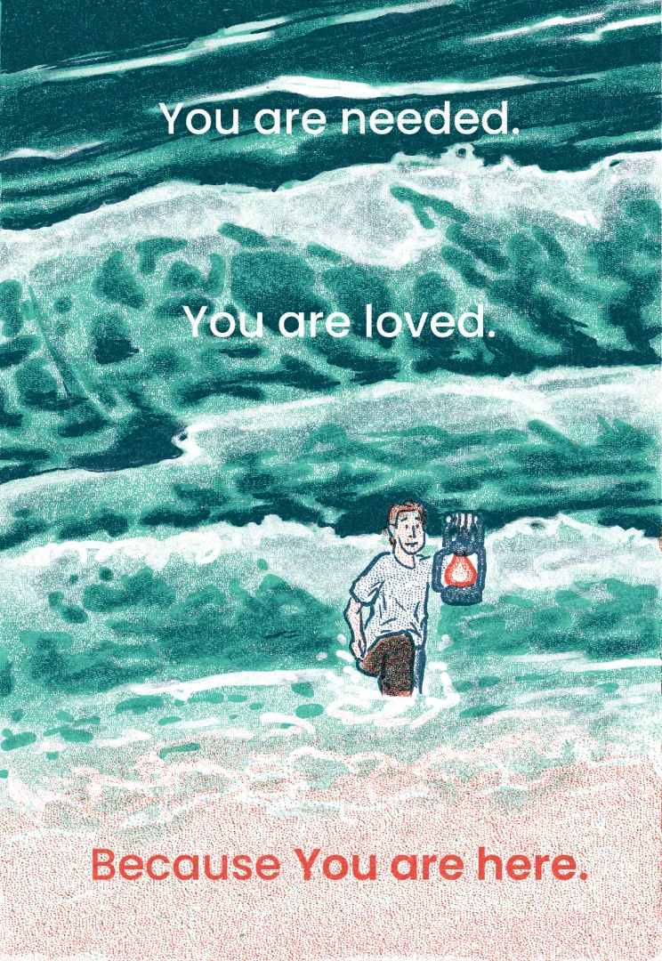
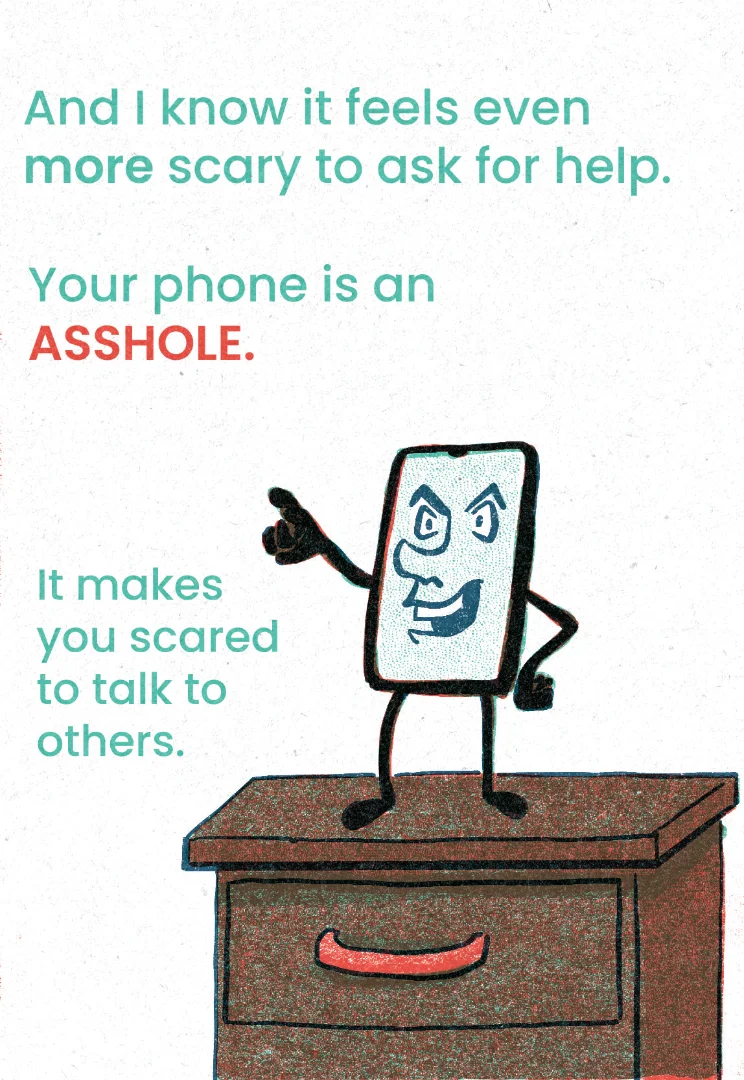
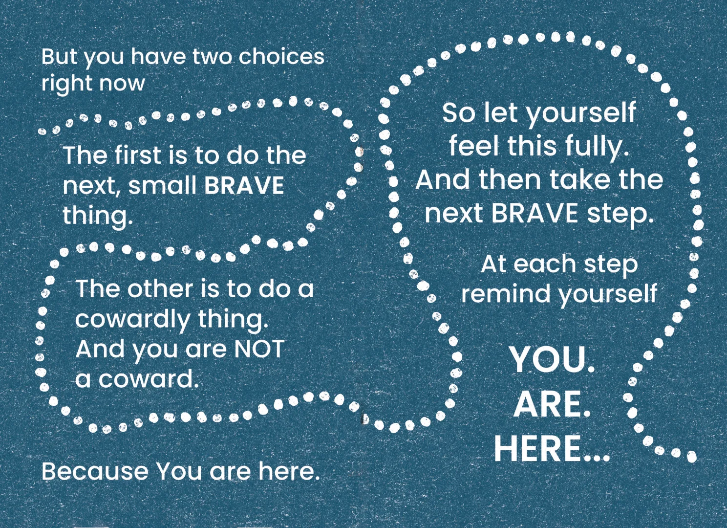
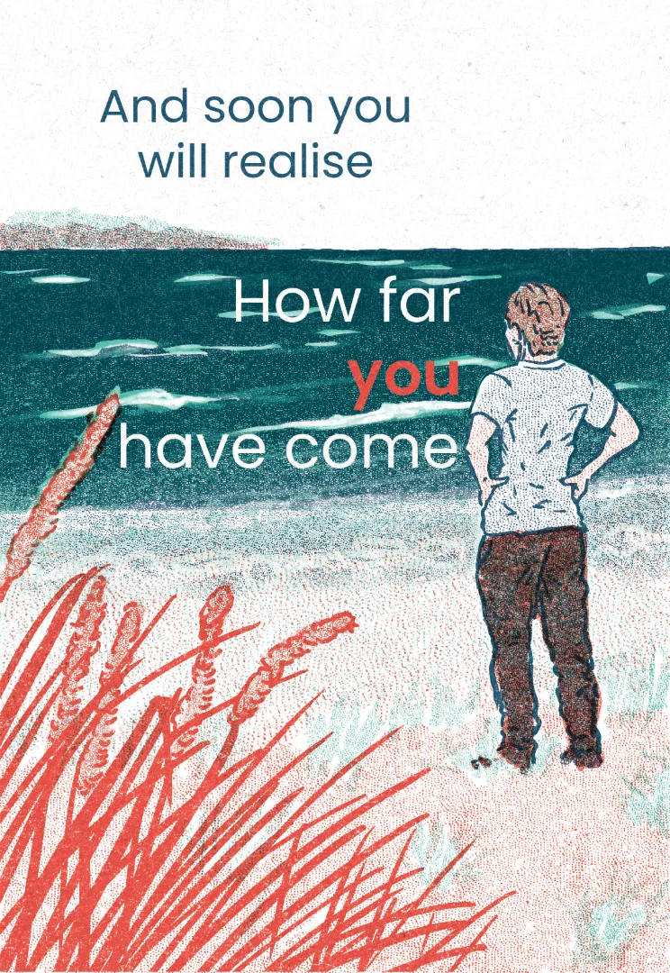
I am very pleased with the quality of the print and the overall read. I think some of the visual elements are very powerful, and I am really pleased with the improvement in my ability to render believable scenes, especially given I was experimenting with the layered risograph approach for the first time.
When I set off on this assignment, I gave myself a personal goal to create a zine that I would feel comfortable selling, should I ever have my own stall at a comics fair. My conversation with Lucy Sullivan was a massive inspiration not only for the content but of my own skills and perseverance. I am very proud of what I have created and would be happy to place this zine on a stall. It also paves the way for me to explore these ideas more fully in future projects.
It's easy in retrospect to see elements that you would change, and I think there are sections where the layout and composition could definitely be improved. However, I think there is something to be said about a self-published zine being perfectly imperfect. I have an affection for the small foibles and idiosyncrasies of this booklet and don't really want to change things.
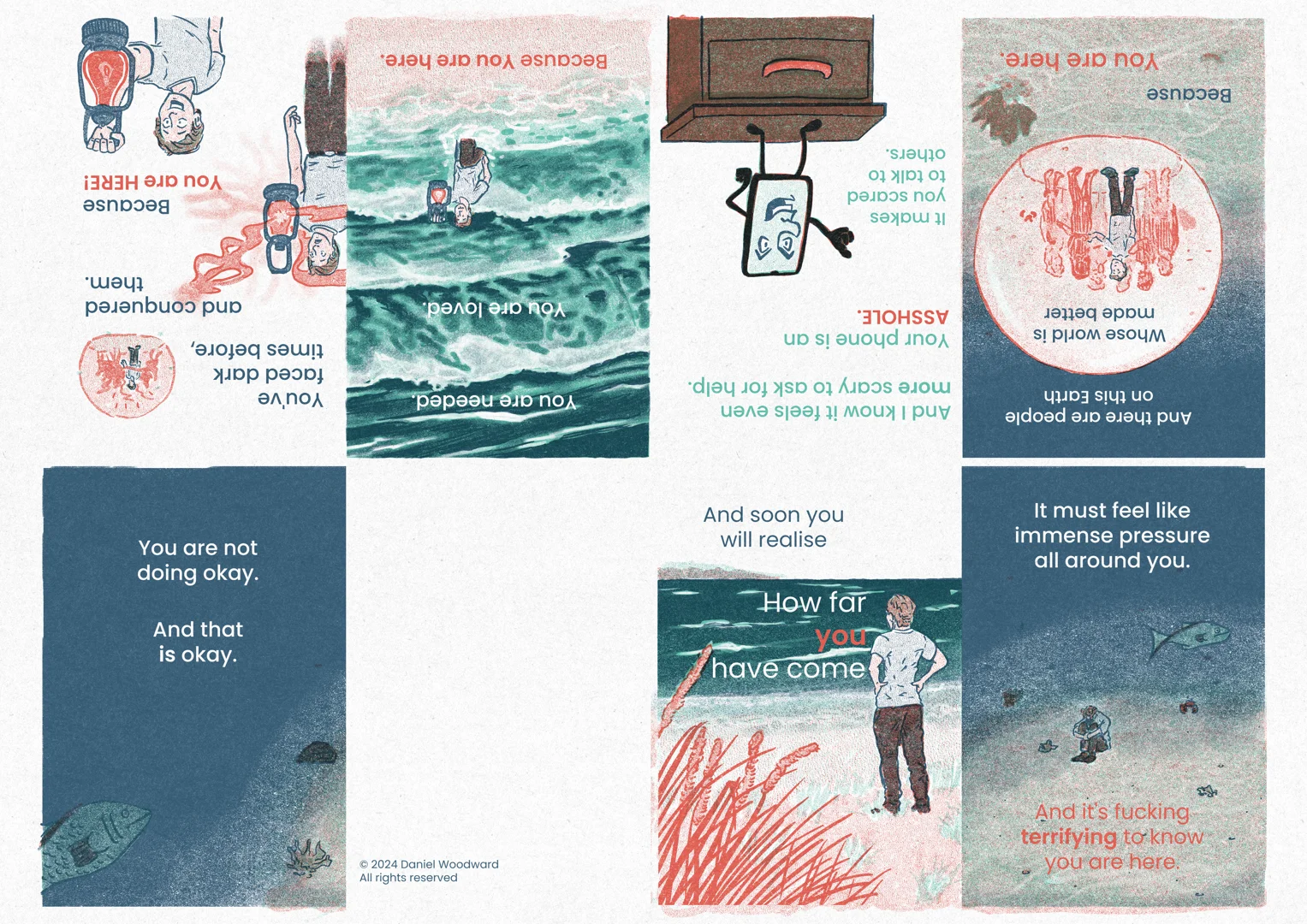
The colour scheme worked well, even if I sometimes got some of the value choices a little wrong. The front cover seemed to work at first, but I felt it could be simplified. I also realised that the printed zine would be hard to translate online (for self-promotion etc.) so I decided to take each page as a separate panel and created optimised web images. This also gave me the opportunity to re-design the cover page, and I think the simplified version works a lot better.
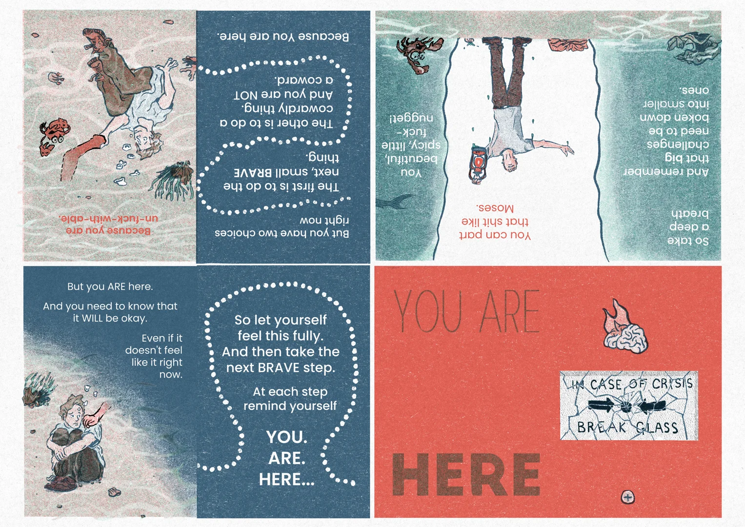
I am still looking for work, and I challenged myself to put my work out into the world. The individual images would work fine for normal social media, but I wanted to go further and start putting my illustration work out on LinkedIn, associating my 'day job' persona with my illustrations. However, I knew that the platform would not let me upload a load of images in a way that they would then read easily. So I opted to create the zine as a single image, creating a comic layout of sorts:

I also took the opportunity to run this image through Glaze, to protect it from being harvested by Microsoft for use in its generative AI. This was the first time I tried to do this, and while it's time-consuming I think it's worth it. I signed up to Clara over the summer, which is anti-AI. It now has Glaze built into the application, so I think I will try to build up a portfolio on Clara, reposting older images as well as more recent ones to create a visual identity.
I am relieved to finish section four, but the emotion I feel most today is pride in my perseverance and resilience. And pride in what I have created. This was fully 'by me, for me', which I think is a massive step forward and will stand me in good stead ahead of my final assignment and into Level Six of the degree. I am looking forward to my tutor's feedback, and will reflect on things when I see what she has to say!



Comments