So here we are, Assignment Five - typically where everything comes together. For this module's final assignment, the task was very matter-of-fact: respond to a brief! I was given three potential approaches to choose from, which did give me a good deal of flexibility to adapt an approach that would fit into whatever my current context happened to be:
A self-directed project. Very much in the vein of recent exercises, this would be a passion project that could form part of a portfolio.
A competition brief. Useful for building experience in safe and fun ways, as well as building out your portfolio with externally-led briefs.
Work with a client. Real work; no frills, and an authentic experience of working directly with an illustration client.
Given my current unemployment, I have been trying to leverage any income opportunities. When this assignment was on the horizon, I reached out to a community of startups and entrepreneurs I am part of, to see if there were any opportunities for illustration commissions. As we are coming up to the winter holiday season, I imagined there might be a need for seasonal cards or gifts.
I was happy to get two responses - one direct and one referral. The direct response was from a trio in the community who planned to start a new podcast. The referral was a larger project dealing with illustrations for a training course. I will deal with the latter opportunity first, as (spoiler alert) its timelines meant that I could not complete the brief in time for the due date of my assignment! However, as it is still very much an ongoing opportunity, I am including it in the 'business' aspects of this assignment.
Workshop Illustrations
I received an email from a community member after one of its organisers had recommended me. Alan Wick is an inspiring serial entrepreneur, and a thoroughly nice chap to go with it. We had met a few times before at some mutual events but had never properly connected.

At first, I was a bit nervous that I had been recommended for 'graphic design' work. However, as I knew Alan a little, I was more than happy to set up a chat and not make any assumptions. I do have a tendency towards 'all or nothing' thinking, so I was conscious that I risked turning away from an opportunity simply on the basis of semantics. I reminded myself that people were more familiar with engaging with designers than they may be with working with illustrators.

Following this, I arranged a Zoom conversation with Alan via his PA. The conversation was enjoyable and useful, and I took notes to get an early idea of the brief. I quickly understood that Alan was not used to engaging in this kind of work, so there was no distinct brief. I told him not to worry - I could help him navigate the steps. After all, we were part of the same community and if I could help educate him then he'd be better equipped to speak to other designers and illustrators in the future. The main gist of the project was to humanise the course's content to make it relatable. I also had the advantage of my 'day job' as a consultant; I was able to relate to the topic and had practical experience in running training courses online.
Alan was also not aware of how other brands use illustrations to humanise their offerings, and I was able to use some online articles to give him a flavour of what was being created by brands. I used this as an opportunity to get an idea of what his taste preferences were, which would help me write a better brief.
We ended the conversation with the following actions:
I would create a brief for the project based on examples of his materials. This would help us both by making the deliverables explicit, reducing any unnecessary ambiguity or friction. It would also be a document he could use with other visual communicators should he wish.
I would use the brief to come up with some high-level fees based on what I knew.
Alan would decide what business his protagonist would run.
Alan would look through the examples of other companies and let me know what style/s he liked best.
Alan was pretty flexible with dates, so I set myself a target timeline to come back to him. Shortly afterwards, Alan sent me a follow-up.

It was on me now to go through and put things together. I wanted to get the brief completed by the end of the following week. However, I still had a lot of other spinning plates, so on the following Friday I emailed Alan to manage his expectations.

There were some areas which were unclear to me, so I was able to clarify them as questions. This also gave me some breathing room as the ball was back in Alan's court. The following week he came back with answers to the questions, which helped me to refine the brief document. It was really useful for Alan to supply examples from the course, and we had discussed the platform he would be using so I had some context on how the lessons would be created and uploaded. In addition, he had put together a business case for the course as well as provided a 1-page summary sheet for his brand which had been put together by a specialist. I had to make some assumptions at this stage as to how many overall illustrations I would need yet the combination of the documents and my experience with training courses helped me to make educated estimations.

I used guidance from the resources on the Association of Illustrators (AOI) website to price up the illustration and design work needed. It was potentially quite a large project, yet there was also a lot of opportunity for re-use in different sections of the training. I also had to weigh up my overall experience as an illustrator. However, I did temper this with the experience I added as an experienced trainer and consultant, which gave me a lot of context knowledge that Alan would benefit from.
I am pleased with the brief document I put together, and I think I demonstrated a good deal of care, attention and observation in making it. The copy you can see above also includes a comment I left for Alan when sharing the file (he is familiar with Microsoft Office, so a Word file felt most appropriate). I felt it important to call out the need to demonstrate diversity in a project like this so that entrepreneurs from all walks of life would feel seen when taking the course. Alan was already conscious that his fictitious protagonist character might be too middle-class, and I felt that this was the next logical extension of that need for representation.
After I sent the email I realised that I had missed an action I had written in my notes: I had agreed to send Alan some examples of my work so he could get a sense of my approach. During my initial call with him, it became very apparent that these kinds of conversations were so much harder without a portfolio. My work is well organised, but that means going through various different folders and that is difficult to do in the middle of a conversation. I sent Alan a quick follow-up email to give him a selection of illustrations that I thought would give him an idea of both what I could do, but also how my work could fit a style similar to the ones he enjoyed most from other brands.

Alan came back to me a little later to let me know that he had received the information and would come back to me soon.
Conclusions
This opportunity is still very much in progress, however I am pleased with how I have managed it so far. I think it allowed me to project the right balance of energy and confidence to my potential client, which I hope will stand in good stead when it comes for Alan to make a decision.
It's clear that need to get a proper portfolio set up so that I can have more productive conversations with potential clients, and while I know where I would like to focus my portfolio, I do think that having good, consistent work from the advertising and editorial sectors will be useful. As much as I might not be a graphic designer, I am a visual communicator, and getting close to that side of things will afford commission opportunities I might not otherwise receive.
Podcast Illustrations
Two members of the entrepreneur community have been planning to start a podcast together for the better part of four years! They have finally managed to get the ducks in a row, and with the assistance of another member who has a background in media as their producer, they have started setting up and recording their first podcast episodes!
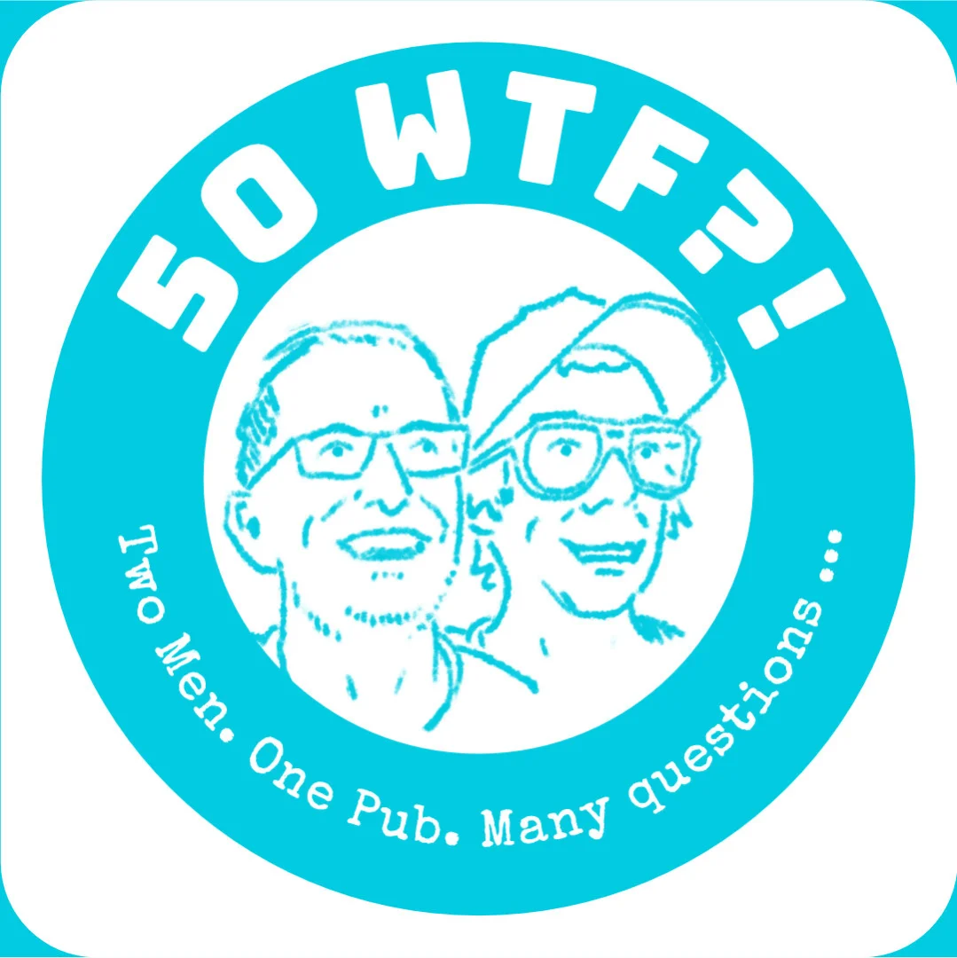
Entitled "50 WTF?" it's a podcast that deals with real talk about what it's like to be a man entering his fifth decade. Recorded in a pub, it is intended to be for the everyman and the pair bring their own unique humour and energy to the project. They approached me to create some images to help build the podcast's identity and advertise it on media platforms.
We started with a Zoom conversation to discuss the brief. They both have some experience with design but had not made an illustration brief before. I walked them through some of the aspects that I would typically look for. They came back with a written brief which was a great start, and we refined the conversation via WhatsApp until we had this second brief ready:
This was a great starting point and was a good summary of all of our discussions. I managed their expectations regarding dates, as I was concentrating on my coursework for Part Five - mainly because all of it would inform the engagement and hopefully let me do the best job possible for them. By the end of November, I was able to sit down and put together a proposal based on the brief. I based my pricing on the calculator from the AOI, but even that was recommending a price which was just not practical for a project that had no commercial goals. So I manually adjusted things down to a place where I thought it balanced the project's needs, my time, and the kind opportunity to complete a paid commission. I made sure to email this as a best business practice to keep essential communication recorded.

Laurence, my main point of contact, came back to me via WhatsApp with some clarifications:

I was a little surprised that (as someone who ran an agency and worked with designers) he had not heard of licenses other than 'lifetime' (perpetual) ones. I didn't make a fuss about it, but I was a little concerned that (if I were to go by the AOI's guidance on licensing) I should strictly be charging more for the additional needs. I felt a lot of tension about charging a fair amount for my work and potentially pricing myself out of a job I wanted to do. So I tried to find a balance that increased the amount, but not significantly. At the end of the day, they were doing me a good turn by agreeing to a paid commission, and I was happy and proud to be involved in the project.
The next step was to send them paperwork to agree on the commission more formally. I put this together using the template from the AOI, which I adjusted to account for the fact that I would be operating through my limited company, so had to separate my person as the illustrator (and holder of the copyright) and the company who manages the business relationship, payment etc. This was thankfully not too difficult, as I had a bit of experience with managing contracts in my consultancy.

I processed the document using Docusign so it was all secure and could be signed electronically. Within minutes of me sending over the agreement it was signed and we were good to go!
Roughs
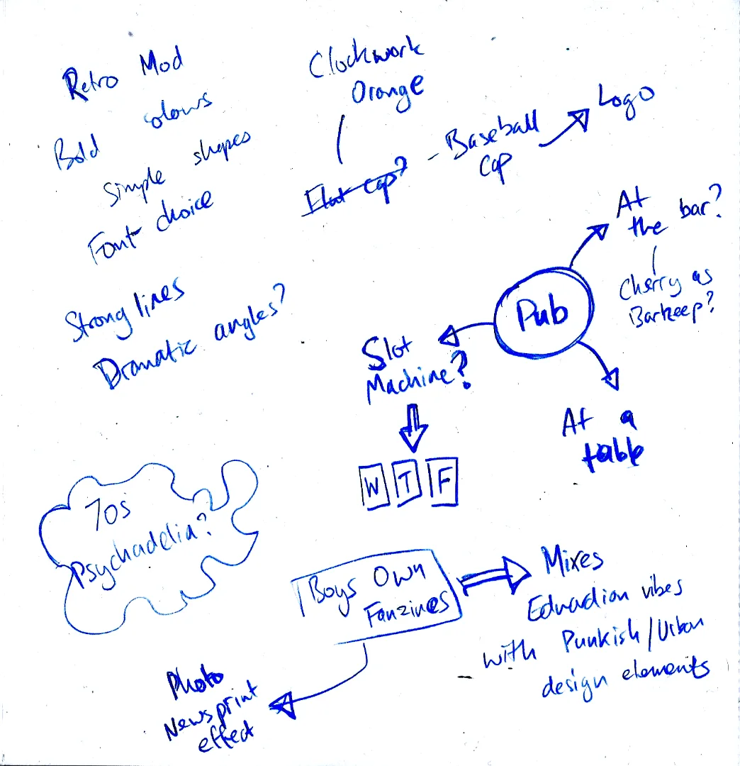
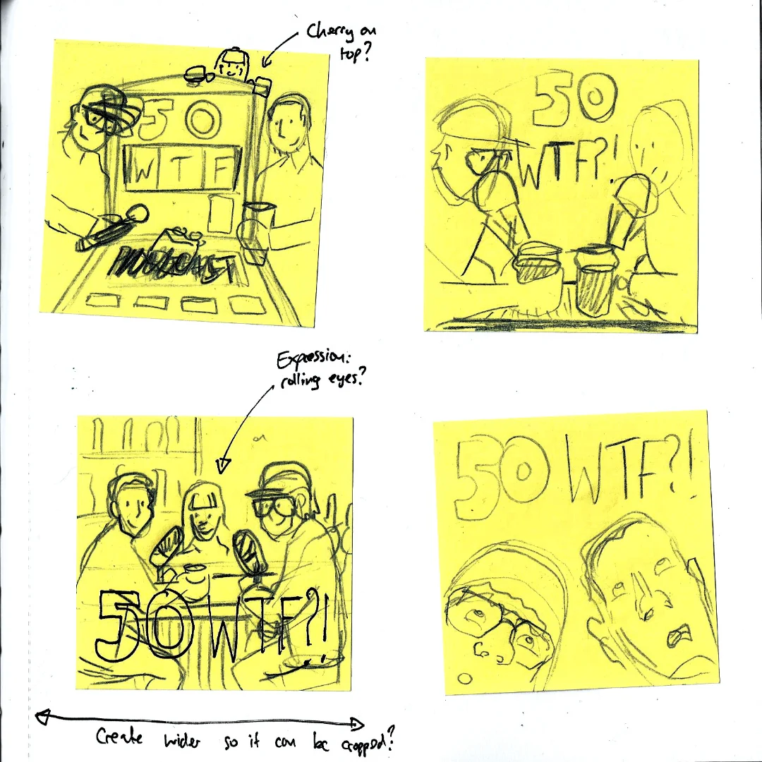
With the brief set, I started in my sketchbook to explore ideas. Quickly, I felt the need to explore the idea visually and started to translate the ideas into thumbnails. Given the square dimensions in the brief, I chose to use Post-its to help constrain myself to something small. It also meant I kept a sense of proportion for the overall composition.
After I had created four thumbnails, I ran them past my wife for some input (particularly given the brief's requirements). When she saw the square constraints, my wife was the one who suggested to me that perhaps I could also explore designs from the perspective of beer mats. I thought this was an ingenious take on the brief, so explored it more in my sketchbook.
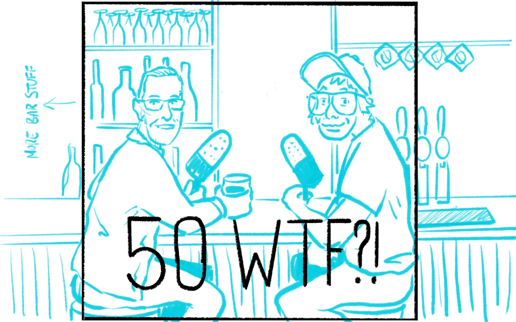
While I liked the beer mat idea, I did not think it met the brief as set out in the document. So I narrowed my next efforts on ideas which met the brief on paper. This is when I noticed that the current layout for the podcast has a hero image; I was concerned that a square image would not suit this space well, so I talked to the clients to explore the idea of producing a landscape image that could then be cropped for the Podcast cover image. I confirmed this amendment over email.

With this new remit, I then started to develop my roughs for the logo.
When I submitted the logos, the clients liked them, but I didn't get the sense that they were blown away by them. I suspected that, in making their brief very specific, they probably limited their options. I wondered if the beer mat direction might resonate with them, so took the risk to pitch the idea to them. Thankfully - they responded to it well!

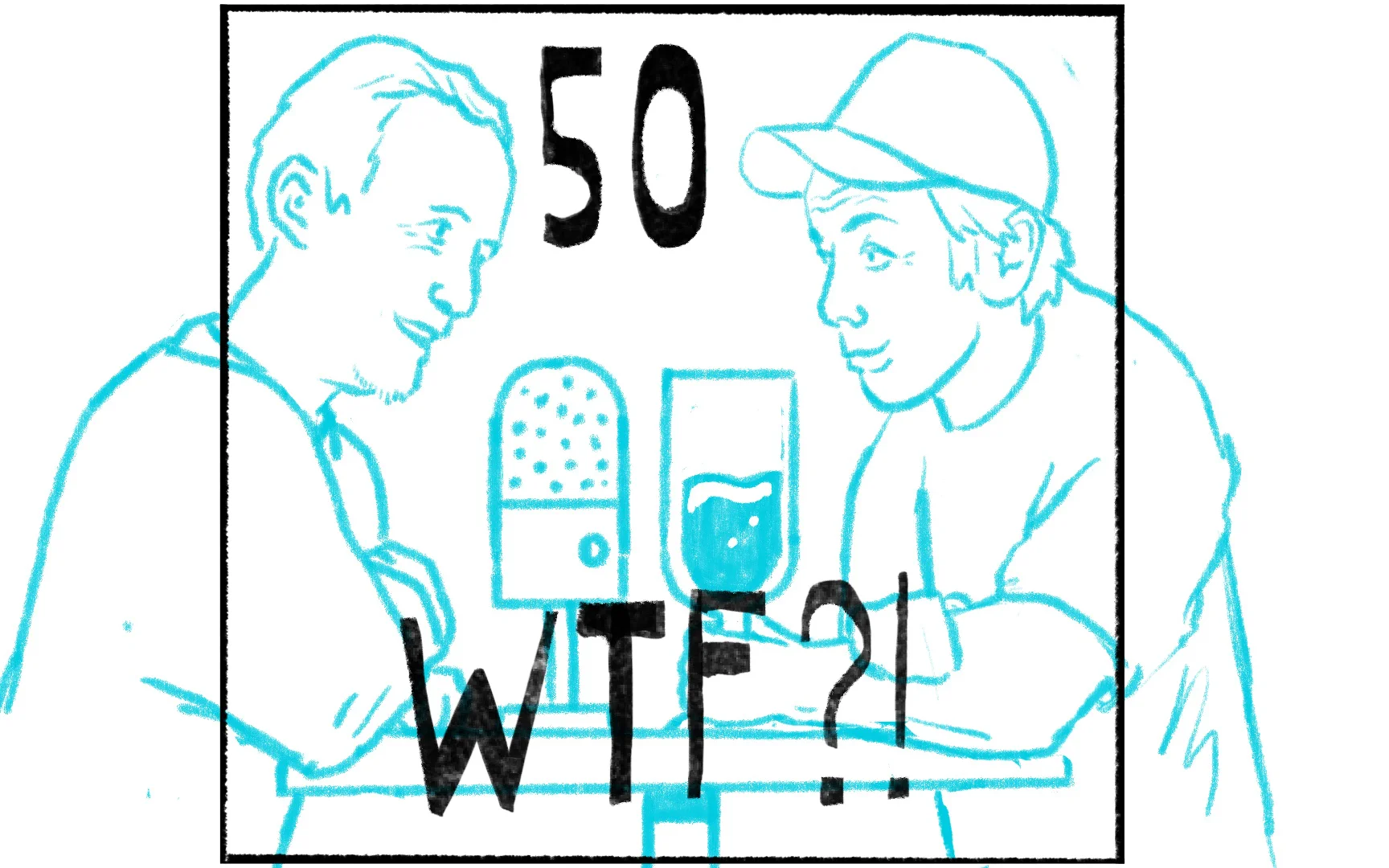
So I then went about translating the thumbnail into its own rough.

I experimented quickly with typeface, aiming for an effect similar to how some beer mat designs emulate a Victorian/Edwardian aesthetic. The clients took this a little too literally, so I quickly changed it to use the typeface in use on their website. Despite this only being a rough, they latched onto the style of sketches. I think the comment that Laurence looks old is fair enough, but I found it very frustrating how much they were latching onto details on a rough - whose very purpose is to focus on things like layout and not to get bogged down in details.
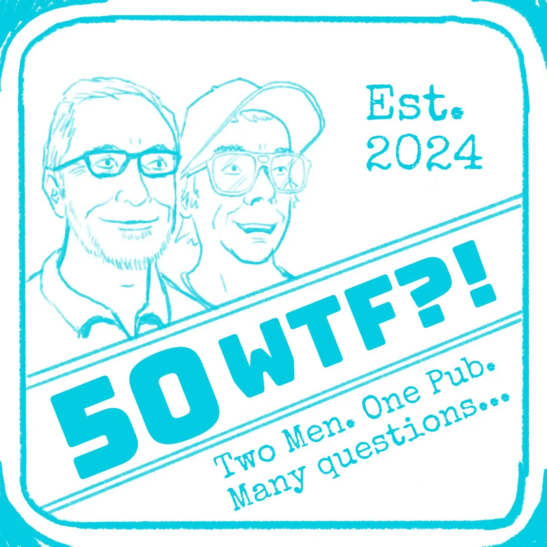
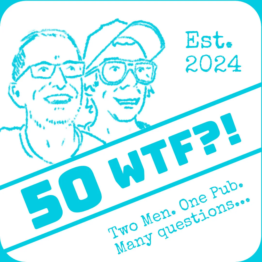
By this point, I had transferred the rough into a dedicated file in Affinity Designer. I had wanted to avoid being too digital at this stage, but the upside was that I could make changes very quickly and then post them to WhatsApp, which reduced the feedback loop time significantly. Given the relatively tight timelines, this was a significant advantage. What followed was a series of very rapid iterations, I purposefully re-drew the mini portraits to be chunkier and simpler, and it had the right effect of changing the narrative to the design and not the details. I also threw in some other variations which I completed while waiting for their feedback. They actually really liked the round version and thought it would work well for circular beer mat merchandise, but in the end, they opted for the slanted option for the needs of the podcast.
Headshots
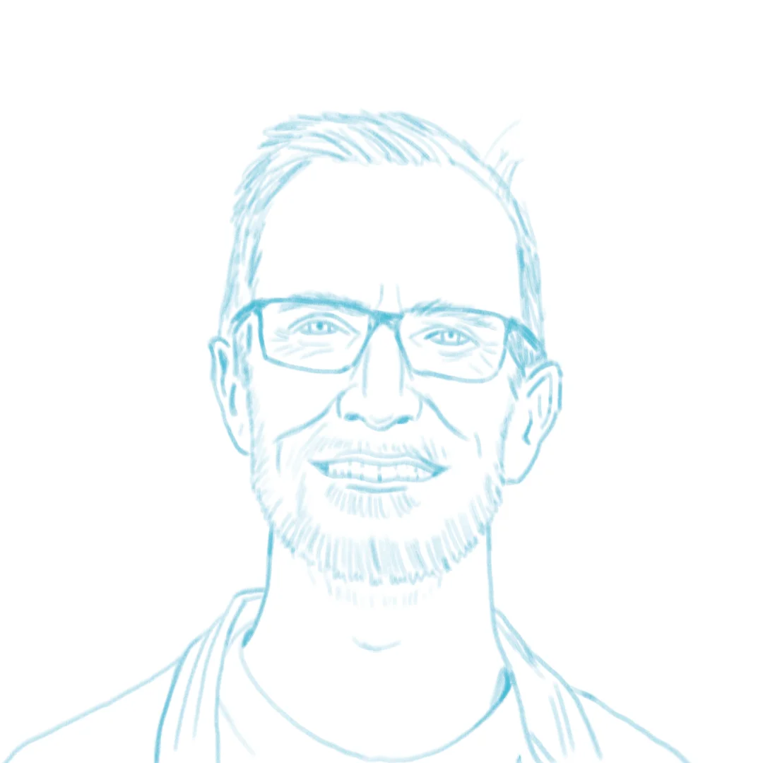
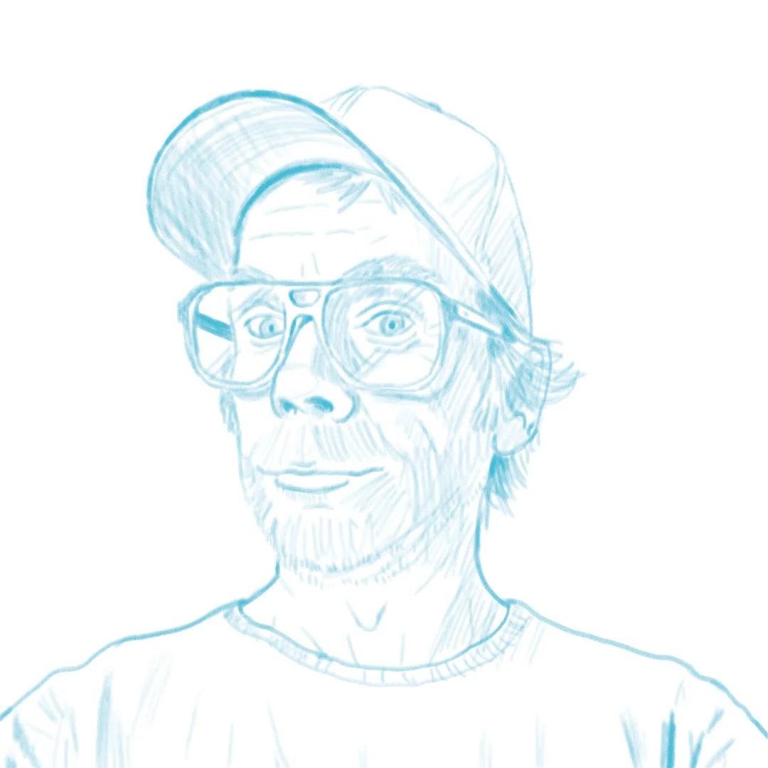
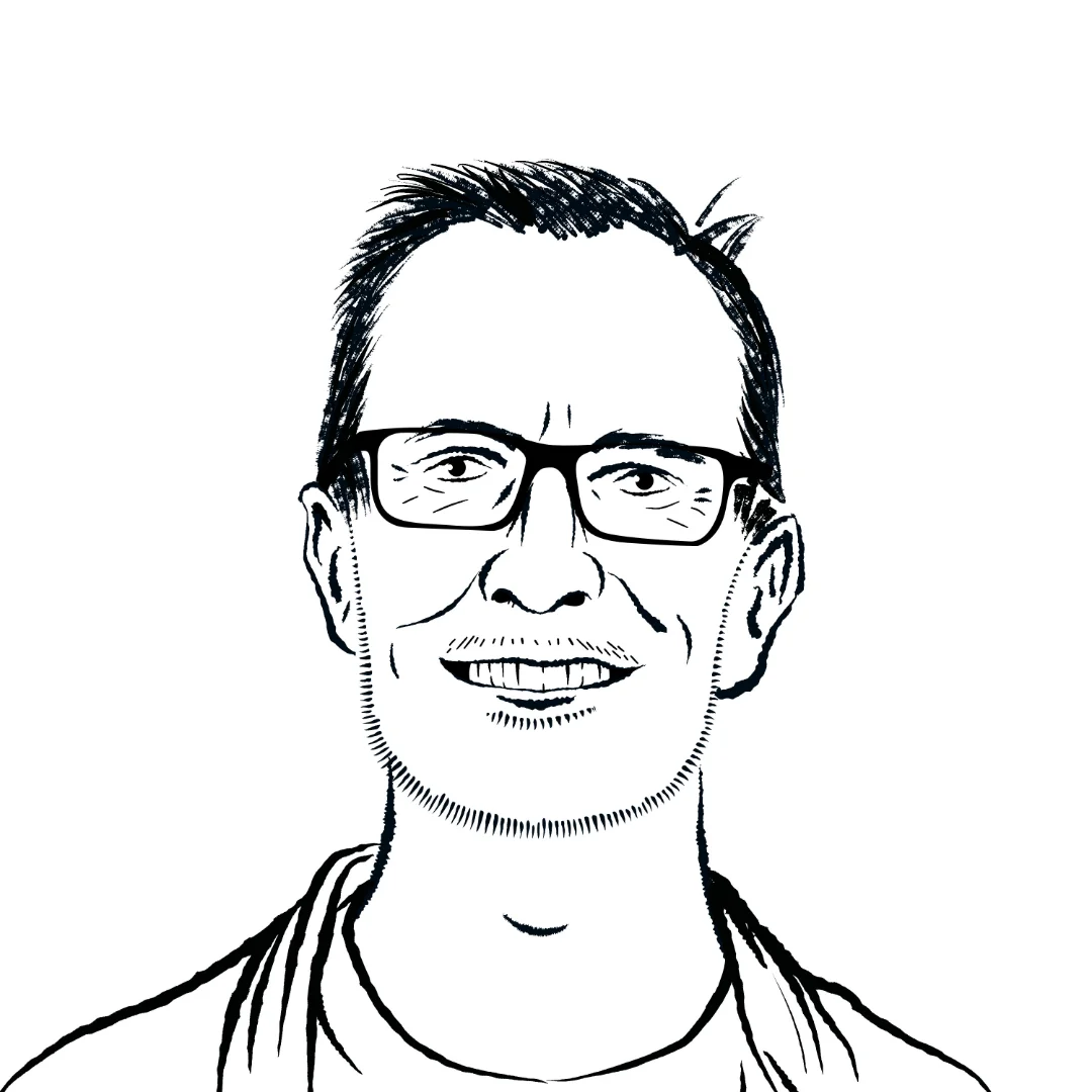
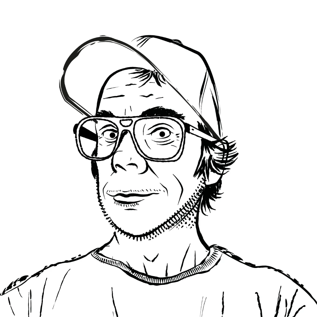
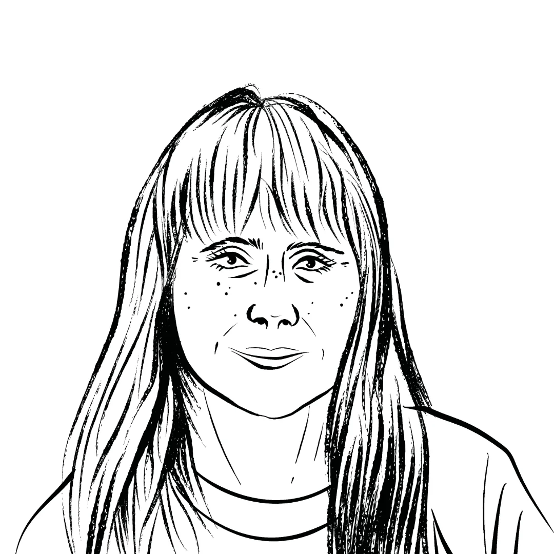
While I was waiting for the clients to make a final choice regarding the logo, I pivoted to work on the headshots. I had asked each of the client team to send me reference photos that they liked and used these as a first reference to create sketches.
I was happy with the sketches, but they also felt too clinical. I spent time researching the influences listed in the brief, and found out who the original designer for the Boys Own clubbing fanzine had been. This zine had come up as a formative influence on both Laurence and Karl during our conversations, so I wanted to try and tap into that aesthetics when it came time to render the images. I created a little mood board for myself to have while I completed the line work.

I remembered how useful Exercise 1.1 had been in creating images that looked right, even without them being 100% faithful copies. So when it came to adding in the linework, I decided to work from the sketches without any view of the photographs. Working with vector lines in this way was a new experience for me. It was hard to have the same kind of control laying down the lines, but the upside was that it was very easy to adjust lines after the fact. I shared the work-in-progress images with the team ahead of the weekend to give them a sense of progress, and to elicit early feedback to hopefully make things easier if changes needed to be made.
It had occurred to me that there had been no conversations about colours, so I used the message with the images to enquire about this too.

I was glad to be able to get early feedback and I had anticipated some of the points already. Going into the next stages I was confident I could factor in the points made. I thought more about the colour scheme, and I played around with different options using online colour scheme tools. Nothing seemed to click.
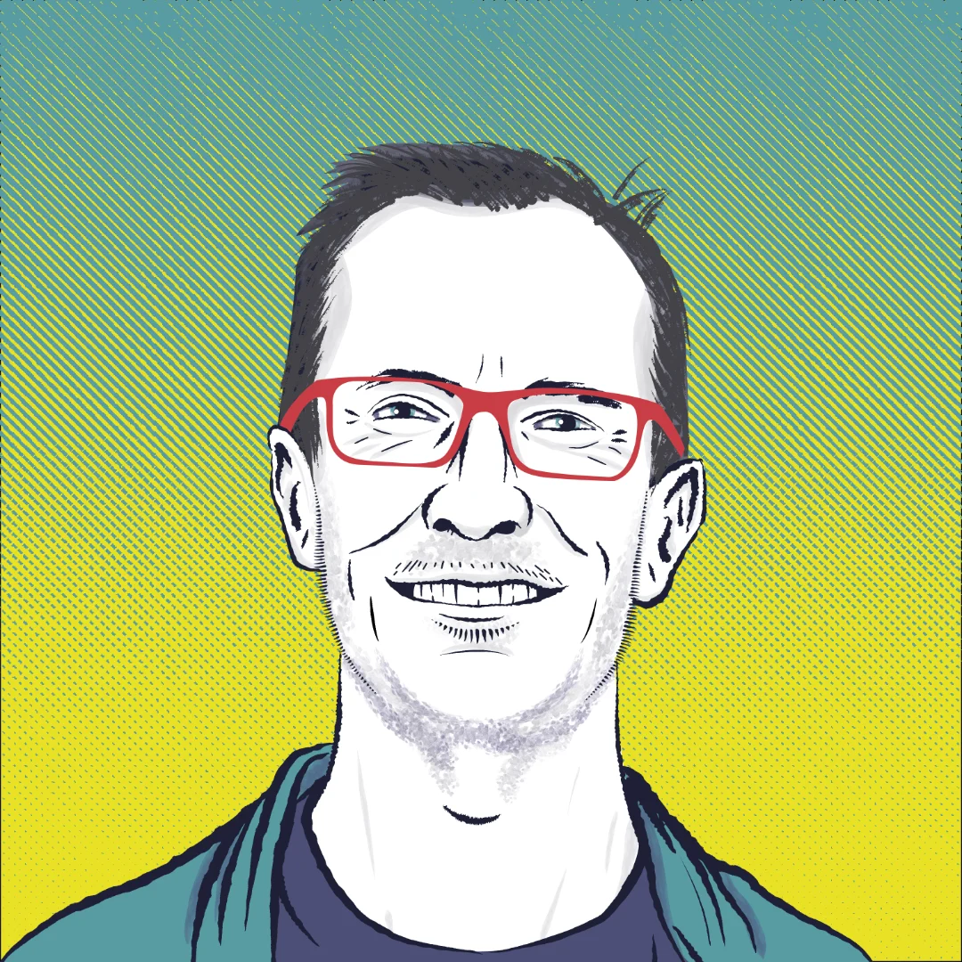
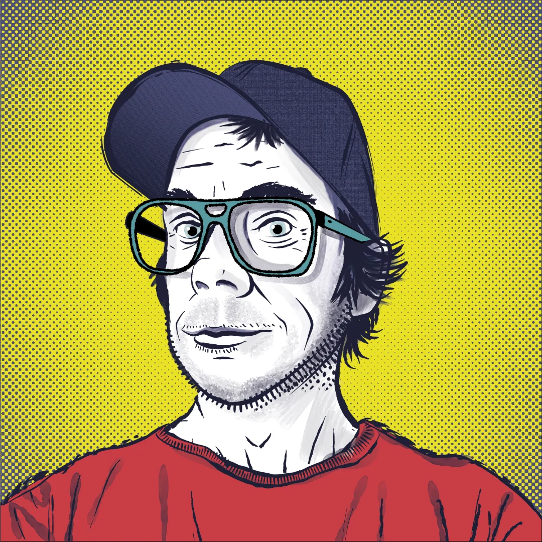
The mood board examples seemed to have a lot of examples of bold, almost fluorescent colours combined with black newsprint styling. I remembered the links to early dance culture and it made me think of the distinctive 'acid yellow' of that time. So I started with that as a core accent colour and then used colour wheel patterns to select colours that could fit together well as a group. I ended up with a light teal and a coral that almost felt like fluorescent red. I then selected a very dark aubergine colour instead of pure black, adding gradations of desaturation to create a series of grey colours that I could use as supporting colours in the overall colour scheme.
With the colours chosen, I went about colouring the linework. I used vector shapes for the main colours, and then a combination of textures to give it a grungy/newsprint feel. For the skin, I was able to use some watercolour vector brushes. This was a very new and novel experience that took a while to get to grips with. I don't think I like it as much as doing raster artwork, but it was incredibly useful to be able to change things after making each line. As the clients seemed to be a little picky (I wondered if this was because it was portraiture, they never seemed to have that characteristic for other projects!) being able to change things felt like a good safety net.
Laurence had given me some useful feedback about his chin area, which I adjusted successfully. I was really pleased with how I used the watercolour splatters to simulate stubble, and I really enjoy the overall look and feel of the headshots, I felt that they have a good mix of dance, grunge and pop art influences that fits with the brief, whilst also feeling like 'me'.
Finishing the Logo
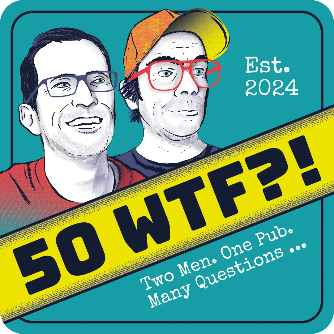
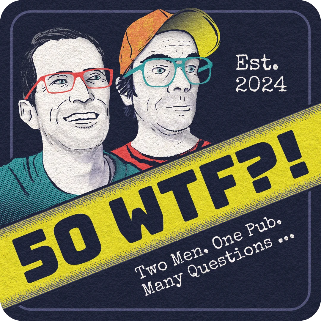
After the headshots were ready I had the direction the clients wanted to take for the logo, so I could now render that properly. Having completed the headshots, I used exactly the same approach for the logo. The big difference was that I also experimented with applying an overall texture to give the image a skeuomorphic effect of feeling like an actual beer mat. I wanted the image to be wholly representative of a beer mat, so I spent time researching merchandise companies that specialised in creating custom beer mats for other companies. This allowed me to know exactly what the print dimension would be, what the bleed was likely to be (at 94mm), and what the safety margin should be. The margin was useful to help me tweak the layout so all important aspects were inside the line. I got so used to it being there, I converted it into a visual element, which allowed me to add a bit of layering to the logo.
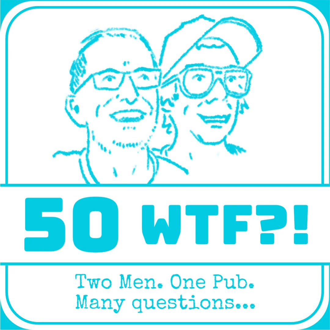
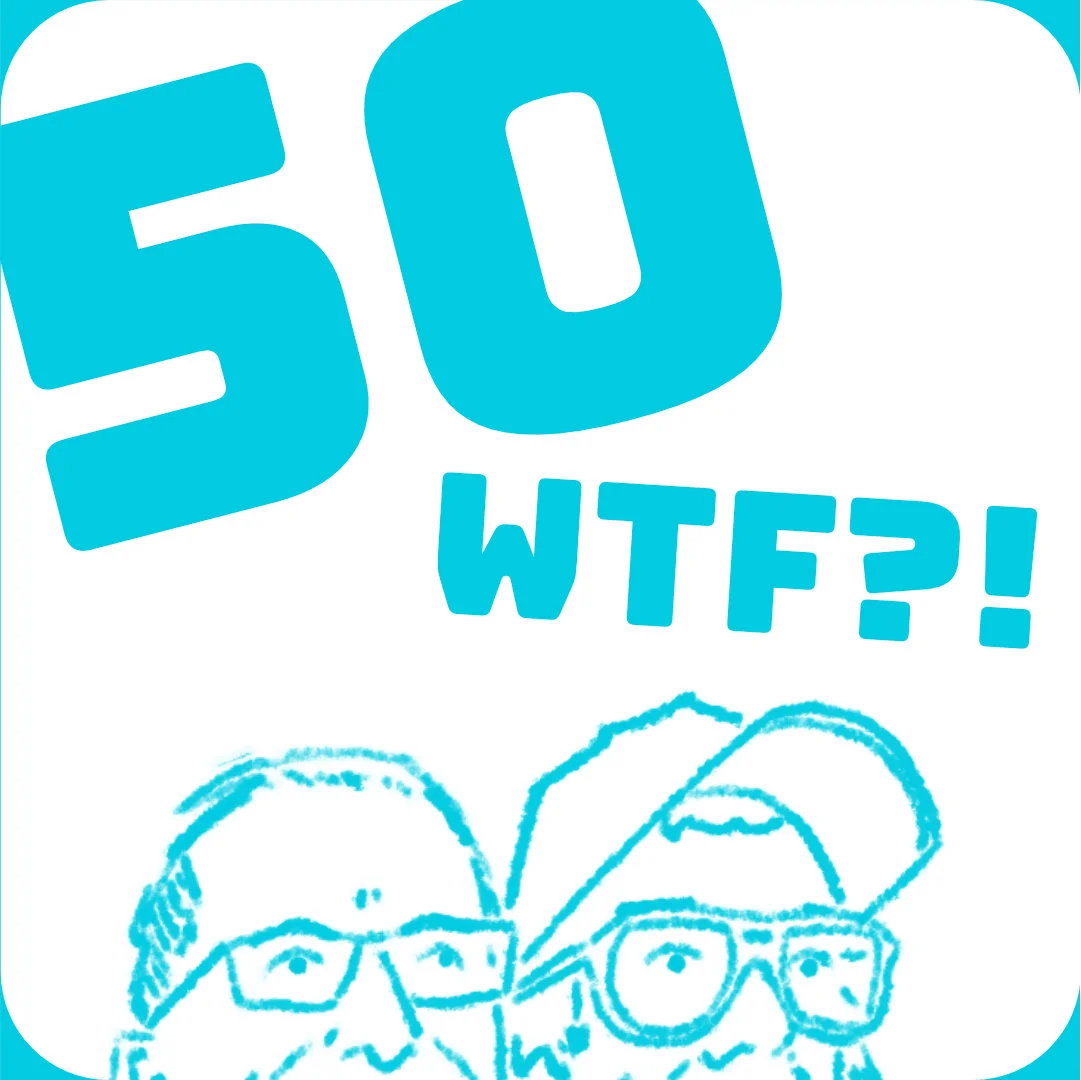
Obviously, the brief had requested images be 3000px squares, but I had a plan on how to get the best of both worlds and deliver my clients a value-added experience! In the meantime, I presented the clients with a preview of the finished logo in both formats:
I was really pleased with the logo and thought that it had everything it needed to stand out amongst a lot of other podcast competition. At the back of my mind, however, I had a niggling suspicion the clients would not be this bold. The next day, not only was I right, but I was about to experience a real tightrope of emotions!

Honestly, at this point I felt really frustrated. There was a rational part of my brain which knew this could be part of the commission process. However, my brain was also screaming with rejection sensitivity dysphoria - especially as I had finished the previous day feeling very proud of myself and the quality of the work. But I also had anticipated it might happen, and the previous evening had produced some alternate colour schemes which I immediately presented.
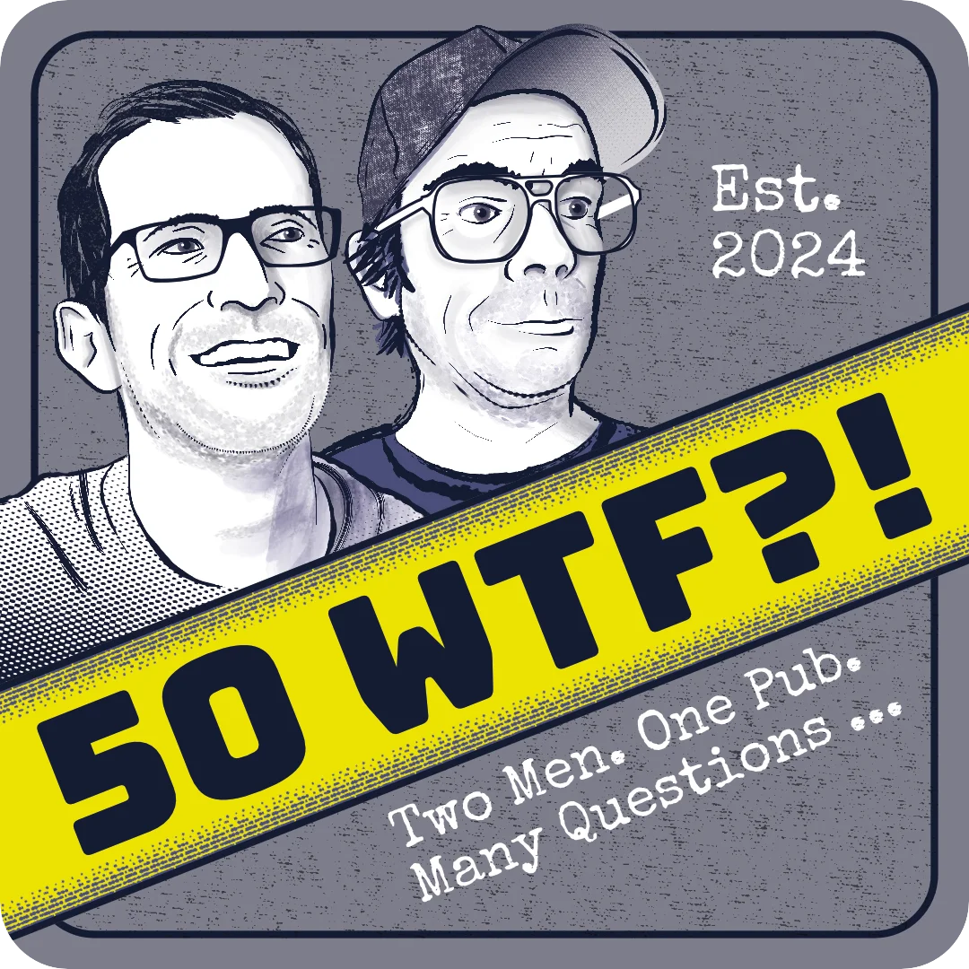
They had also specifically mentioned a preference for a minimal look. As much as I did not agree with this option, I quickly presented it to them. I thought that part of Karl's expression looking surprised was the bright blue pupils on the Teal version, so I changed them to be the same as the linework; I think this was a good choice and made the expression seem more grounded. I also explained that the line art and watercolour style was a direct influence of the football comics references they provided in the brief.
I was getting a crash course in learning that sometimes what a client says they want, and what they actually want can be very different!

Laurence actually quickly mocked up the new options in Spotify to see what they looked like amongst competing podcasts.

I was peeved that he hadn't done this with the Teal version, so offered that myself for comparison:

I pled my case that the Teal option was designed for high-contrast so it would stand out, and I think it does this very well. The minimalist version had less separation between the background and foreground, I was concerned that it would get lost in the mix. However, out of all of them, it seemed to be their favourite option! I couldn't help but feel a bit distraught. I came up with a few other options to try and add some contrast back.
I had gotten to the point where I needed them to make a decision so that I still had enough time to make tweaks and then prepare the files to send them for the agreed deadline. I also didn't want Karl to feel bad about his logo portrait, so intended to change that for him.

In the end, they opted for the plain option, textured. There was no point fighting their decision; it was their logo and their money and I respected that even if I disagreed. Interestingly Laurence had made the choice visible on social media, and the results at the time of writing were largely split between the plain version and my Teal one. It helped my brain react more objectively to the situation and made me curious if you could run A/B tests on podcasts to test which options work better.
I got to work on Karl's changes, messaging him directly to get as specific feedback as possible. He really wanted to look happier like the mockup. The roughs were easy enough to approximate a smile as they were so low fidelity, but I wasn't comfortable doing it accurately when the image was full resolution. I asked him if he had another photo he was smiling in, which he provided. Using this, I was able to come up with a new portrait that had the cap etc. but now showed him smiling. Karl was happy, yet I think the likeness is not as good - I think it's a combination of the eyes and teeth that are throwing it off, but I put many more hours into the second version and needed to draw a line where good enough is good enough.

Not out of the woods yet...
As I was working on Karls re-do, I received a message from Cherry saying she was still not happy with her portrait and felt like a diva telling me. The last thing I would want would be for her to be upset, especially when it's meant to celebrate her contributions to the podcast. So I resolved to fix the issues, which I did by finding an alternate photograph and using it as additional information. There were a few elements I could reuse, but in the end, I basically did the whole thing from scratch which took hours. In the end though, she was a lot happier and that is what matters. It is also a better likeness and generally a more successful image, it was worth the time to do.
Preparing the images

It was late in the day, but I finally had final signoff on all the images. It was time to turn them into the deliverables. In Affinity Designer I created an Artboard as soon as we entered the colour shenanigan phase of the project, and this meant I could go back in time when needed. It also meant that I could set things up for specific export requirements.
First, I created exports for the logo and headshots for the main files. I created jpg versions in both RGB and CMYK colour spaces, and also provided the images as vectors in both EPS and SVG formats so that they would have the maximum flexibility in how they could use the images. I also provided the image in CMYK as a PDF optimised for print, which included the bleed and print marks, so that should they want to print it off for stickers, it would be easy for a print supplier to do so.
As an added extra, I then formatted the image to 94mm, with the direct settings taken from artwork guides of beer mat printers. This was then exported in CMYK as a pdf. They will be able to take the file to any printer and come out with perfect physical replicas of their logo! I placed all the different files, organising them in a logical way for ease of navigation:

As you can see I added a text file to the folder. This originally contained the hex codes for the colour scheme I created, and later I also added information regarding fonts and corner radius measurements to get the proper beer mat look. After I sent it over, the client remarked that downloading individual files can be laborious, so I also added them all as a ZIP file so they could export them in one go.
After Care
The files were submitted on time, and the project has been a success so far. The podcast goes live tomorrow and you can find it on Spotify and other podcast platforms. As I have been writing this assignment up, I have had more work to do as there have been emergent needs for the logo. I made some tweaks to the logo to add spot colour back to the portraits (they came around after a different designer gave them the same advice I had earlier in the process!) as well as to create a version of the logo stripped of text so that they can add their own in for each different episode.
I am very proud of the work I have done on this commission. Looking back over the experience, it has been difficult doing work for people you are friends with. I think I would have been more assertive with my time and boundaries if it had been less personal. The biggest takeaway for me has been the realisation that, while I can do illustrated portrait work, I will likely avoid work where the portrait is closely linked to the project team. It just becomes too personal when you are looking at an image of yourself. I think that portrait work for editorial commissions would be a useful outlet for this skill I have developed.
Mostly, I finish this final assignment with a sense of grateful relief, It has been the second module in a row where I have had to contend with a lot of things happening in my life. I am proud that I have remained resilient, focused and tenacious. I can see progression in both my practical and operational skills, and with more time and focus they will continue to grow. I feel ready to put myself out into the world as an illustrator, and I am confident that this module has given me both breadth and depth of focus. A bit part of the challenge is sometimes knowing what you don't want to do and having the courage to start respecting your choices, to shape your practice into what you want to put out into the world.









Comments