Responding to a Brief - Exercise 1.4: Visual Depth
- Dan Woodward
- May 30, 2023
- 2 min read
I've had to tackle perspective a number of times over the course of my studies, and it is something I enjoy yet am slightly obsessive about. Sometimes I think I focus so much on an accurate perspective that I kill the energy. Thinking back to my small comic for assignment five of Graphic Fiction, I lost a lot of time in making the perspective accurate, and I am not the comic was the better for it. So it's good to do a practical exercise to cover different perspective drawings in a way I can focus on the essentials. For this exercise, I had to capture different views of a room in my house. As I was completing my studies in my office, I decided to capture that instead. I used my camera phone to seek out different views to draw and then transferred them to digital paper.
It's interesting, when you use a camera most of the time you'll be capturing some element of 3-point perspective, so for each of my drawings I had to use the photograph as an initial point of reference, but then adapt it to fit the specific perspective I was trying to focus on. When working digitally I set up rulers to act as guides in the same way I would when working traditionally with pencil and paper.
One-point perspective

Two-point Perspective

Three-point perspective

Isometric

Mixing things up: fish-eye perspective

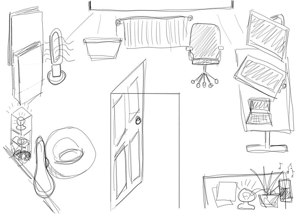
Flat drawing

Thoughts on Meaning
Going through the different approaches for perspective was interesting. The three main ‘point’ types seem to be focusing on a literal representation. This doesn’t mean that they can’t fulfil a role in storytelling, but they require thought on the ‘camera angle’ you want to use. Isometric is useful for giving a sense of three-dimensional space and the relationship between objects. It covers more ground in terms of genre application - isometric can be diagrammatic, narrative and decorative.
I decided to experiment with a fish-eye perspective as it’s not something I have done before. I quite liked the experience and the approach could be used in interesting ways to show lots of information, focus attention or even to distort in humorous ways. Lastly, I tried a flat representation. This attempt was less focused on accurate drawing and I tried to be more instinctive in how I put the image together.
For some areas I tried to use a flat representational approach that I have seen used in retro video games, for other areas I used forced false perspective and even used a symbolical approach for the book cases in the corner. The overall effect felt to me like drawing a map. Taking a flat approach could therefore be useful for informative as well as narrative approaches, where meaning, symbolism or metaphor are more important than literal accuracy.

Comments