Responding to a Brief - Exercise 2.4: Architectural illustration
- Dan Woodward
- Aug 21, 2023
- 6 min read
In this exercise, I explored aspects of architectural illustration. The task specifically asked me to create an illustration that "shows the contrast between a building or structure ... and its surroundings". It gave me some examples of what contrast could look like:
Old and modern.
Alterations and renovations.
Man and nature.
I was also asked to think about how I deal with the contrast creatively in my choice of mark-making, colour and composition.
I started by thinking of locations that were relatively easy to get to locally that might be good subjects. I feel at this stage I was looking for something that screamed contrast. I had even made a note in my coursebook to look for juxtaposition. I had subconsciously decided that contrast needed to be extremes. Here are some examples of locations I considered:
However, getting out to do field work kept on being difficult to the combination of unseasonal weather and work commitments. Time was slipping away and I was getting anxious about completing the exercise. So instead I tried to think as pragmatically as possible. What was within a five-minute walk of my house?
Necessity and Pragmatism
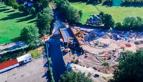
This is what gave me the idea to use the railway bridge that runs next to the local green. Constructed in 1865, it was a local landmark (and was certainly an experience trying to navigate its narrow side along with the two mini-roundabouts!) and well-loved. By the 2000s, however, traffic (including heavy goods vehicles) was much more common and the bridge was no longer fit-for-purpose, especially with the planned development of new housing estates at that end of the town. Over more than a year the bridge was cordoned off, demolished and replaced with a new wider bridge and simpler roundabout system. This was a massive undertaking which caused significant disruption to the town. Unsurprisingly in a Hampshire town, many residents objected to the removal and construction works.
First I considered it suitable simply from a structural point of view, with the landscape around it. I set out with a sketchbook, pencil and pens. I managed to find some safe places to sketch away from the traffic and tried to capture the essence of the new bridge. It wasn't until I shifted locations to take in both sides that I realised the bridge had many different qualities which qualified it for the brief:
It contrasted old with new,
It contrasted with the natural elements of the landscape,
It had the contrast of renovations, and
I noticed that both sides had their own personality and textures, creating a light-and-dark contrast as well.
So before the weather turned, I also went to sketch the older side of the bridge as well, trying to capture the way it clung onto shadows, even in largely overcast light.
I am really enjoying sketching with the combination of pen, col-erase pencil and magic pencil at the moment. Just having three choices allows a surprising amount of variation in what and how I can draw. Each of these three images has aspects I enjoy, and I am particularly pleased that I was able to handle the perspective fairly successfully given I was only using one of the pencils as a makeshift ruler to give me guidelines.
One of the things I noticed when capturing the different compositions of the bridge was the way I made selections and choices as to what I would put into the sketchbook. Obviously, cars were a particularly unpredictable part of drawing the scenes so I decided to leave them out very quickly. There were no real pedestrians to worry about during my time there. I simplified things like details, vegetation and signage.
This worked well to help focus the eye on the things that I was noticing while drawing: the shape and sense of size you get from the bridge; it's a very different feeling from the one you get when driving under either side of the structure. I think it's worth asking myself not only what I enjoy most about what I might be drawing, but what I want the viewer to look at, and take in.
Before I left to spend some recreational time with my family I also took some additional reference photos to explore different sides of the bridge.:
Next to the bridge was a presentation panel, detailing some of the history of the bridge:

This got me thinking about how the history of the bridge relates to how it sits now. I looked through local social media and websites to create a gallery capturing elements of its transition. I wanted to see what gave the bridge its character, and how that factored into its new personality. I hypothesised that by making those images more recent in my memory, I could somehow incorporate the ideas into any more finished illustration I might make.
Here's a view of the bridge when it was finally re-opened by The Flying Scotsman!
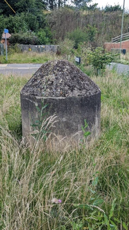
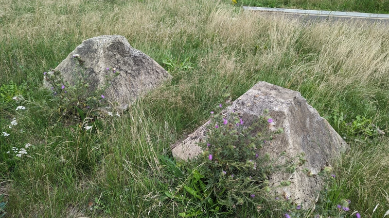
The weather had improved a little by the end of our family time, and on the way back I returned to the bridge to try and explore it from a different angle. While I had been walking to my sketching positions earlier I had the chance to get up close to the structural components of both sides of the bridge. I was fascinated by both the colour and texture on both sides. I took the time to photograph the aspects that most appealed to me. I wondered if I might be able to take some kind of inspiration from the images when it came to further image-making.
Exploring Ideas
I started using my sketchbook to think about how I might bring things together into a more finished illustration. I mentally explored a few different avenues, but I struggled to think about how I would do something that felt more energetic and vibrant. Everything in my head seemed to come back to the traditional style.
I thought about how to make it more contemporary or abstract, but couldn't conceptualise an image in my head and I had no idea about how I might experiment to find my way. My last thumbnail ended up being me drawing quite flippantly, yet I ended up enjoying breaking the rules of the composition and perspective.

So I tried to explore this more by sketching out gestural lines, and I even got as far as laying down some colour to see if I could play with the picture and find a way to render it in a way that I liked and felt good. No matter what I did I couldn't make any progress.
So I decided to leave the exercise for a whole and do something else. The problem was that I couldn't see even an idea of the image in my head. The thought of coming back and starting at a page was painful. I did some small experiments with using vector shapes but they didn't work either.
Eventually, I got to the point where I just wanted it done. While I was exploring the vector shapes I had thought about doing an isometric perspective illustration. While the vector approach felt laborious, I still felt the isometric approach could work if I took a more hand-crafted approach. So I sat with my iPad and used ProCreate to visualise a basic isometric grid. Then I used my reference photos and sketchbook studies to sculpt out the roughs of an isometric illustration of the bridge and roundabout.

From there I placed the image on the texture of hot-press watercolour paper and used an ink pen to sketch in the image with more detail. This was a time-consuming process in its own right and I spent about eight hours for the rough and linework stages. The drawing was a little clinical, but I liked that I managed to apply line different line weights rather than have everything with the same thickness. I also had to make certain editorial choices about what I to put into the image and what to leave out.
It is a challenging isometric composition, as there are lots of organic elements and angles that do not confirm to the triangular base pattern. So overall I am pleased with the results. It does feel a bit boring and safe, but done is better than ideal.

Finally, I added colour, using digital watercolours to allow me to work quickly, layer in the depth of colour and work as closely to have I would have had I had the time and space to do the same drawing with physical materials. The brickwork was a pain but I like the effect so I am glad I took the time to do it.
By the end, I had created some effective short-hand ways of depicting different trees with both my drawing and colour choices (there was a surprising amount of green to colour for such urban subject matter!). I did run out of steam after persevering on this illustration for the better part of 12 hours solid, so, in the end, forgot to add details like signage and road markings.
Overall, I think it's a half-decent illustration that meets the brief but I am disappointed that I couldn't think of a way to do something more... cooky.

Here is the timelapse of the whole process:


コメント