Responding to a Brief - Exercise 3.2: Once Upon a Time
- Dan Woodward
- Mar 19, 2024
- 5 min read
In this exercise, I had to create a series of black-and-white illustrations for a popular fairy story or folk tale. I had just introduced my son to William Golding's "The Princess Bride", so my first inclination was to create some illustrations for this alternative fairy tale.
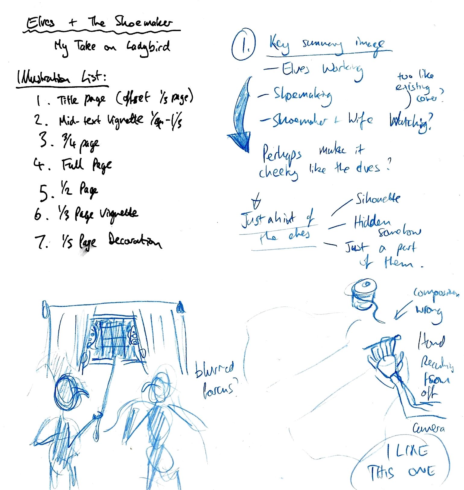
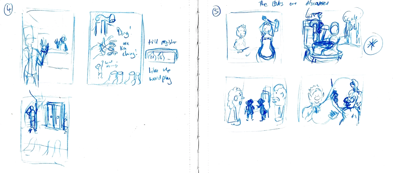
The brief only mentions a 'series' of illustrations, which is a little ambiguous. When working through some ideas in my sketchbook, I was unsure how many illustrations I would have to do, so I tried to split out some key scenes into different types of illustrations.

When I got to this point I got overwhelmed by the potential scope of the exercise, and my interpretation was to complete the whole story, and not just some example moments. Given that, by this point, I was massively behind my original study schedule (and that the reason for that was significant mental health challenges) I realised that I needed to adjust my approach to make it feel manageable.
With my resurgent interest in roleplaying games, I had been learning a game named Vaesen. Beautifully illustrated by the Swedish illustrator Johan Egerkans, it is based on Scandinavian folklore with expansion books covering the British Isles and Ireland. These kinds of folk tales have interested me since a small boy, and I wondered if I could take a tale normally thought of as a children's tale and give it a darker feel more reminiscent of Egerkan's approach.

The Ladybird series of books was one of my favourites growing up. They told classical fairy stories and folk tales in a way that was easy for children to read and enjoy.
I remember enjoying the illustrations growing up, so took a look at the original book I remember reading to get an idea of how Ladybird books were put together. I noticed the overall number of pages and tried to take in the format of the book design.
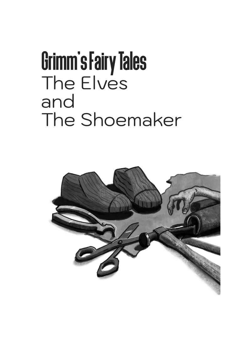
There were some variations in the illustrations used, starting from the inside cover page, and then throughout the book. They seemed to choose illustration size and placement to fit the story beats over setting a convention.
I managed to find the original story text from the Grimm brothers and used the attached story as my template for the rest of the exercise. I needed to establish what the story beats were, so took my time to read the story a number of times and make notes. I transposed the text into Affinity Publisher, and then cross-referenced the story beats with the overall layout and flow to identify the places where I could add illustrations to aid the storytelling,

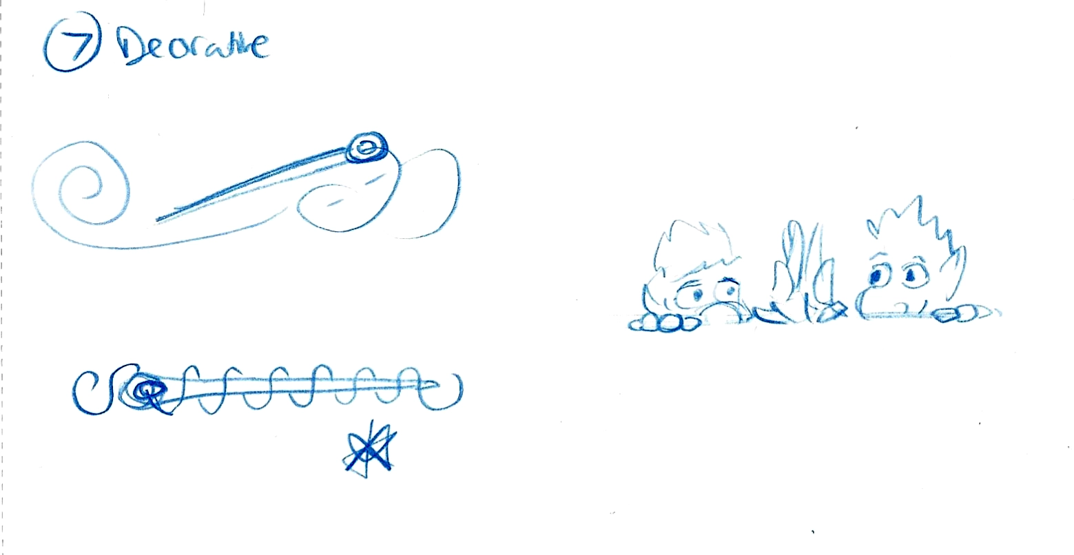
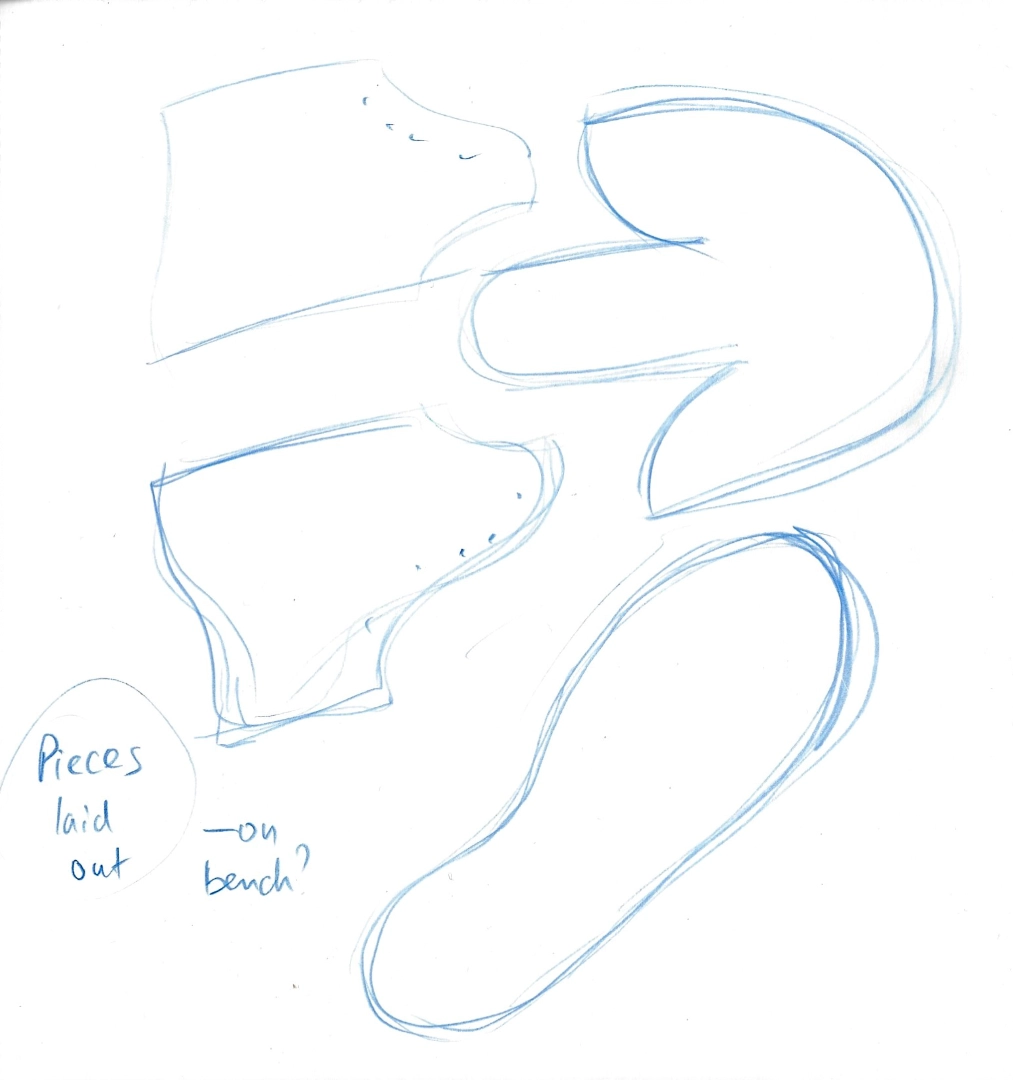
This then gave me a firmer idea of the total amount of illustrations that I would need for the story, and the layout I had chosen meant I could play with a variety of formats. I went back to my sketchbook to explore possible options for each of the illustrations. I researched traditional shoemaking to build up a reference library that I could use for inspiration when exploring in my sketchbook.
I had an idea of how the illustrations needed to look, but I wasn't certain how to render them in a way that took inspiration from Johan Egerkans. I had read articles where he talked about his process, so had some idea. Despite the style, everything after the sketch is done digitally, which surprised me. It looks like it uses watercolour layers alongside some pencil marks. So I took some time to delve deeper into how he approaches his illustrations, trying to work out myself. I started with a simple sketch study to see how he employs his angular drawing approach. He has noted that he was influenced by Mike Mignola, who is a comic artist I have explored before.

Doing the pencil study helped me to get an idea of the relationship between angles and curves. I found it useful to get an idea about how he simplifies what he is communicating, and how what remains seems to be chosen with focused intent. There is an economy to his approach that I admire yet find hard to replicate. I think I need more practice breaking down images to their core visual information like I started to do at the beginning of this module.
Next, I took another of his illustrations and converted it into black-and-white so that I could then study how he manages value and contrast in his visual storytelling.
I found this practice very useful, especially when comparing it with the original coloured illustration.

I thought I should try and make a start with the illustrations, trying to employ some of what I had learned from my investigations. I started with the inside cover illustration. I was not happy with the way I went about trying to draw things. I was comfortable adapting references for the image, but it also meant that it felt a little stiff.
Moreover, I didn't like the overall rendering style. I decided to try some more experimentation, so I took my sketch for the first illustration and printed it off several times before pasting the copies into my sketchbook. There, I took the time to approach the ink part of the rendering in multiple ways to see what I liked and what worked well enough for the story.
While none of them felt exactly like what I was going for in my head, it did give me a better idea of how to proceed with the illustrations. I set about creating the individual illustrations, basing their size and composition on the space I had allocated in my layout as well as the preliminary rough sketches.
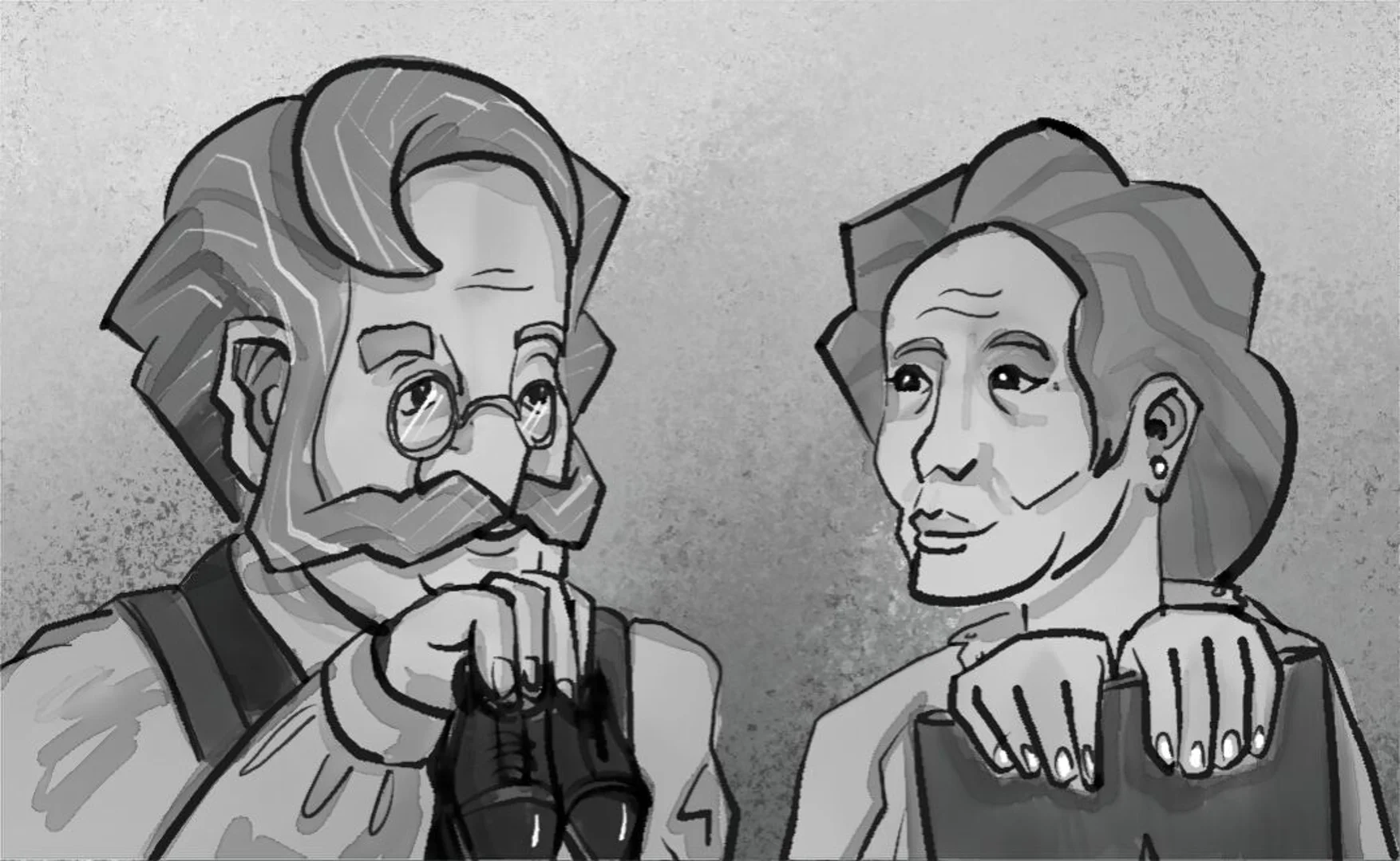
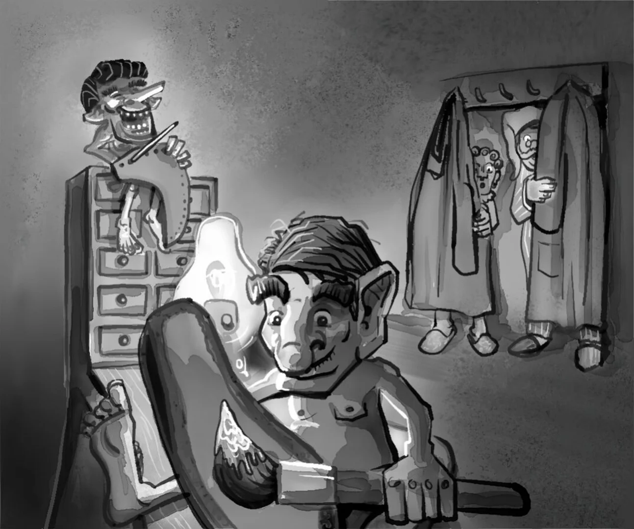
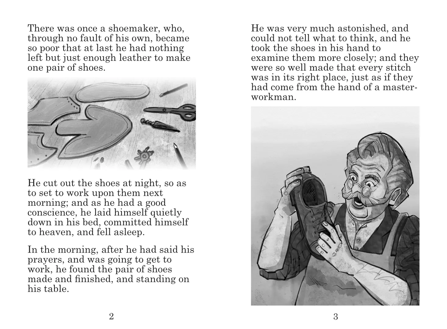
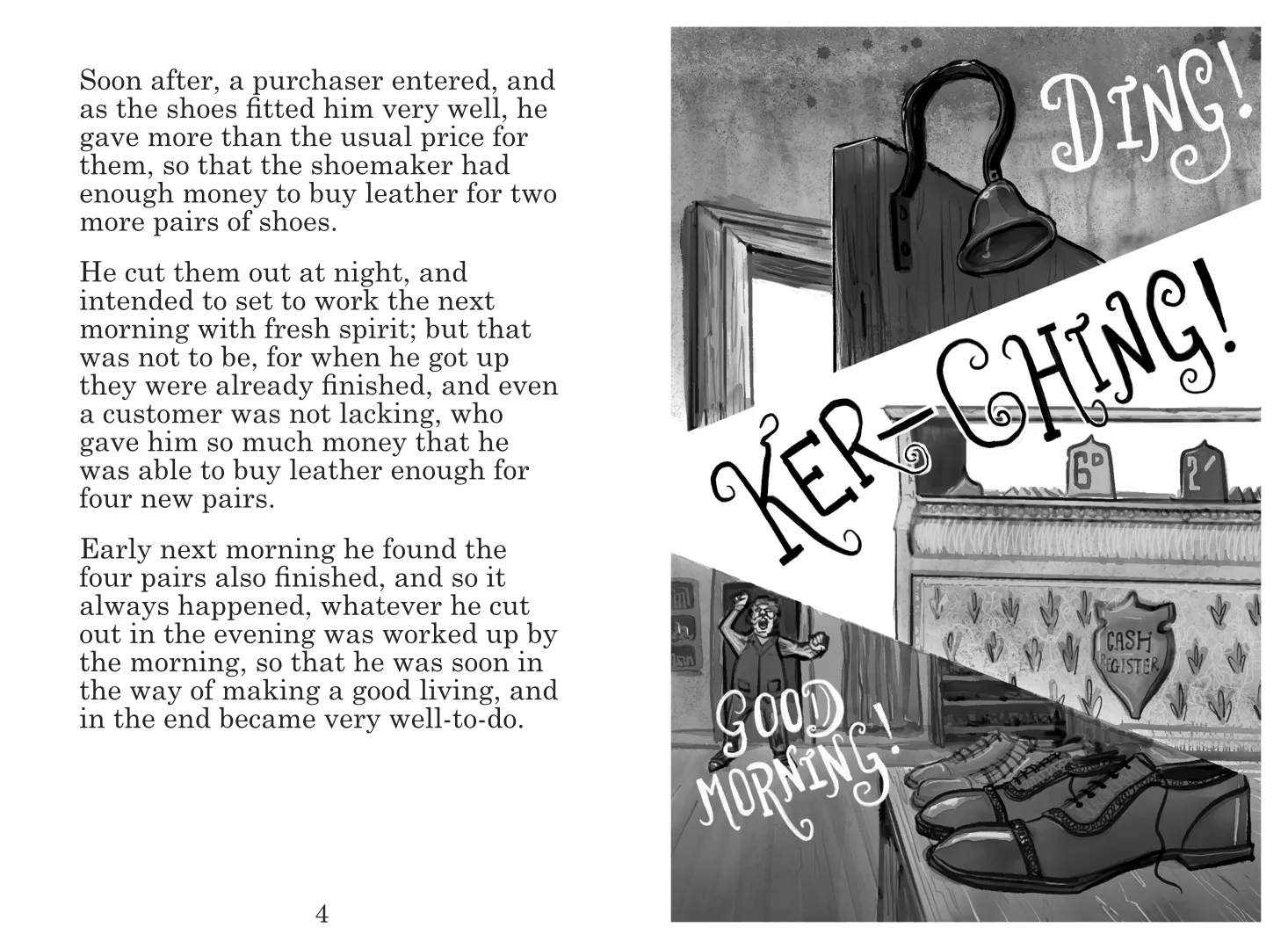
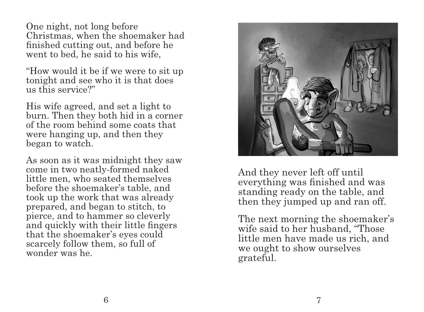
Once the illustrations were created, I laid them into the page layouts to see how they worked in context. I was quite pleased with how the story read, and how I selected each of the illustrations to convey a particular point or moment. It allowed me to use a variety of sizes and formats, which I think generally work well. I enjoyed my full-page illustration that explored the relationship between images and words playfully and sequentially.
Lastly, to get a sense of the work in a more realistic context, I pulled together a mockup of how it could look as a book. In this format I am even more happy, the text feels authentic, and I think the illustration sits well alongside it. While this wasn't my original direction when I started the exercise, I am really happy with the outcome. I think by the end of it I had improved my layering abilities by another small measure, and allowed me to have fun with the process.








댓글