
For this exercise, I was tasked to create a poster to advertise a circus coming to town, with all the relevant information available to the viewer. In our town, we have a small green which has a connection to the circus and fairs - their troupes have a historical right to gather and perform on the green. It happens that the green is around the corner from my house, so I am very familiar with the presence of a circus and its promotional material!
I decided to try and give myself some additional constraints to help me focus my problem-solving. I imagined that the circus that visits my town was my actual client, and had commissioned a new poster illustration and design. I first started by looking at what I could find out about my 'client' online, sourcing both images and website content. I then made notes in my sketchbook and created a reference mood board.

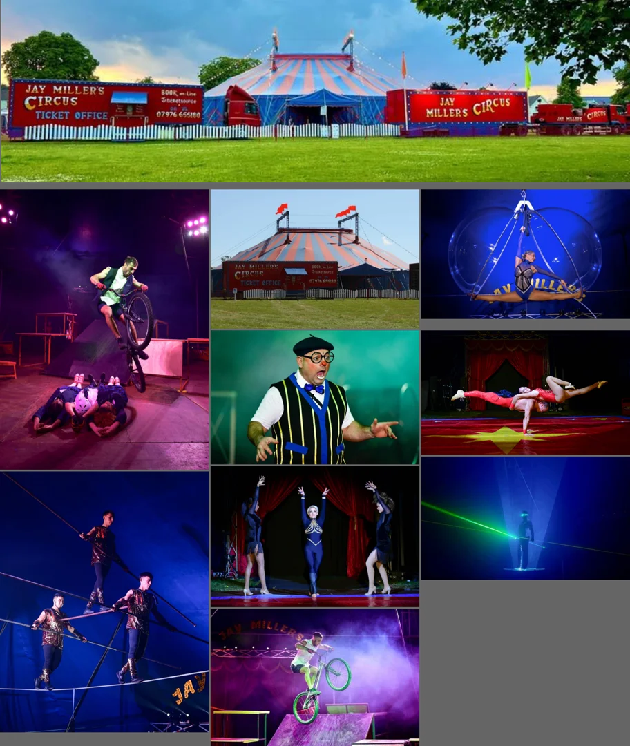
There were a few things that stood out for me about this particular circus troupe:
Their focus is on acts of acrobatics (of various sorts).
They are proud of their main clown performer, he takes a prominent role in the circus's acts and advertisements.
They are constantly updating and evolving their offerings each year.
I thought their clown's prominence could be a good place to focus my efforts. I remembered that each clown's costume is registered with Clowns International [1] and painted on an egg! At first, I thought about a design that was more abstract, with the shapes inferring the clown's makeup and costume. This got me thinking about making an image within an image, drawing on pareidolia to hide the image of the clown within the larger illustration of acrobatics.
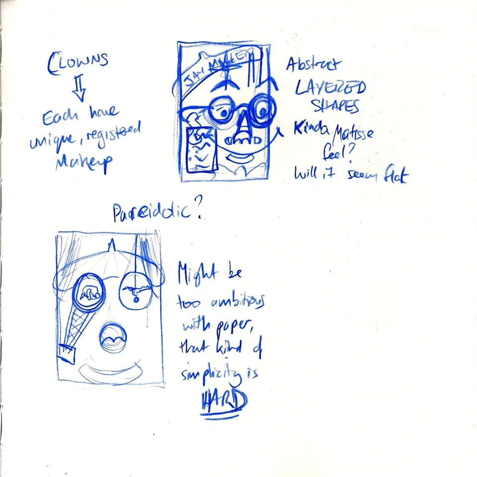
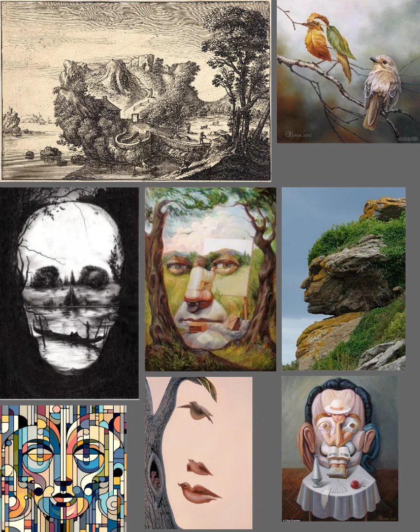
I pulled together another reference set of images that employed this optical illusion, and the one thing that screamed out to me at this point was that I was far too ambitious in the context of this exercise. I abandoned this direction and pulled together a more holistic mood board of circus illustrations, pulling on stylistic approaches that appealed to me. This enabled me to explore some potential designs by making some more thumbnails.
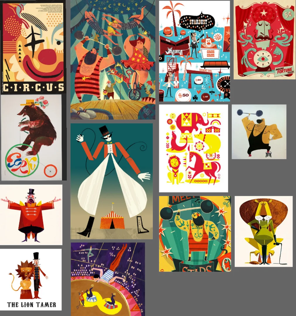
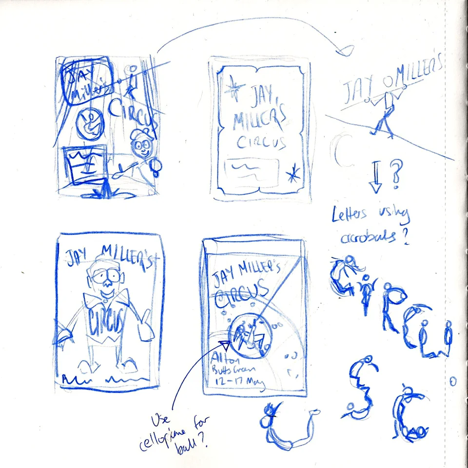
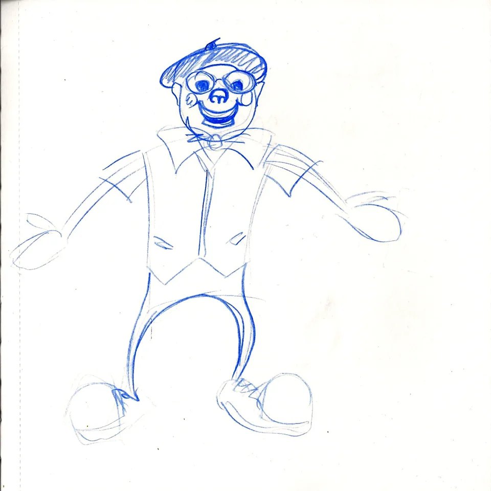
I tried to also put time into how the typography would work on the images. I explored an idea about creating some words using images of acrobats together yet I steered away from it because I was put off by the potential complexity within an overall illustration which already had a lot to manage. I explored how to illustrate the clown in a more simple, stylised way before I selected two compositions that I liked. One of them was heavily inspired by one of my reference illustrations, so I decided to focus on the other option (top left thumbnail).

Next, I experimented with my sketchbook using rubber stamps to see if they might be a suitable way of doing the typography on top of cut paper. I found the stamps inconclusive. As individual stamps, they were difficult to align correctly, with no way of ensuring correct spacing or line height like you might get with a letterpress.
I quite liked the randomness to a point - it made the typography feel a little punk-inspired, but I was unsure if it fitted in with Jay Millar's brand identity. When I realised that I didn't have any number stamps for consistency, I took it as a sign that this was not the right approach for this exercise.
Before jumping head-first into the final poster, I needed to make sure that the composition that I had selected would work to give a clean feel to the image - something I believed strongly that this approach would need. I again used my sketchbook to create a small 'colour rough' of one aspect of the illustration. I wanted to see what it would be like to try and cleanly create the illustration this way, as well as validate the construction approach itself.

It wasn't bad, by any means, but I found it difficult to get the clean shapes that I wanted to achieve for this particular composition. It made me wonder if the other thumbnail (bottom right) would be a better fit for the construction method and materials at my disposal. Ultimately, I decided it was, and would be easier to adapt as I encountered any challenges or opportunities.
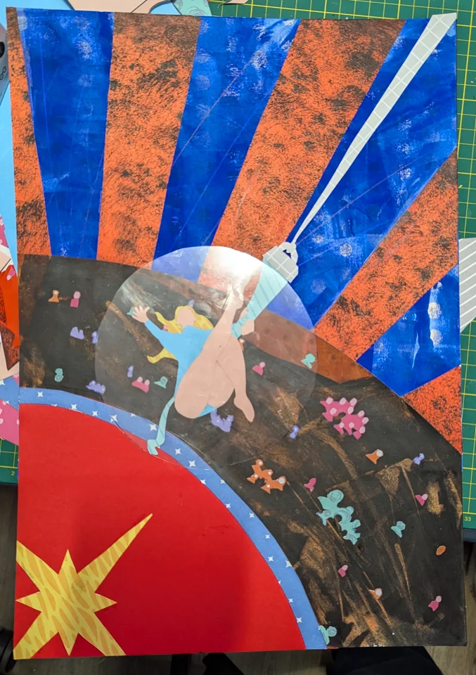
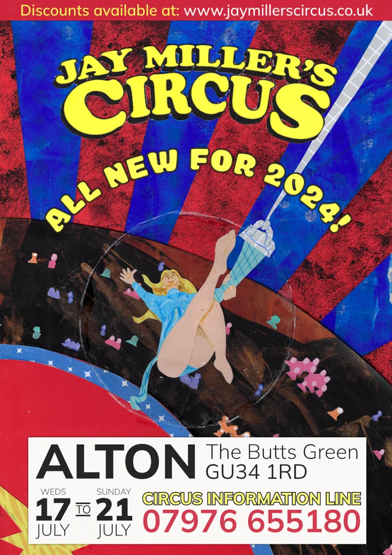
The Big Top
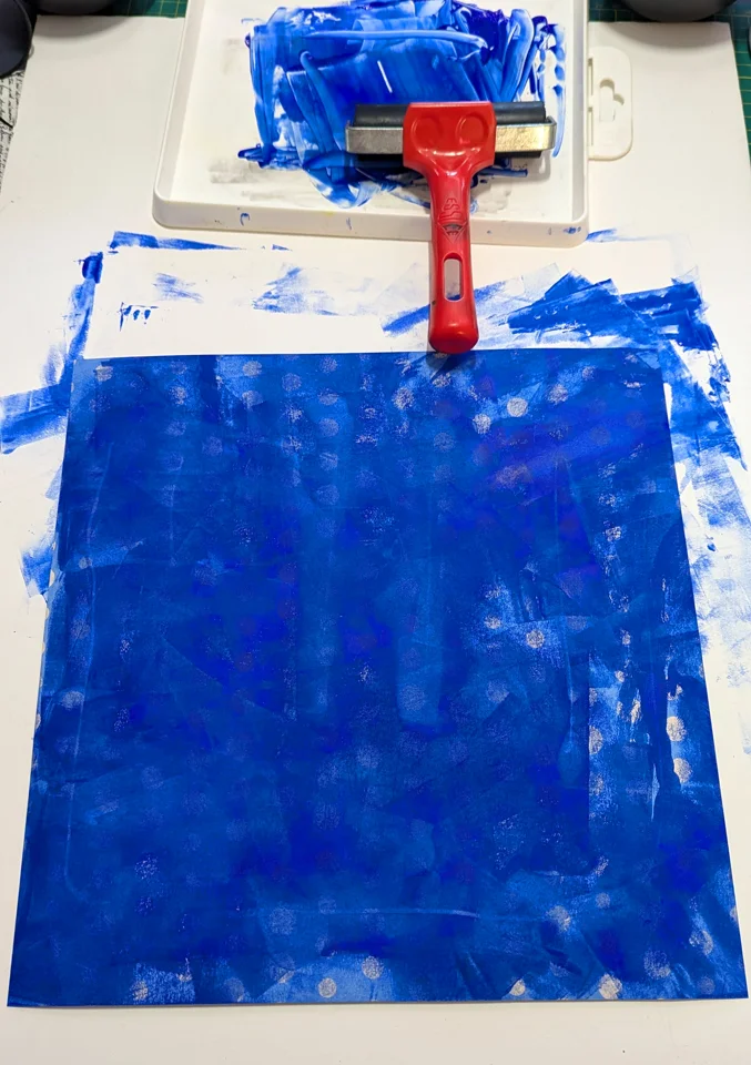
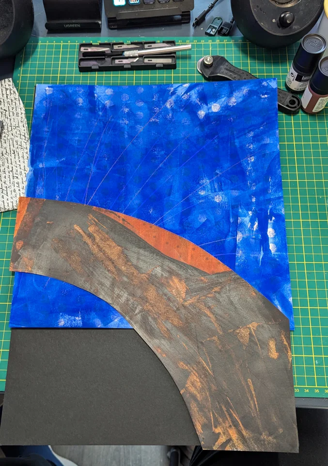
I had recently purchased a bunch of cheap patterned craft papers for the exercise, as well as an A3 piece of black backing board. I selected a large blue piece of paper with white polka dots on it, as it felt thematically linked to the circuses. But when I put it down, it was both the wrong blue and too light. I remembered I had some acrylic gouache in my materials collection, so grabbed it and a linocut ink roller.
I experimented by using the roller to cover the paper with ultramarine blue. It went on a little thick (in retrospect I think I would have liked more of the pattern to show through) but was ultimately the hue and tone I was after, and I gave a cool texture. It was good enough to move forward, so I then tried to create the stalls of the circus using another patterned piece of paper, this time yellow with black spots. Again, it was far too light, so I went back to the acrylic gouache, creating a mix of the left-over blue with burnt sienna and a bit of black.
This time, however, the paint was way too dark and thick, it obscured everything. As I was not attached to anything but the inconvenience of re-cutting the paper, I grabbed different utensils off of my desk to try to thin and scrape the dark paint (some of which had already dried!). It resulted in a very random texture, and a little voice at the back of my head told me to just roll with the punches! So I listened and moved on - if it didn't end up working, I could just re-do that section before I glued anything down.
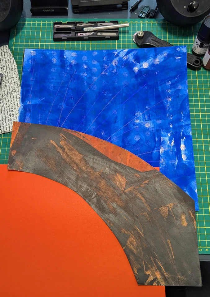

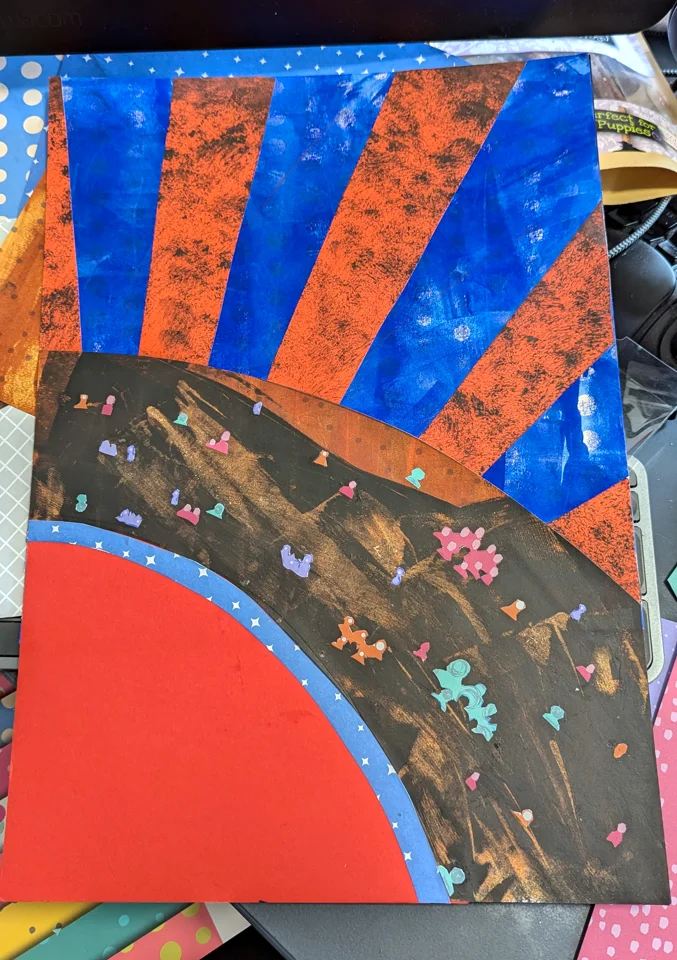
Next, I moved onto adding some red elements to the image. The floor was easy enough, the first red I selected was vibrant but too orange. It was easy enough to find an alternative that worked better with the colours I had seen in use on the Jay Millar Big Top tent. The first red might work as the red banding of the tent, but it had the same problem as the blue paper - it was just too light a value for the dark inside of the tent.
As I was thinking about the problem I cleared my workspace a little and picked up a rag that I had used to wipe away the dark paint on the stalls. It was still wet with paint and gave me the idea to use the texture of the rag as a way of printing onto the bright red paper. It went on easily, and I built up layers of stippling and printing to create a gradient, which I thought might emulate the change from the dark canopy of the tent, down to the flood-lit floor of the circus. It worked well, and I carefully cut out wedge shapes to align around the blue paper. I wanted it to have a good sense of depth perspective.
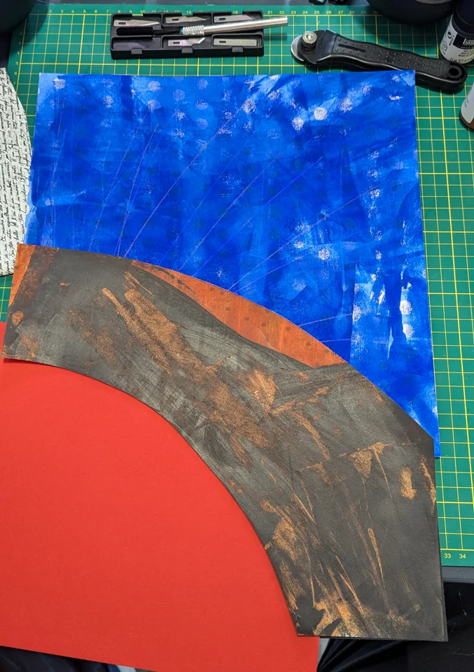
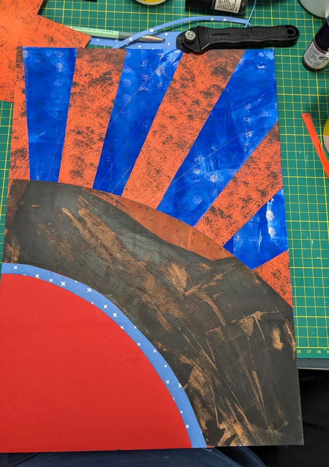
I stuck them down to the blue paper before sticking the brown stalls on top. I also added a band of blue starred paper to denote the edge of the performance area. This was quite frustrating to do, and would have been a lot easier to get flush if I had not stuck down the stalls - I would have been able to use the 'stalls' paper as a stencil. However, that learning moment stuck in my head, and I made sure to try and think about other opportunities to work smarter, and not harder as I continued.
Lastly for the backdrop, I added the crowd to the scene. I selected coloured paper whose patterns had circles, dots and splodges that made me think of a crowd. I painstakingly cut out small shapes for the crowd using a scalpel and then glued them to the image. I tried to vary the size, colour and location of the different elements so that nothing seemed too homogenous. I also added in the compass-style star to the floor of the area with a different piece of yellow patterned paper.
The Acrobat
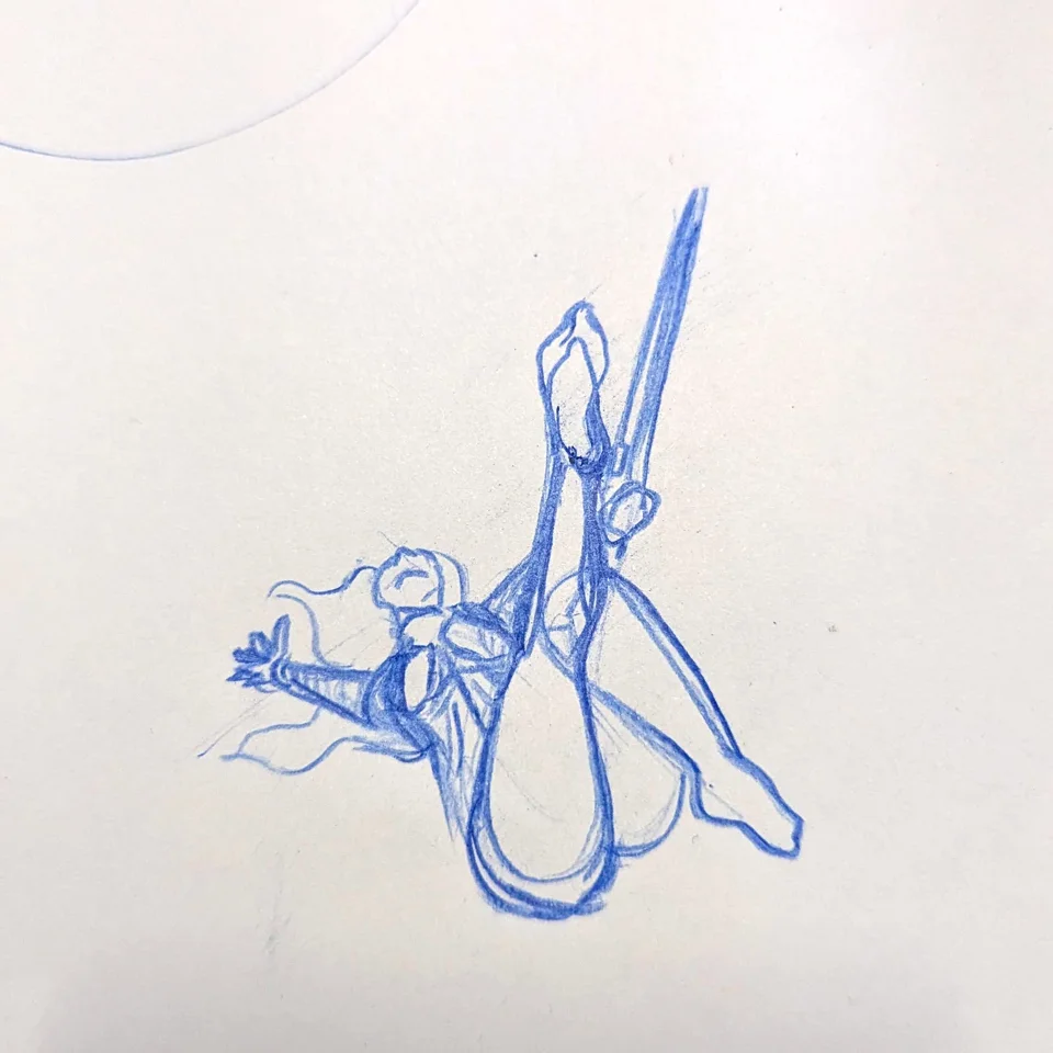
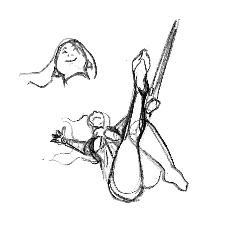
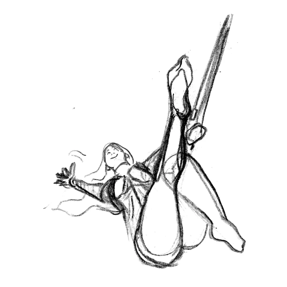
I only had a rough sketch in my initial thumbnails, so I realised that I needed to put some proper thought into the acrobat's pose. I had decided that I wanted to depict an act I had seen in my research where the acrobat performs at height inside of a transparent ball. I had a piece of paper in front of me and just started sketching it out. It took a little while, and I adjusted things a few times to get the foreshortening as close as I could manage. I'll be adding this sketch into my sketchbook so I have it with the other content for this exercise, I think it came out well. (Well, I wasn't 100% happy with the head, and re-drew it!)
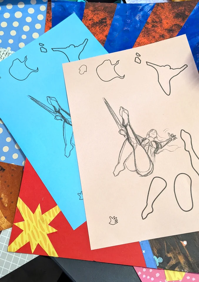
I wanted to use the new head, so had the idea to scan in the image to merge it into the original sketch. This got me thinking - how was I going to assemble this figure with paper?! Especially in a way that looks clean and visually reads well. When I was making the sketch I constructed the acrobat using a lot of shape language. Perhaps I could use these shapes when cutting the paper? I then realised that I could reverse the sketch, so when I cut it out, I could glue down the side with the linework, keeping the acrobat looking neat and tidy. To make this process easier I created vector shapes for each of the main body parts and then printed out my templates onto simple coloured paper.
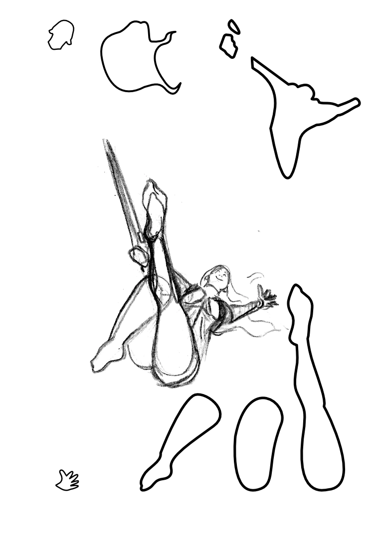
I cut and test-assembled the acrobat, making small tweaks here and there to accommodate the glueing process. I realised my sketch had not really thought about the fabric, bubble or chain. The fabric was relatively easy to do by hand, and only needed a few minor adjustments for perspective and gapping with the other elements.
The ceiling chain was also not too difficult, and I was pleased with my choice of textured paper for this element. When it came to the bubble I was not sure what to do, and tried to find the right size circle to draw around. I was not sure whether to go for a paper circle, perhaps use an acrylic pen, or white coloured pencil?
In the end, I ran with an idea I had at the thumbnail stage and used a piece of clear acetate. I played with the size of the bubble by mocking up the shape electronically over my template sketch. I transferred that circle to the acetate using a circular object of the same size and a Sharpie and then cut out the circle using a rotary blade. I had experimented with whether the bubble should be open or closed, and how to depict the metal banding of each half. However when I experimented with the cut-outs, the perspective of each half did not translate well, and when the together the banding obscured the acrobat.
So I took some artistic licence and elected to not have any detail on the bubble. I was happy with the overall look and feel. After showing it to my wife we both agreed that the acrobat may need some additional detail to read more effectively, so I used coloured pencils to add a little line work and shading to some shapes. I also used the white pencil around the bubble so it read more effectively in any light. I am not 100% happy with the face, but it was good enough for this exercise. I'd re-do it given the chance. I also am critical of the bubble's size - while it worked on the screen when placed in context with the cable it was too small - for the perspective to be correct the cable would need to obscure the acrobat - a bigger bubble would alleviate that problem.
To the naked eye, it still works and I am pleased with the overall effect produced.
Finishing the Poster
I printed out the Jay Miller's Circus Logo onto thick paper, and then manually cut it out using a scalpel. I glued the logo to the board, and I am still frustrated with its positioning. I veered away from the composition of my thumbnail and (likely influenced by the real posters) moved it more centrally - but not actually at the centre!
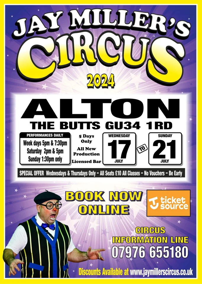
I scanned in the poster, so I had a reference image as a backup (and so I could add to the learning log of course). I was not sure if I should add the additional information with hand-cut typography as I had explored earlier. When I looked at the actual posters used in 2024, there was a LOT of information. I thought about my different options and ended up sleeping on the decision.
In the morning, I decided to add the other information digitally but did it in such a way that it should appear like I printed the elements out onto paper, and then stuck that paper to the poster, using textures to give that illusion. I cropped the illustration to centre the logo, which cut into the real estate I had for the information. I had to think creatively about where to put the information and how to display things without it getting crowded.
I tried to emulate the 'client's' usual style for posters, which I think I did well without being too busy. However, if I had not given myself the imaginary client constraint, I think I would have spent more time playing with different layouts and typographic options. I am pleased with the final result, however. Using just paper was very very time-consuming and while enjoyable at times, became very frustrating and laborious. I am quite glad I took a pragmatic approach with the typography as it allowed me to complete the exercise rather than get exhausted. I am also pleased that I was brave and embraced the happy accidents I had.
I have asked for feedback from my peers in case there was something I had missed, or if they have different ideas about how they might have approached things, but at the time of writing I have not had any replies.

References
Clowns International (2024) Egg registry, Clowns International. Available at: https://www.clownsinternational.com/egg-registry/ (Accessed: 16 October 2024).
Comments