Responding to a Brief - Exercise 4.7: Contemporary ceramics
- Dan Woodward

- Oct 23, 2024
- 5 min read
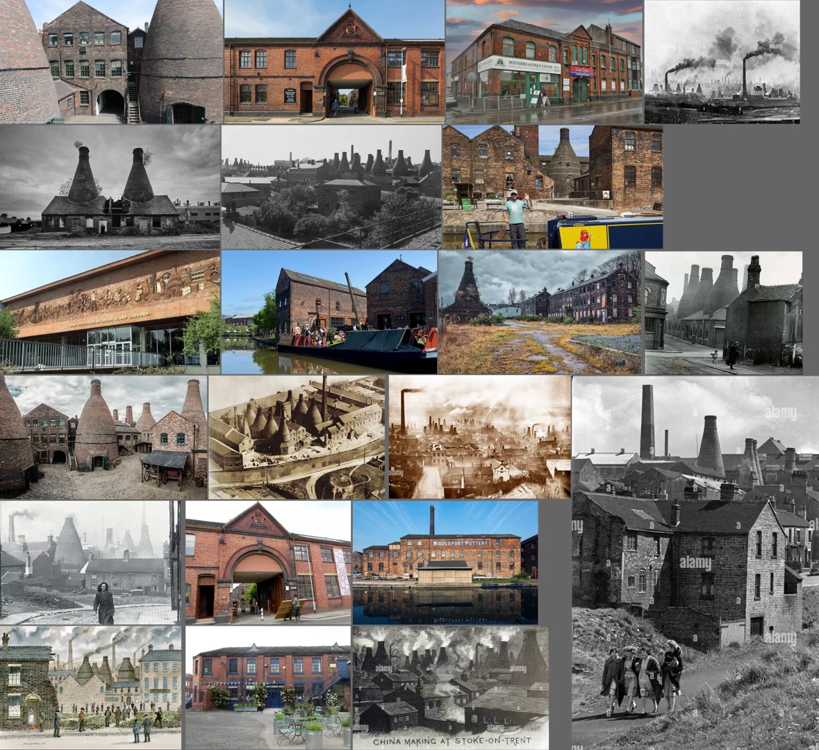
For this exercise, I was asked to create illustrations for contemporary ceramics that drew on the visual history and symbolism of pottery. I was very clear from the outset that I wanted to touch on my familial links to The Potteries of Stoke-on-Trent and looked into some of the more famous styles that came out of the big pottery factories in the 19th and early 20th centuries.
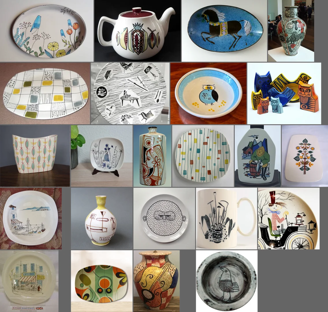
I couldn't find an aesthetic that I could relate to, so I decided to look at the literal (rather than visual) history of the area, and then try and render that in a way that emulated the mid-20th-century ceramic visual language. To get going, I pulled together some visual references and then used my sketchbook to explore the ideas, history and styles I discovered through my research.

Exploring Ideas Visually
My ambition was to emulate aspects of 1960s pottery design, combining some modernist sensibilities of geometric shape and lines, and combine it with sketchy illustrations of landscapes I had seen from that period. I used my sketchbook to sketch freely, focusing on the shapes and themes. I started using a glass dip pen, before moving to a steep nib pen and then a fine-liner pen, to see how the different pens might affect the line quality ahead of doing the final illustrations.
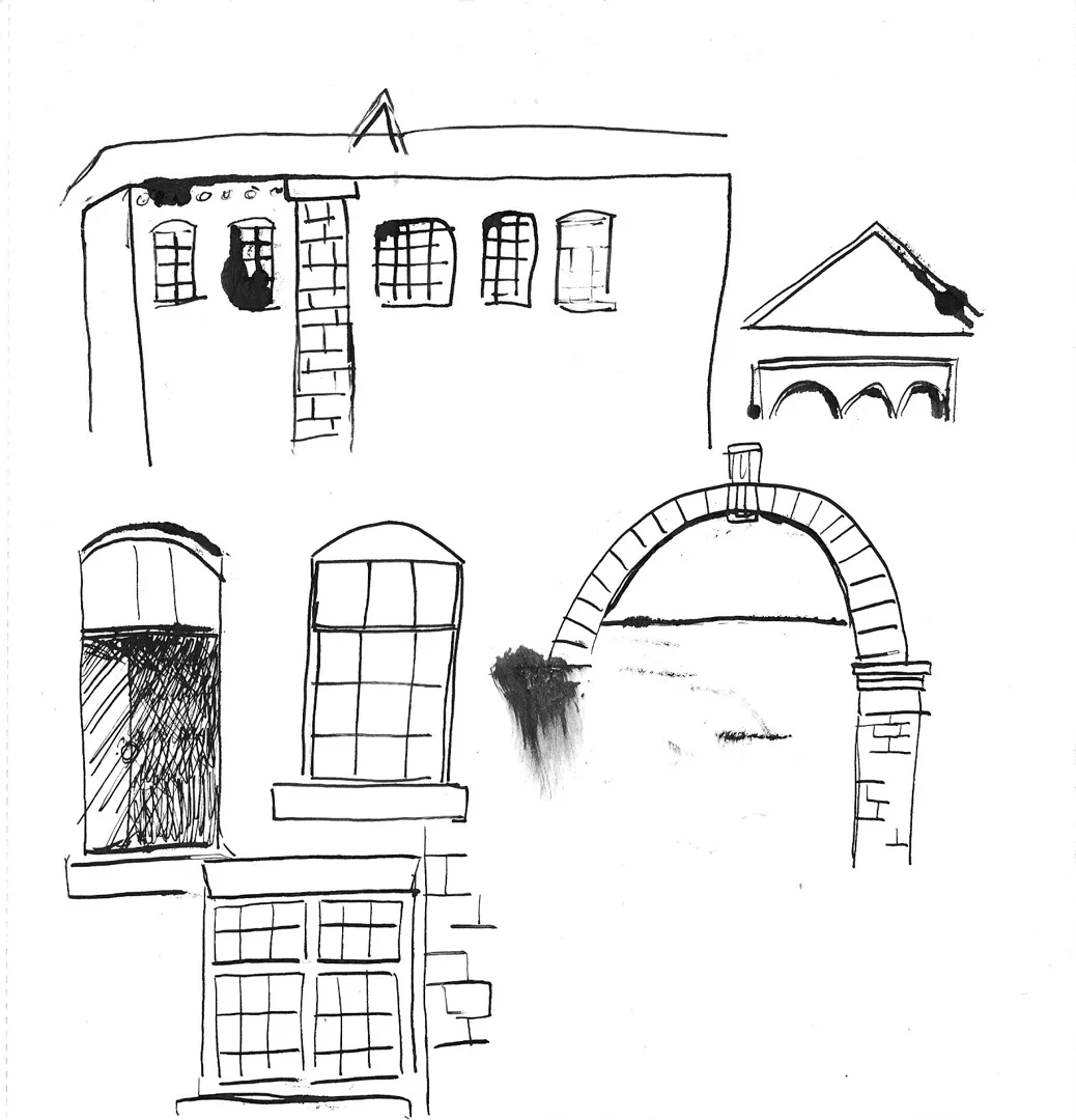
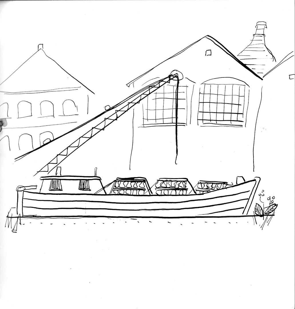
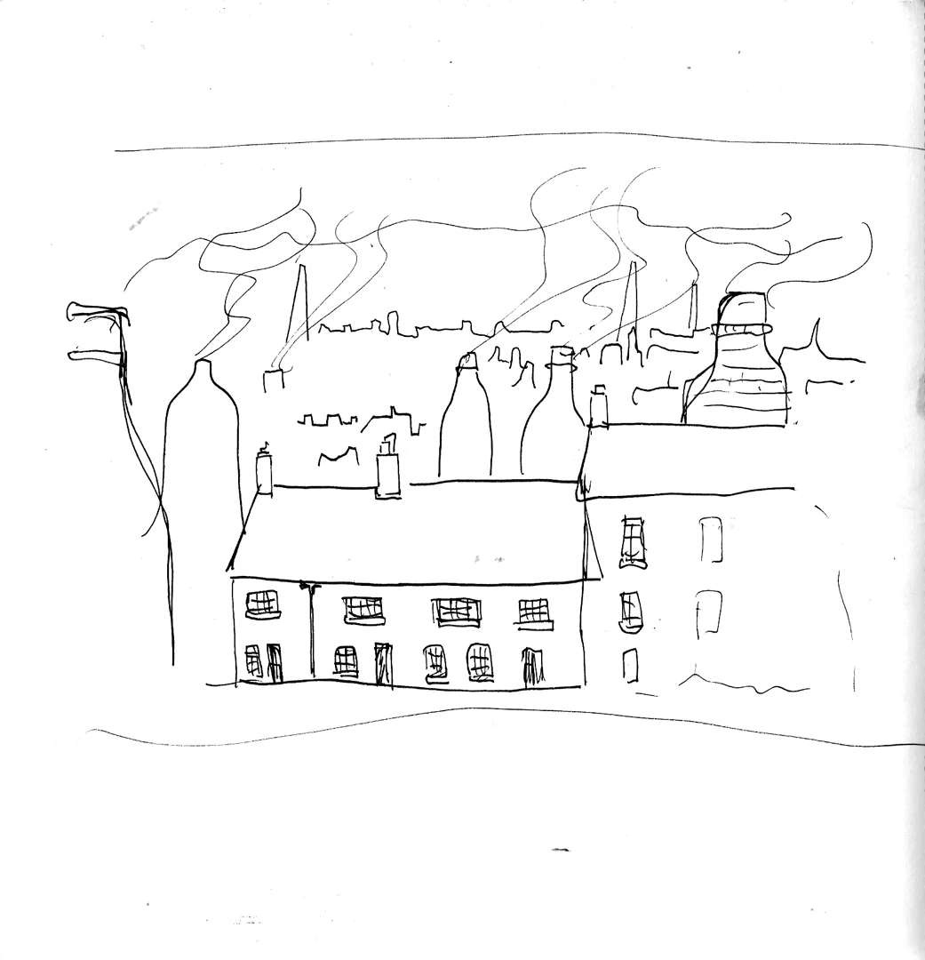
My first sketches were focused on architectural shapes and features in the buildings. This took me down quite the rabbit hole, and I spent hours and hours looking at old photographs and learning more about Stoke-on-Trent's past. I even ended up mapping out my family tree, something that I had done with my Dad before he passed away. This helped me feel even more connected to the theme.
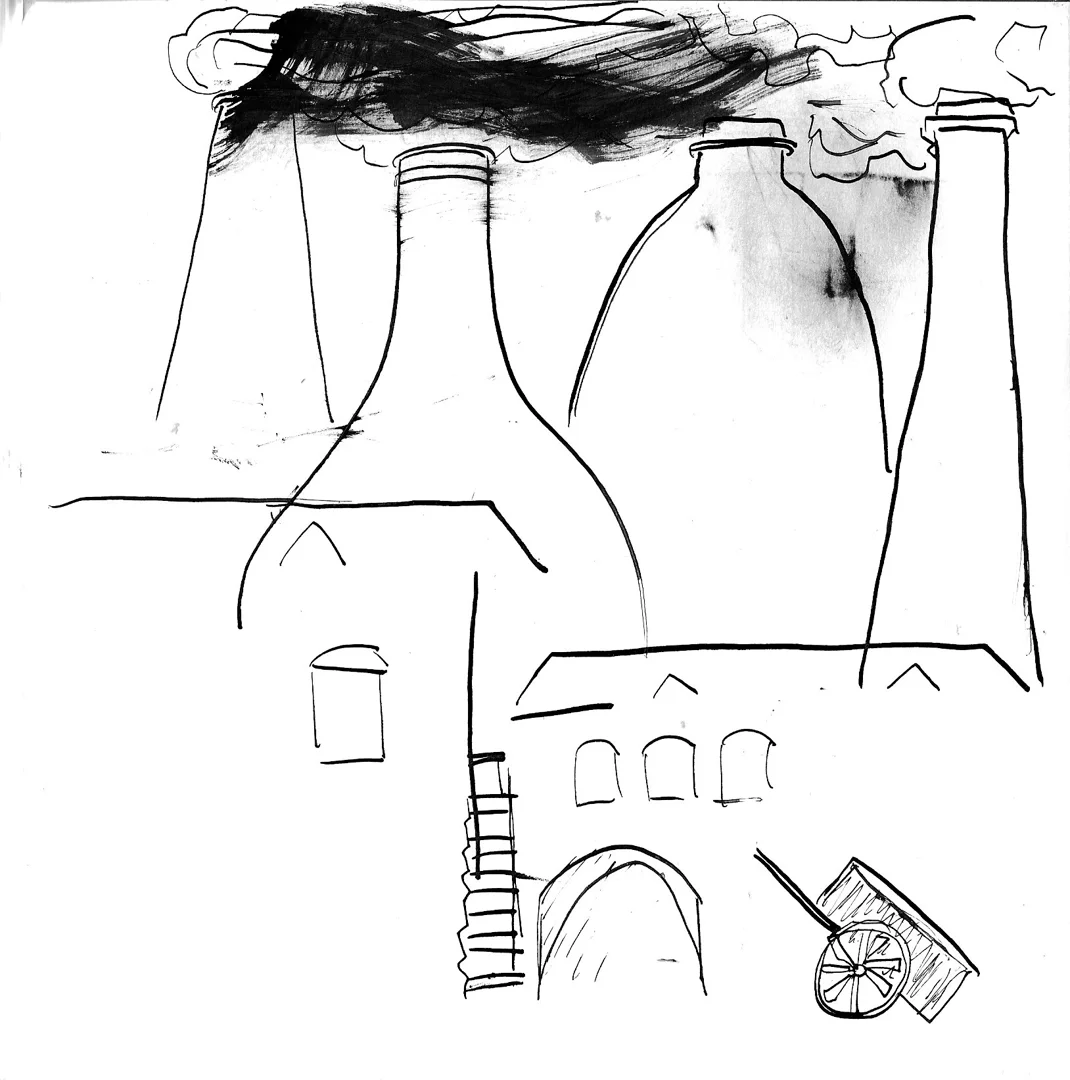
When I went back to my sketchbook, I wanted to try and capture different aspects of the industry. My grandmother's side of the family worked on the canals, while my grandfather's side were linked to the collieries and potteries. I drew a little from reference and a little from imagination. My final two pages of sketching gave me the kernels of some ideas that I thought would translate well onto ceramics.
Creating the Illustrations
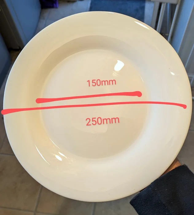
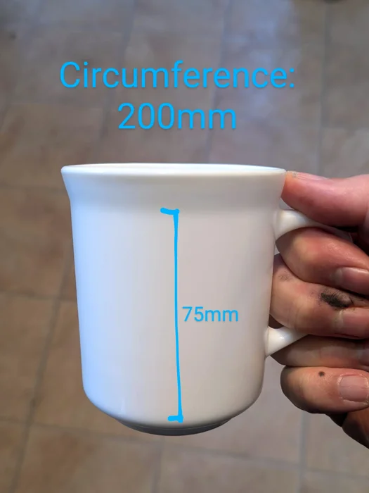
I had bought some cheap white ceramics to use for this exercise, getting multiples in case I came up with lots of designs, or needed backups! Given my time constraints I decided to go with only two designs and took some measurements from the ceramics so that when it came to creating my designs, I could do so as close to actual size as possible.
I had come up with a strategy for getting the designs onto the ceramics and also had a 3D model of a vase on Procreate as a backup if everything went wrong. I planned to use waterslide transfers to apply the designs to the object, which was not only a tried-and-trusted technique for me as a miniature model-builder but was also in keeping with the industrial printing heritage used in some of the potteries.
I used a digital programme to create my roughs and designs and chose Rebelle 7 for its ability to replicate traditional paints and inks effectively. I hoped this would give me the closest experience to hand-painting on the objects themselves. Below you can see videos of my process for both designs:
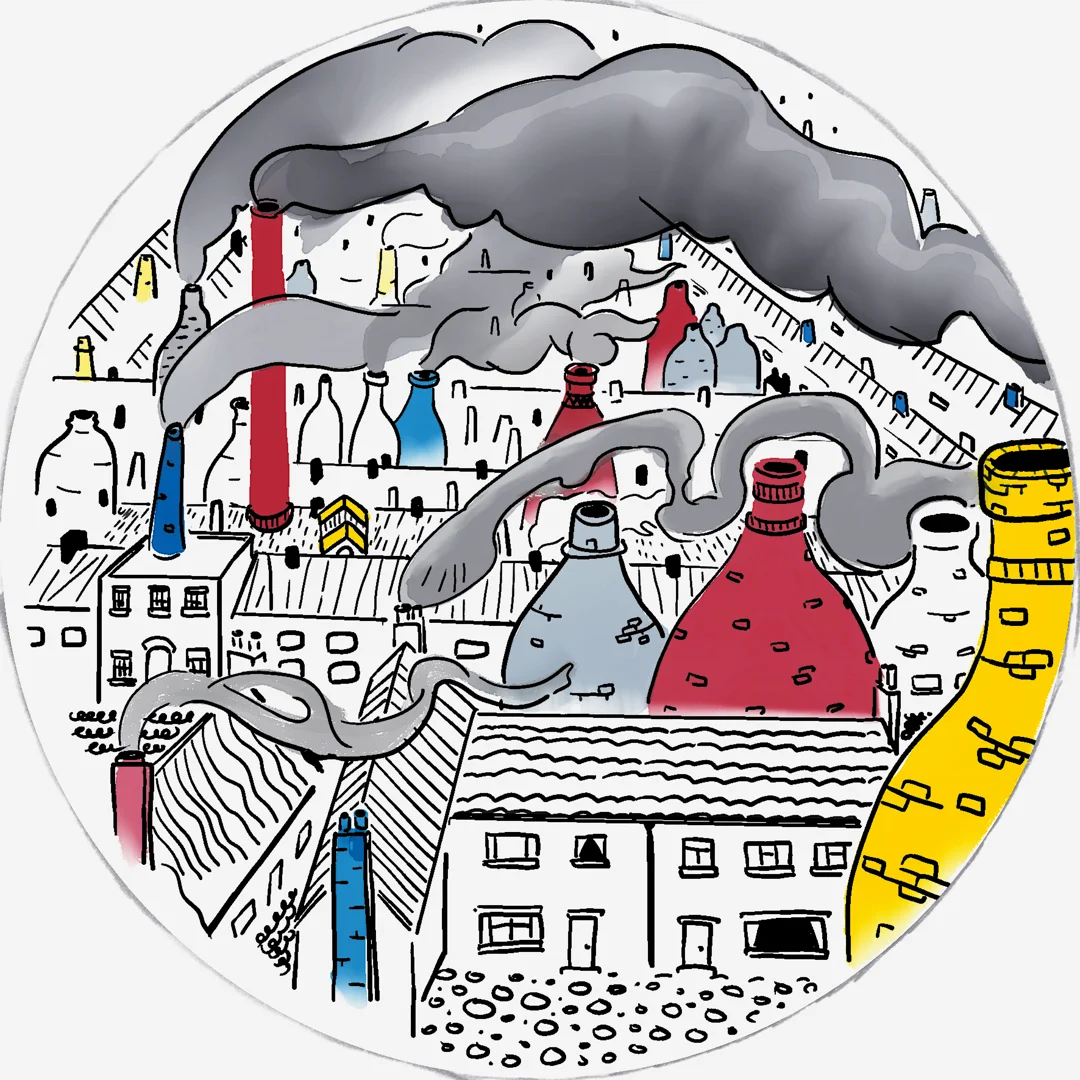
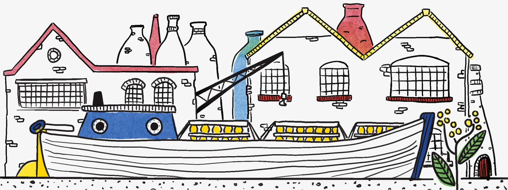
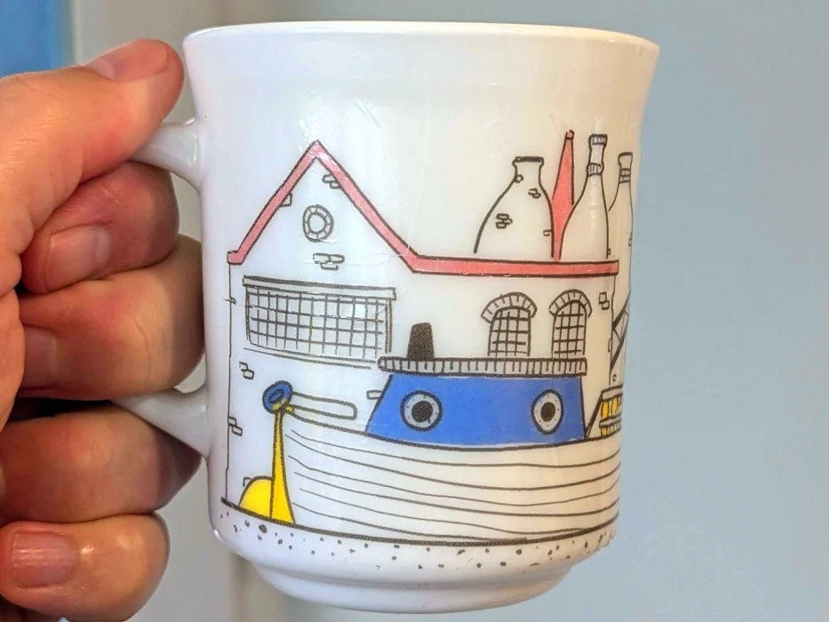
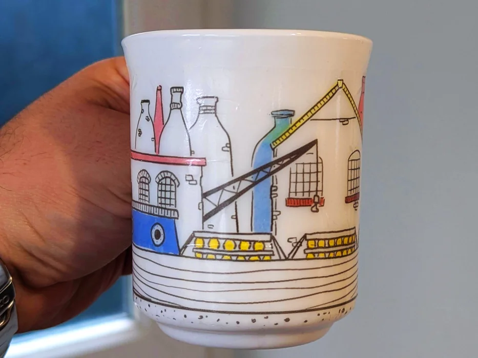
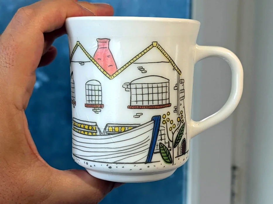
Below, you can see the final illustration designs. I chose a limited palette of bold colours, which from my research seemed popular during the period I was emulating. I stuck to my instincts while creating both images and tried to experiment as I went. I ended up moving away from the more abstract geometry, but I really like both of the illustrations. I think they both convey the history of the potteries in their own way.
One of the things I took time over after the images were completed was to check the colour management on my computer and printer, making sure there were no discrepancies and the colour gamut would print as intended. In retrospect, I noticed that my levels adjustment was off slightly, creating an off-white backdrop. This would normally not be a big deal, yet I was printing onto transparent transfer paper, and it would carry over to the printing. If I were to do this again I would remove all white from the image before adjusting the levels.
Applying the Illustrations to the Ceramics
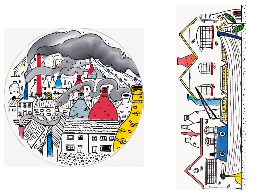
As I knew the size of the illustrations, I was confident that I could fit both onto a single sheet, which would avoid a lot of wasted paper. I arranged both digitally, ensuring that their dimensions were correct. Then, I loaded the transfer paper into the printer, and adjusted the print settings to match. The first print had to be aborted as the printer didn't like having many sheets in the caddy at once. It was still useful, however as I could see the print settings gave a good result, and the colours were faithful to the design.
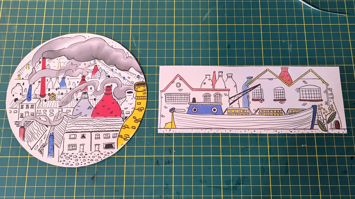
The second print came out perfectly! I let the printout dry fully before gradually applying three coats of acrylic varnish/sealer to the paper, letting each coat dry in turn. This would ensure that once placed into water, the ink on the paper would not run and dissolve! I left the varnish overnight to cure, and in the morning cut out each illustration - this is where the slight off-white was a hidden blessing as it made it a lot easier to see the edges!
Using a bowl of water, I immersed the plate design fully. I left it for about five minutes until I could tell that the design had sufficiently separated from the backing paper. Then I carefully slid the design onto the plate, using a brush to carefully anchor one end while I pulled the backing paper away.
I had a small window of time to adjust the position and then used kitchen paper to carefully press out any trapped water and address any creases I could see. With the plate design applied and drying, I immersed the mug's design in water.
Applying such a long design to the mug was not easy at all, and it was a struggle to keep it straight even with help from my wife. There also seemed to be less room to manoeuvre the design once placed. I did my best to align everything and while not perfect, any defects are only noticeable when up close to the mug.

Conclusions
The approach that I took had a lot of similarities with my paper-based work, so perhaps I don't have as much as I had expected to transfer back to that part of my process. However, what I did learn from using the waterslide transfers was how I could create a coordinated set of designs and turn them into things that people might pay money for. Once I had the two designs on ceramics, I could envisage a whole series in the style I had created. This gave me a lot more confidence that I could produce my own designs for objects and monetise them. It made me feel like I could actually be a working illustrator!



Comments