Responding to a Brief: Experimenting with texture
- Dan Woodward
- Nov 19, 2024
- 5 min read
While doing the work for Research 5.2, one of the artists I considered covering was Johan Egerkrans. However, given I have talked about his work in previous exercises I decided to omit him for the research task. While researching, I came across his old Blogspot website, and noticed a few posts with the tag of "tutorial". This got me curious and I spent some time investigating.
I was thrilled to find some posts which explained his process (at least as of 2016) in more detail than I had been able to find elsewhere. I was eager to try things out, and luckily in a previous post, he provided some texture files that he has used for his work. They were not the highest resolution, but it was enough for me to have a go at his approach.
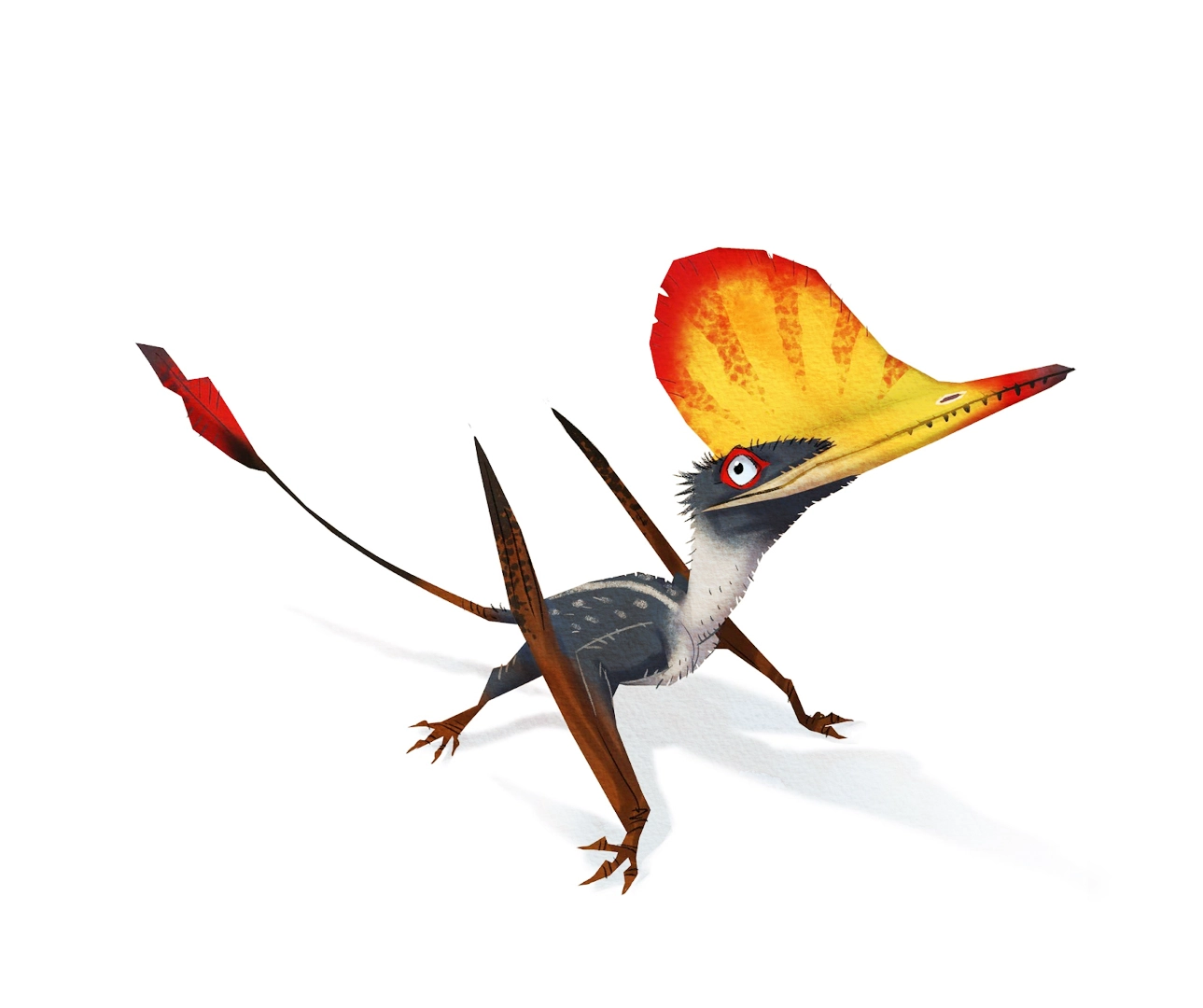
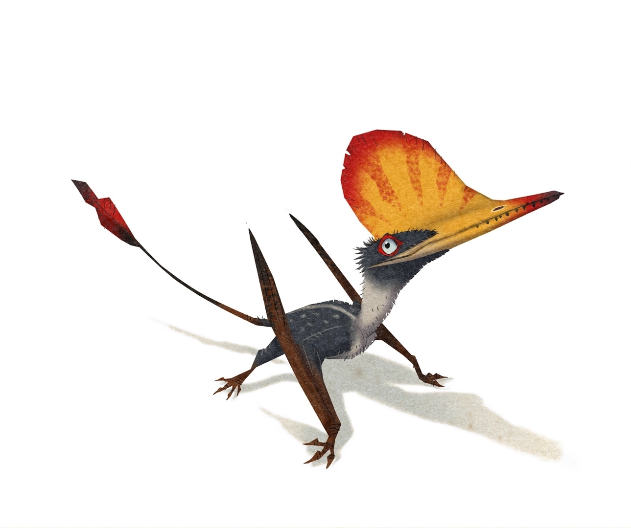
To make a fair comparison, I first used the penultimate image in his tutorial, which had been coloured and shaded, but no texture added. I then selected one of his textures and added it on top of the image using the Overlay blending mode as he described. I was conscious that I did not know which texture he had used originally, so chose one which I hoped would come close.
Looking more closely to compare, despite the relatively low resolution of the texture image provided, the result is still really pleasing, and I can see how these files could still be used for parts of an image, even if they might not cover a full illustration.
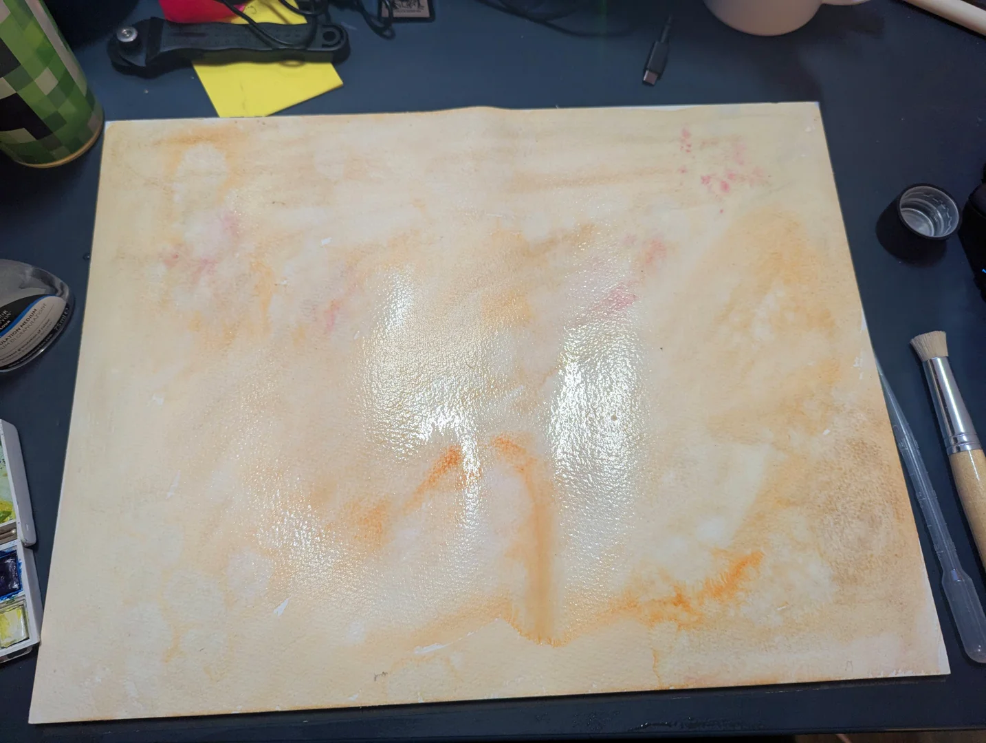
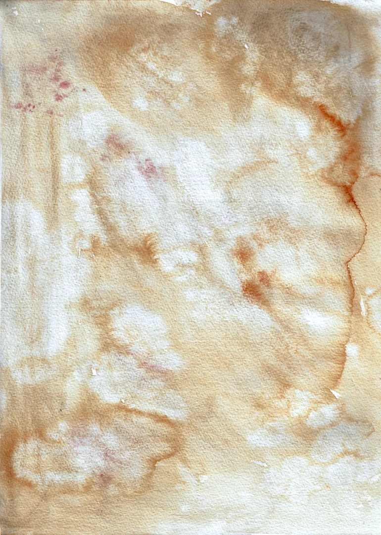
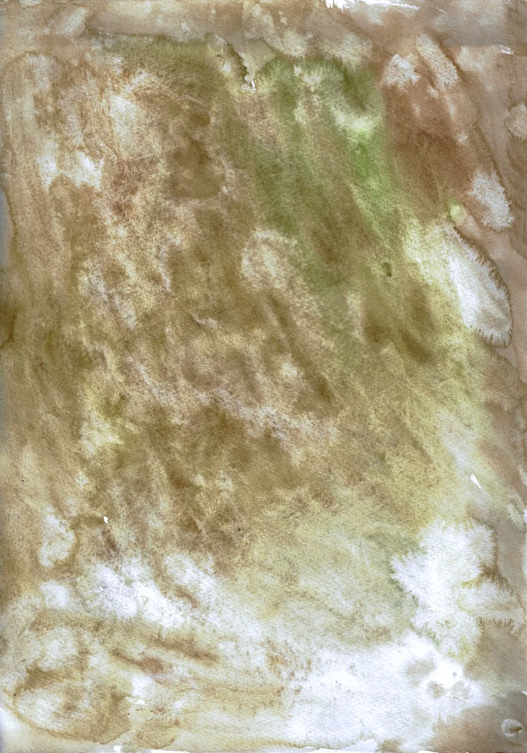
This inspired me to make my own textures. I used A3 watercolour paper of both hot and cold-pressed varieties. Egerkrans's only advice was that he uses 'earthy' colours, and looking at the textures provided I can see browns but also neutral versions of greys and blues. There are also some red and green elements in some of them. So I grabbed a small watercolour pan set and went about having some fun!
It was good fun to be using paints again! I didn't think too much about what I was doing, allowing my intuition to guide my marks and choices. This let me experiment with marks, including flicking and scraping. One of the things I noticed in some of his examples was the amount of granulation going wrong. So I grabbed some of my granulation medium and started to use it wet-on-wet. Sometimes I dabbed with a brush, but I also flicked spatters and used a pipette to drop and then blow the medium around. I managed to get some interesting results which, while different to Egerkrans's examples, I was happy to experiment with.
Whilst scanning and optimising the images, it occurred to me that I had other ways of potentially getting a similar effect, so I decided to experiment with each approach and see which one gave me the result I liked the most.
Experiment 1: Scanned watercolour
I am very pleased with this outcome, on my version I really get a sense of the texture of the paint as well as the paper itself. It would be relatively easy to experiment with adjusting the size of the overlayed image as well as levels of opacity to make the paper texture more or less noticeable. The colours are not the same, but that was to be expected, given that Egerkrans will often do some colour grading and I was using a completely different texture, with its own colours.
Experiment 2: placing the image within a paper texture file
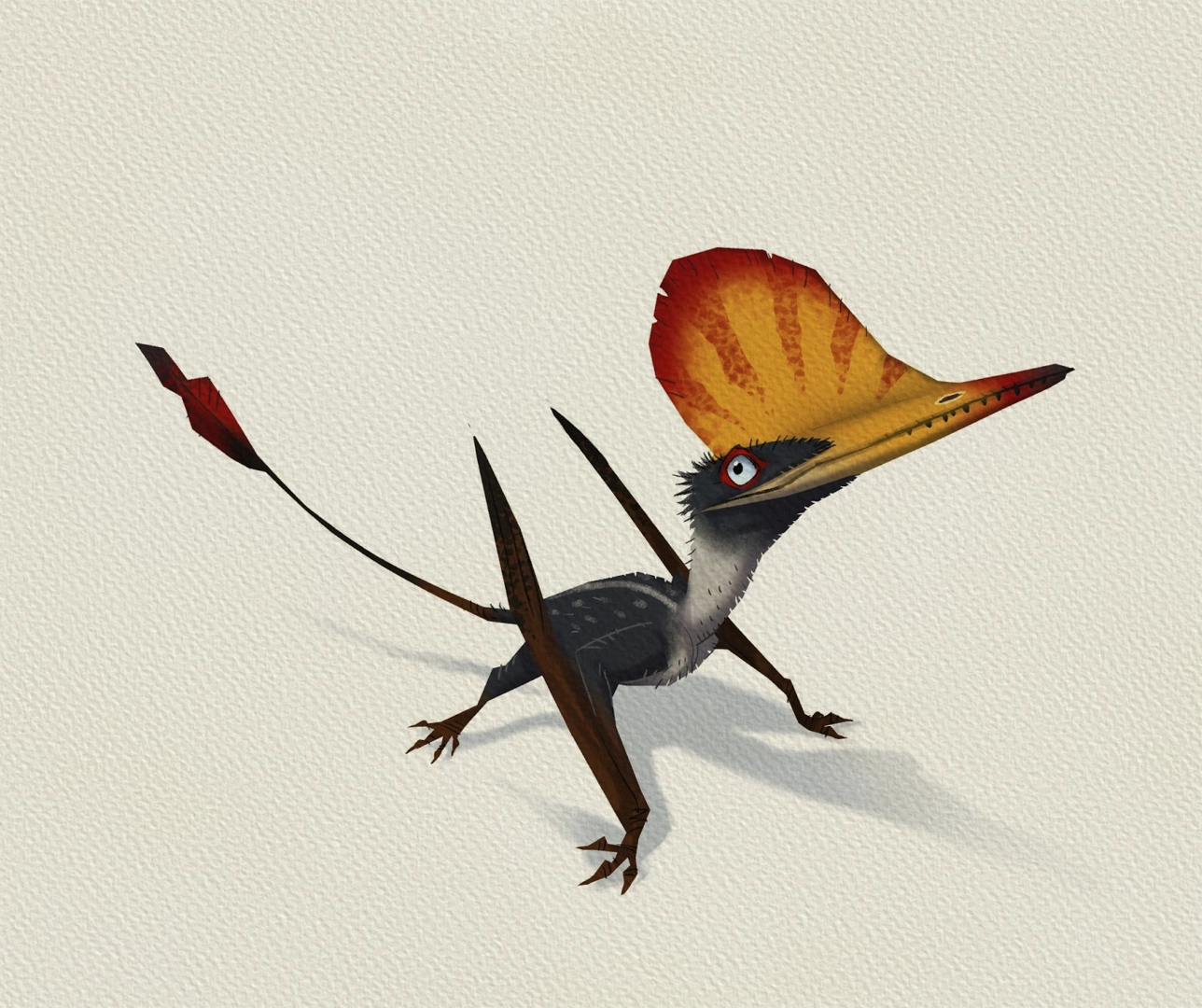
For this experiment, I used a tailored paper texture file from True Grit Texture Supply. I chose a paper called 'rotting pulp' as this not only had an organic paper texture but was also mottled and imperfect. These textures have been optimised to not only accentuate the shadows of the paper but also highlight the surface as well.
This approach had a really interesting effect, and the highlights on the paper make the image feel palpable. I had to mask the image, otherwise the whole image would see the paper effect. This had a noticeable effect on the shadow, which now feels too solid. While I think the texture is effective, I think I would likely use this approach to give the whole illustration an organic feel, rather than just certain elements. I noticed there is a second pack now available, and I will look to pick that up when I can afford it as it has watercolour paper alongside others which I think I will find useful.
Experiment 3: adding the image into Rebelle 7
Rebelle is the application that has allowed me to create convincing paint and ink effects digitally and behaves very closely to traditional media. I chose a backdrop of an off-white aquarelle texture and placed Egerkrans's coloured image with multiply blend mode..
When I inspected the result, I noticed that it was a very good watercolour texture, but did not have the same kind of organic randomness. Also, because it was placed in multiply the overall effect is darker than I would like for the context of the image. The other drawback was there was no easy way to get a like-for-like by masking the texture to show the white backdrop. Thinking about the texture that the paint gave did, however, give me another idea...
Experiment 4: Creating a texture digitally

If all of the interest came from the textures I created, then why didn't I try to create something similar digitally - seeing as Rebelle can simulate the running and bleeding of wet-on-wet watercolours. I didn't bother to use a stylus, and just wet the page and added colours using my mouse, experimenting with bush shapes and sizes to get something interesting. The result ended up being darker than I had expected, but it had a lot of visual interest for not a lot of time investment. It was impossible to get the same kind of granulation effects as doing it traditionally, however, and this is something I'd like to ensure - so I don't think this would be a replacement, but is an interesting way to add more textures to my library relatively quickly.
Now that I had a paint layer I was able to clip and overlay the texture to Egerkrans's image, but was still not able to mask it:
The image did seem to have more visual interest this time, but it still felt muted in comparison to the original or the other experiments. I realised that I could just export the watercolour layer by itself, and then apply the original overlay technique:
This came out so much better! and in a lot of ways is similar to the original. Despite the overlayed texture being quite dark, it didn't overpower the image once I reduced the opacity. What I especially liked was the effect the speckling had once overlayed over the image, I may be able to replicate this traditionally using salt or flicking bleach carefully once dried.
A Final Comparison
Overall, I think the overlay using my hand-made texture works the best, although I did like the final overlay using the digital texture. It makes me think that I can afford to have some textures in my library that are more saturated - something I will consider when making more textures for my library. Also, given that I have scanned the originals, perhaps I can experiment with more layers to the first set?
References
Egerkrans, J. (2016) Adding a bit of texture, JOHAN EGERKRANS. Available at: https://johan-egerkrans.blogspot.com/2016/08/adding-bit-of-texture.html (Accessed: 19 November 2024).
Egerkrans, J. (2017) How to draw A wukongopterus, JOHAN EGERKRANS. Available at: https://johan-egerkrans.blogspot.com/2017/08/how-to-draw-wukongopterus.html (Accessed: 19 November 2024).









Comments