For this research point, I was asked to review my own work in order to identify work that best reflects a personal voice. I store all of my work digitally (except for sketchbooks) so that I can upload it to this learning log, so I sat down and started to go back over my work, looking for an emerging voice in earlier work, and identifying any recent pieces that feel closer to what I want to say with my work.
Key Steps in Illustration

I wanted to include this piece, as it was the first time I had created something in response to my mental health.

I really enjoyed this work and it was the first time I felt like I had created something I would be happy to put out into the world.

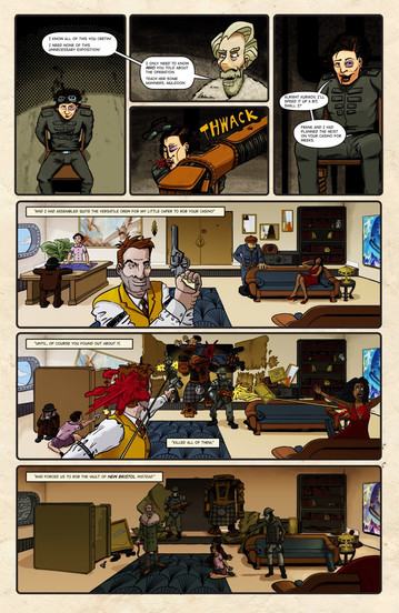
I included this image because I let my humour come through into the work. I am not sure that the Edwardian aesthetic is the look I am going for, but I am pleased with the render.
Illustration Sketchbooks

I still really like this coloured version of a sketch I did whilst doing an exercise. I came such a long way with my sketchbook work during this module, which atrophied a lot due to the pandemic.

I like the way that I captured colour in this image, and played with using shapes and empty space to suggest form, and not just contour lines.

This one still makes me chuckle/ I like how I reduced the illustration down to simple lines and shapes, but it still communicates well. It's also a bit silly, and I am glad I started to allow that in my sketches.

This was such a random thing for me to make. Dan Berry is one of my favourite comic creators and I have learned so much from his work and his former podcast. I think I really did this as a silly 'present' to send him over social media. It's surreal nonsense and I love it.

I loved this exercise, and the wild freedom of filling up my zine-style sketchbook. It was the last think I created before lockdown hit.

I love the layers in this image. It's bold, textural and just a little bit weird!
Graphic Fiction

This was the first time I started to feel like I creating as 'me'. Well, me as I was then...
It allowed me to be proud of the things I love, which lifted my confidence considerably.

I wish I had had the time time to rend this the way it looked in my head. I loved delving into my personal history to create this. Showing the world what my life was like was a great feeling.

I picked this image as it's something I am still proud of. I found using fine-liners exhausting, so it's not a rendering style I like to do very often but I am really pleased with the way I combined the different marks.

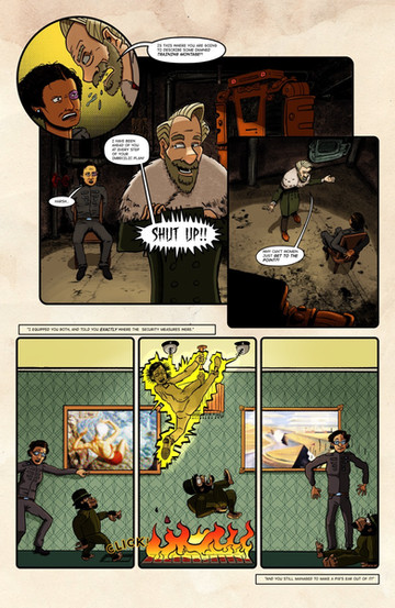
This comic still means a lot to me as it represents overcoming frustration and adversity. I also think that I achieved a good balance between a semi-realistic style and having fun with my work.

I completed this work after getting advice from my favourite comic artist. It helped me to let go, get weird and play with my work. I love all the randomness and little easter eggs hidden everywhere.

I really enjoyed combining illustration with some design for this piece. I managed to combine retro influences and silliness into something that could be still be accepted for the 'serious' business of designing packaging.
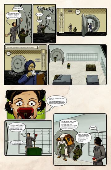
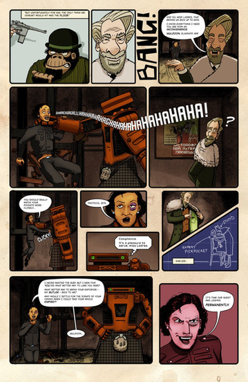
Whilst it burnt me out, I am really proud of this comic. I learned a lot by creating it. Looking back at it there are a lot of things I would change, especially with the rendering and colouring. But it was a full story where I did what though was cool, free from anyone else's expectations.
Visual Exploration

This is not my usual style at all, but I loved the sense of movement in this piece, and I was really proud of the way researched the style guidelines of the official competition to create something that could have met a brief.

Whilst this was not the most successful image in the context of the exercise (lack of a detailed background) I really like the final outcome. It has a vintage comic feel as well as more modern grunge aesthetic. I love all the vibrant colours and my rendering really improved.

This was the first time painting when I suddenly felt this 'whoah' moment deep in the pit of my stomach. There was precision but also so much energy. I loved the colours I had used and the sense of freedom I had when creating it.
My Thoughts
It was a bit weird going back through all my work, to be honest. Some of it brought back fond memories, and some more painful memories. Looking at my selection I still find it very hard to identify a clear voice, which upsets me. I would have thought by this point in my studies something more clear would have emerged.
One thing I have noticed is that I don't seem to have found 'my' way to draw yet. There were some moments in the sketchbooks module where I saw me capturing people in a more cartoon-like way rather than trying to do plein air life drawing. I seem to have lost that. I have been trying to practice drawing people quickly in my sketchbook and it feels like I am 'face-blind'. I don't seem to be able to interpret things in my own way.
I also see that when looking back at some of my comics. I love how I have let my inner world come out, but in terms of my technical approach everything still feels so forced.
If someone said to me "how would you draw if no one was watching?" I honestly couldn't tell you. In that regard I feel like I am still masking, I don't know who I am.
There are positives from this exercise. Whilst I may not see a cohesive voice, I think I start to see things I care about:
Sillyness
Bright colours (I can even see elements of a preferred palette emerging)
Texture
Line work
I also know there are things that I am interested in my voice saying through my work:
Mental health and neurodiversity
Callbacks to retro influences
Letting go of shame, to be yourself
Storytelling
I also am starting to get a better sense of the projects where I'd like to explore these:
Medical illustration
Packaging (physical goods, board games, digital commerce)
Sequential illustration, especially for 11-18 year olds
Live illustration (graphic recording)
Tabletop games (spot illustrations, book covers, playing card art etc.)
I am not sure where to focus, and I also am unsure on what I should develop in order go in the direction that fits me. Hopefully more will become clear as the module progresses.







Commentaires