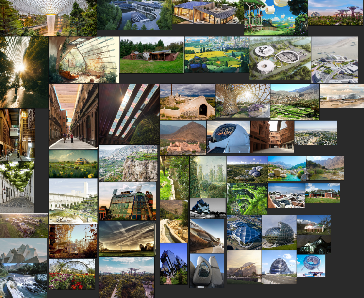
This post will cover my work for the first image of the assignment. For this image, I decided to start by reviewing an approach I had taken as part of the module - namely the photo-compositing approach I used to mash images together. The first thing I did was to create a general moldboard for solarpunk, drawing on conceptual as well as real-world aesthetics. I particularly looked for where technology and architecture were already starting to adopt some of these elements. I also tried to stay away from anything too high-rise. This mood board would form the basis of my approach across all three images.

Next, I started to think about the community aspect of this image, referring back to my previous sketchbook maps. Thinking about community and the revival of sustainable approaches from the time of agriculture made me think that there would probably be a number of existing images made in those times that depicted the kind of scene I wanted to present, so I then created an additional moldboard that tried to capture this sense of community and sustainability:

Having created these sources of inspiration, I used my sketchbook to create thumbnail compositions I could explore more:

As a way of creating roughs, I then chose two thumbnails and created photo composite images from the ideas. I drew from some of the images in my mood boards, as well as searched for available web images that I could adapt to the scenes.
I think that both of these images are quite successful in the way they create a sense of place, and compositionally I think they are quite strong. I struggled to place people into them in a meaningful way, so I decided to not get bogged down with that at this stage.
I wanted to develop these further and chose to move forward with the estuary image. I took this concept and then used it as a basis for a painting. I didn't want to turn it into a full concept art image, I wanted to be more traditional and painterly with my approach. I also knew that I wouldn't be able to simply copy the photographic reference, given that the colours and lighting are not consistent in the rough composite image. Again, I did this all digitally in Rebelle, trying to combine the traditional painterly approach in a digital space. You can see my painting process below:
And here is the final image:

Looking back at this image, it is a far cry from the original photobash. I tried to play with the sense of light, so there was a consistent time of day and took inspiration from other traditional painters and the way that they played with colour. This was a particular focus of mine for the waves in the water. I was unsure if I should sign this as Spindrift or not, as it didn't feel as free or as confident as my portraits. I think I need to work a lot on my painting when it comes to colour and light, and I think that overtook this painting too much. I overthink the need to be a realist painter like the artists I enjoy (e.g. Hopper, Gurney) and I find it hard to reconcile that perhaps that's just not my style.
You probably saw that I struggled a lot with the buildings. Everything I did seemed to end up being a copy of an American 'earthship' from New Mexico, and I wasn't sure how to adapt my approach. One thing that I discussed with my tutor is the emerging role of AI in visual creativity. I have very strong feelings about its use, and very much disagree with how many of these systems have been trained on images without any attribution, reference or compensation to the artists. The law is only just starting to adapt to the creation of images through AI, and so whilst not yet illegal, I certainly see it as immoral.
I also think it is dangerous for creativity in general - these systems are trained on pre-existing images that have been created through the diversity of human ingenuity. If we recursively train these images we will inevitably end up with a homogenisation of style which will be difficult to recover from if artists and other image makers cannot make a living from their work without it being stolen and sucked into a training database.
Where I do see AI's role is in the generative part of human ingenuity. AI is very very good at generating lots of different options. Right now, a lot of them look downright weird. However, I believe that this weird space is where creatives can see the spark of ideas. We can use AI to give us lots of options, and then take aspects from some or many of those ideas, and then extend them, creating something unique.
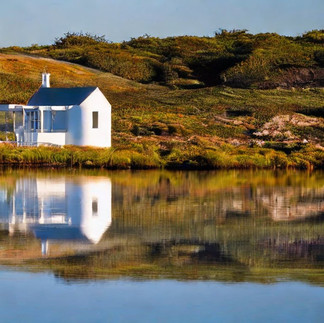
To that end, I used a free version of Stable Diffusion, which had been trained on free-use and royalty-free images only. Trying a variety of different prompts, I experimented with what images I could get back that would help me not only with shapes but also act as a lighting reference I could draw from. Here are some of the more successful images that were created using this method:
These were enough assistance that they got me out of a hole when struggling with the structures in this image, and I think the painting is better for it. This initial foray into AI intrigued me a lot, and I wondered how I could then apply it as I approached the other two final images for the assignment.


Commenti