For this second image, I decided to delve into the realm of 3D. I studied closely two books by James Gurney [2,3] to explore not just the topics of those books but also how he used his experience creating Dinotopia as a reference for many of his examples. One of the things that caught my eye was how he created maquettes as a reference to explore compositions, lighting and colour. He also explores this in this video:
I thought that this could be a fruitful area to explore myself, thinking about how I can explore scale and space through the use of models.
Physical Model
To start with, I had an idea of how to start simply. I had the idea to do another photo composite, but instead, try and create it in a layered 3D space, that way you could reposition your perspective to look for different compositions etc. This is similar to the parallax approach that was common in animation and is now seen every day in web design.
One of the aspects of solarpunk I wanted to explore was to think of how this solarpunk world exists all around the globe - the aesthetic seems to be heavily dominated by a western euro-centric approach. So instead I decided to explore my experiences living in the middle east. The Omanis traditionally adopted approaches of how to live in balance with the natural environment and developed amazing systems to live and flourish in otherwise inhospitable conditions.
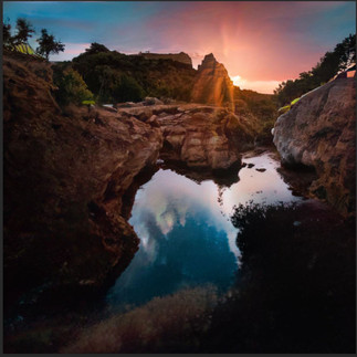
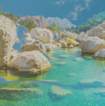
I started with this stock image taken in Wadi Tiwi, a wonderful place. Some of my most cherished memories are venturing into the wadis with my family. My Dad and I took a 4x4 into Wadi Bani Khalid so I could complete my A-level geography project on its geology and how that affects the creation of wadis in the area.

I then sourced various different elements that I would then try to incorporate into the image. I printed both the main and smaller images onto card sheets.

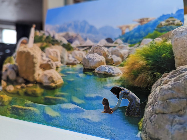
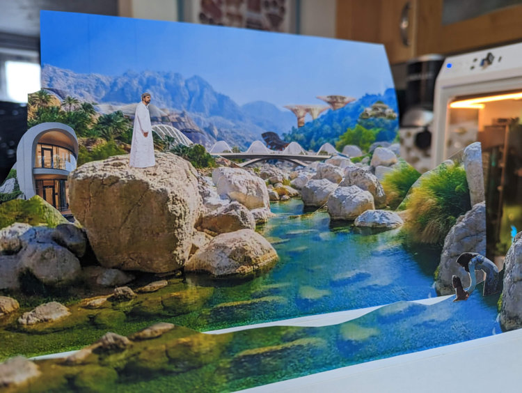
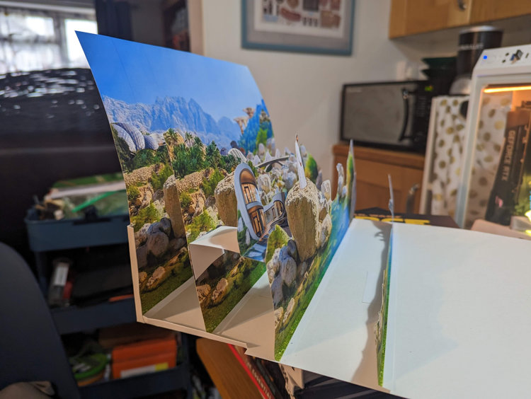
I printed the main image many times and then segmented each copy into a different plane. I then glued those planes to an A3 sheet of bristol board, which I bent so that it would support the rearmost image. I then worked out where each of the thematic images could be placed to create a new composite image with a meaningful composition. Below you can see the final maquette:
And to demonstrate how this could be used to explore perspective and composition used my phone to take a short video:
Digital 3D - Blender
I thought that this was a successful first experiment. But I wondered how I might take this into a final painting again. I wanted to push myself outside of my comfort zone, so decided to start exploring Blender. There is so much information available for this open-source software, but this also makes it quite daunting; it's difficult to know where to start.
I discovered a useful tutorial that explained how you can use plugins to import satellite map data as well as topographic information and combine them to get an accurate representation of the physical space. My thought was I could use this to find the same spot in Wadi Tiwi, and then create a comparative scene, this time with the space being 3D, and having the ability to adjust lighting as I wanted. I successfully worked out how to do this, the downside was that the topographical data just wasn't detailed enough. I wouldn't be able to get the kind of effect I wanted.
It did make me think of how I could use this to get a sense of scale, however. I was able to get quite a good sense of the panoramic space using this method, and I could see it as a really useful way to find settings on which to overpaint in an image editor. Once I have learned how to create physical assets and structures more proficiently, I think you could have a lot of fun populating the space with a digital maquette, and then using that 3D space to find interesting viewpoints.

Whilst I know there are expert professional digital artists out there, who work out how to turn a scene like this into a fully realised and rendered scene, I think the sweet spot for me is to use it much as Gurney did using cardboard, wire and plaster. To keep that separation between the paint and the reference.
Depth Mapping
So if this approach wasn't going to work, I had to explore other options. First, I explored the idea of depth maps. These are black-and-white representations of a scene that represent relative depth. You can then overlay your image and get a 3D representation of that space. But how to do this? Again, I discovered that AI was already making progress in this area, and used a free AI experimental tool called MiDaS to create a depth map from my original photo:

It was relatively accurate, all I needed to so was to take away the white edges that appeared on the edge of the backdrop, which was easy to do in my photo editor.

Using the side-by-side image above, I could then load this into a specialist plugin in Blender which would combine the two for me (this can be done manually, but the plugin allowed me to save time and learn the steps later).

As you can just about see from the screenshot above, it does work. I just don't think that this reference image is the right subject to use for this technique. However, if there was an image with high contrast and obvious variations in its detail, I think this could be a really cool way to add depth, especially to backgrounds.
What would AI do, anyway?
Ok, so that experiment didn't work either. This got me to thinking: if an AI was actually going to 'paint' this scene, what would it come up with? So I took a diversion to experiment with Nvidia Canvas - a piece of software crate by the graphics technology company to explore how AI can be used to merge with the creative process.
Now, I still have reservations about where Nvidia has trained the AI behind this tool, so I don't think its output should ever be used directly as one's own artwork. However, I was intrigued by how this worked, and if I could replicate the original scene given the correct general information.
In simple terms, you paint your scene using very basic shapes, and each colour that you use represents a different material (sky, river, sand etc.). The AI then interprets this information and renders the scene photographically for you. This happens in real-time as each 'brush stroke' is laid down. Here is my representation of the wadi scene:

It's no Monet, but it will do! I mention this is rendered in real-time, however, there is an option to view both the sketch and the render together, or each one by itself. I created the above image without seeing the render. I then switched over to see what had been created. This is what I got:
The software lets you choose between different ambient settings (including a snow scene, would you believe!) as well as the option to upload your own reference image. I uploaded the wadi Tiwi photo, which you can see as the final sixth render above. Interestingly, it interpreted the light and colour to mean that the setting was more jungle-like than a desert oasis. The water completely changed to become a cascade. Whilst not fully representative, I do think that images 1 and 3 have a semblance of resemblance to the original composition. I think this could be an interesting tool at the thumbnail stage, or when looking to create backgrounds and backdrops for rough work.
The Cardboard Maquette, but digital!
Back on track, I wondered, if I couldn't make a fully digital representation of the space yet (as my skills were not up to the task) could I at least create a digital facsimile of the cardboard maquette I had originally created?
Having been inspired by the work of the French Illustrator/Animator Dédouze in previous exercises, I was also encouraged to find an example in the Blender Catalogue of a piece of commissioned work to show off how the Grease Pencil tool in Blender could be used to make sophisticated illustrations and animations. The benefit is that the Blender file was free to download, which gave me an insight into how it was constructed. Here are some screenshots to illustrate this:
As you can see in the image on the left, it appears to be a traditionally-created digital illustration. All the different parts actually move as an illustration. But when you move the camera you see that each part is its own layer, painted on the canvas in 3D space.
So I was encouraged that I might be able to do the same.
The first experiment I tried was to take the original base image of wadi Tiwi, and remove the sky. Then to place it into 3D space with a stock sky image to see if I could get 2 planes to work in relation to each other:

This seemed to work, so I then separated each of the elements into their own image, allowing the space around each part to remain transparent. This would not have been possible on the physical model unless I had used sheets of perspex or similar:
I then imported each of these into the Blender canvas with the sky, separating each of them to create a sense of depth.

This allowed me to reassemble the original composition, and like my physical maquette to alter the view to achieve alternate compositions. (These were screenshots rather than rendered images, as I had not worked out how to do that at this point!)
So far, so good. Just learning this had taken me a couple of days, so I went home tired but happy that I'd pushed myself out of my comfort zone considerably. The thing that did weigh on my mind was I had experimented a lot for this image, but really wasn't any close to rendering the final image. The best thing to do was to sleep on it.
I had the original maquette in my office, and as I arrived the next day I happened to notice that there was a particular composition which I found quite interesting, so I took a photo of it:

I sat down thinking that this image might have to do as my finished second image. However, my curiosity got the better of me. I was not satisfied with just having a photo of a physical composite. If I could chop up a photo, perhaps I could learn to paint in Blender, like I had seen done in the example file. The only way to learn was to start. It took me hours to work out how to paint in 3D space. I did not have a wide range of brushes to use, and the ones in the system are a bit clunky. I realised that the whole system is essentially like creating vector graphics. This is something I will remember when attempting this approach in the future, so I can work smarter rather than harder. There is a lot that I can carry over from the work I have done with vectors in 2D.
I painstakingly painted the image in layers similar to my previous experiment, but this time with the additional information and detail of the mockup. This took a long time as I learned how layers worked with each other in this program, but I got there. You can see the final result below:
Shortly after I filmed this sequence as a screen capture from my monitor, I worked out how you could see an image through the 'camera'. I couldn't let this sit, and spent extra time learning how to move the camera as if it were on a trolley and to have the camera focus on a particular area. I also then learned how to render what the camera saw as an animation. So whilst my static images didn't move this time, the camera itself is moving as the animation, replicating the parallax effect:
It also meant I could render a single image through the camera's view too:

Whilst the use of some of the basic blender tools meant some of my layers had weird alpha transparency issues, I think the overall look of this image is pretty cool, and definitely far removed from photo reference. It also has a painterly look to it which I like and I am particularly happy with the way I painted the mountains in the distance.
Since completing this work, I have found more inspiration by looking at the artists featured by Blender who are using this Grease Pencil tool to make their work. In particular, I am very inspired by an artist called Gaku, who is making some amazing work that I can learn a lot from:
Whilst my output from this section is not what I expected when I started, I am happy with where I got to. I learned a LOT by doing this and can see ways in which technology and AI and be applied to my practice in interesting ways, maybe even ways that people have not tried yet. As my skills increase with the tools, the options to use them in meaningful ways expand as well.
References
GAKU, - (2022) Grease Pencil Blender Reel 2022, Youtube. Available at: https://www.youtube.com/watch?v=TNPeTVWPymo (Accessed: February 8, 2023).
Gurney, J. (2009) Imaginative realism: How to paint what doesn't exist. Kansas City, MO: Andrews McMeel Pub.
Gurney, J. (2010) Color and light: A guide for the realist painter. Kansas City, MO: Andrews McMeel.
Gurney, J. (2012) Maquette Magic, Youtube. Available at: https://www.youtube.com/watch?v=u6VozAf1vpc (Accessed: February 8, 2023).
Gurney, J. (2015) Making a Robot Maquette, Youtube. Available at: https://www.youtube.com/watch?v=IHTsQdVZyg4 (Accessed: February 8, 2023).












Comments