For this exercise, I had to change direction due to the destruction of my studio space. Originally, I had decided to choose Option 1 - destructive art. My original plan was to paint/stain some eggs in the colours of Ukraine, and then suspend them in vinegar. I would then place a camera next to them to film them as a timelapse. The idea was to observe the delicate shells being slowly eaten away until only the internal sac was left, vulnerable.
Unfortunately, I ran into difficulties reliably staining the eggs, and by the time I had tried this in multiple formats much time had (ironically) elapsed. After talking to my tutor, I decided to shift to Option 3: A Comic Book.
As my last module was Graphic Fiction, I was both excited and bored by this option. I knew it would be within my capabilities, but I was disappointed that I wasn't able to try a novel approach to broaden my experiences. I was really unsure about how to approach the exercise in a way that challenged my comic-making skills - especially with pacing. I am by no means an expert, but I was familiar with the tried-and-tested approaches. I still wanted to experiment.
I discussed the challenge with my friend and fellow student Emma who has already completed this module. The discussion made me think about the relativity of speed - for something to seem slow something else needs to seem fast. I explored that relationship in my sketchbook.

Thinking of comics, the relationship between slow and fast led me to The Flash, one of the iconic DC Comics heroes. When he moves so fast, the way that speed is depicted is by how slow everything (and everyone) else is around him. This made me first think about how lonely the life of a speedster must sometimes be, that they move so fast that they never really fit into the world around them.
This then reminded me of an episode[1] of the adult animation Rick and Morty. One of the titular characters, Morty, encounters a Narnia-like dimension where time flows much faster than his own. I wondered how I might use the idea of separate timestreams in my comic when I realised that there was an autobiographical story to be told.
My brain works differently from most. Its hyperactivity means that it is always going, always busy. Because of this I can talk myself out of things in moments, forget what I was doing consistently, and give the impression of being both indecisive and impulsive.
I wanted to somehow capture this inner world for others to see. Using the sketchbook I played around with having two tracks - one with more panels than the other to represent the speed of my brain relative to the slowness of the world around me.
I experimented with different ratios of frames and sought input from other students on their thoughts. While I was doing this, I thought about how I might change the format to read vertically, in a way that hopefully would read well in the traditional horizontal reading format, and also work well as a vertically-scrolling webcomic. I decided to push myself and try this out.
I sketched out an idea for a story based on a real experience I had and then transferred that to a Word document so I had a better way to test the pacing. I laid out the script in a similar way to how I thought the comic would be, so I could visualise how it would read.

I then worked in my sketchbook to thumbnail the story, I used my thumbnail stamp I had created after being inspired by another comic artist - it allows me to create consistent thumbnails easily, taking away the repetitive chore and allowing me to remain engaged with the activity.

As you can see, I started with the format laid out in the script. But as I sketched I realised that this actually made the pacing really awkward - it just didn't flow well. So I flipped the layout, and it seemed to work much better. You can also see where I sketched out a basic plan of the kitchen so that I could orientate myself as I was drawing the story.
I then started to create the storyboard. The first page took me so much time. I drew the roughs fairly quickly, but as I started to add in the linework, I found so many problems with my composition. They made perspective very difficult, and inconsistent. It took me a long time, and I realised that the easiest thing to do was change the compositions and approach things in a different way. I was also extremely frustrated with the style I was using, it felt wooden and lifeless. I ended up wiping the line art and re-drawing the roughs, which I think was the right thing to do, despite the time I had already spent.
I spent time in my sketchbook, just sketching and doing study pieces from art, comics and cartoon films. I particularly studied characters from Don Bluth's films. Doing this seemed to do the trick in freeing myself up a bit, and I found that I started to move my arm more freely, which seemed to give more life to my linework.
I steadily would through the three pages, making design choices as I went to add or remove details as needed to make the page tell the story without being too plain.
I decided that the sketchy linework was good enough to tell the storyboard's story, so I decided not to do any digital inkwork, and moved on to adding in the text.
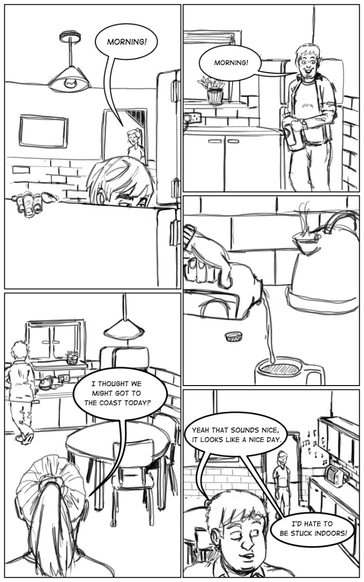
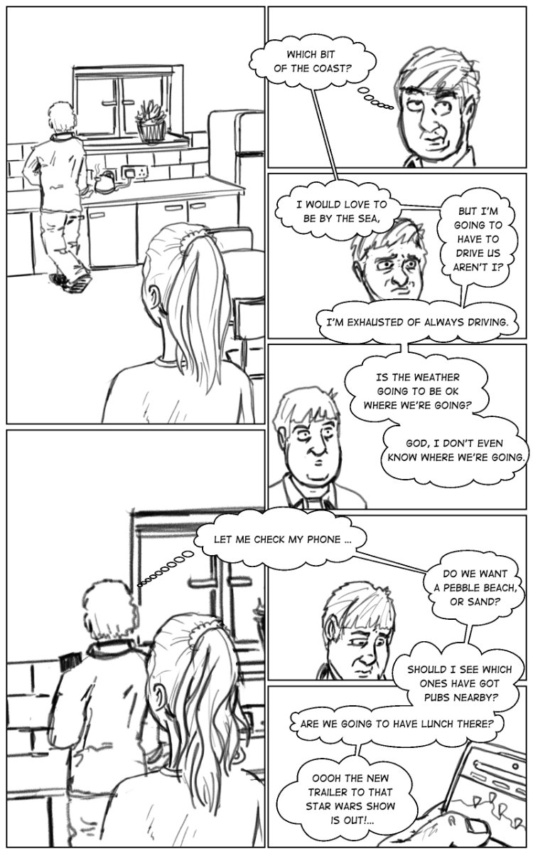
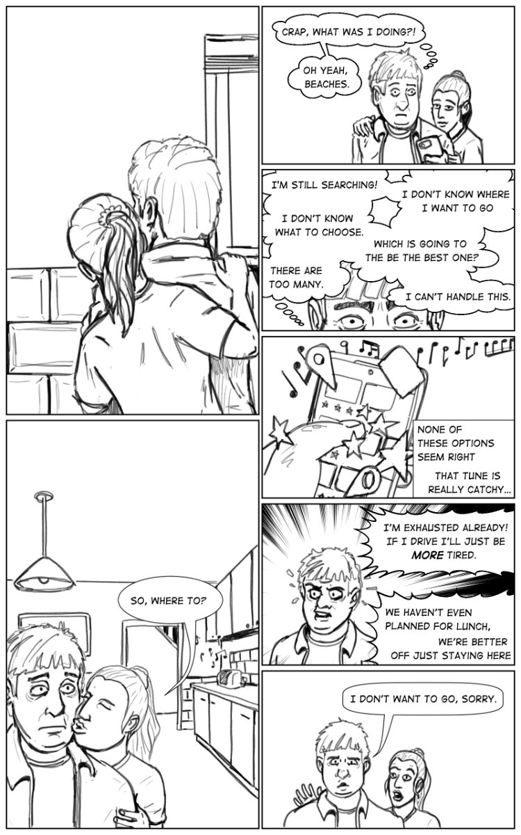
I think the lettering in this story does a lot of heavy lifting and storytelling in its own right, especially the difference between the first and second pages. I hoped to show that, as the brain gets busier and thoughts more frantic, overwhelm emerges. The text hopefully conveys how crowded everything feels in my head.
Below you can see the final comic, which I have laid out in the vertical webtoon format, I think that the story still reads well, and I am pleased with the final outcome. It was a really useful experiment to play with a sense of time and pace in this comic, and I have learned a lot about composition and pacing using lettering as a crucial component of comics. Whilst not 'slow' in the traditional sense, I am pleased that I created something from my own personal experience in an authentic way, and found a way to loosen up and draw more naturally.
I really like the style emerging here, some of it really reminds me of my Dandy comic hero Ken Harrison. But I still get the sense that this is my own work and not a copy of a style.
References
Rick and Morty - Season 5, Episode 1: "Mort Dinner Rick Andre", 2021. [TV programme] [adult swim].


Comments